We’ll see how to create beautiful visualizations using ggplot2
library(tidyverse) # also loads ggplot2 packagelibrary(ggthemes) # color palettes for ggplot
…using the dataset:
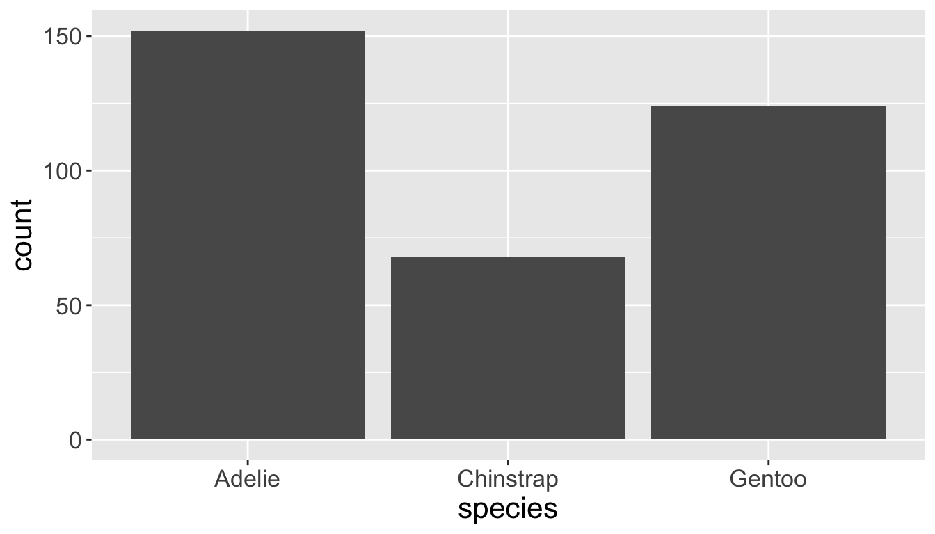
library(palmerpenguins)penguins
# A tibble: 344 × 8
   species island    bill_length_mm bill_depth_mm flipper_length_mm body_mass_g
   <fct>   <fct>              <dbl>         <dbl>             <int>       <int>
 1 Adelie  Torgersen           39.1          18.7               181        3750
 2 Adelie  Torgersen           39.5          17.4               186        3800
 3 Adelie  Torgersen           40.3          18                 195        3250
 4 Adelie  Torgersen           NA            NA                  NA          NA
 5 Adelie  Torgersen           36.7          19.3               193        3450
 6 Adelie  Torgersen           39.3          20.6               190        3650
 7 Adelie  Torgersen           38.9          17.8               181        3625
 8 Adelie  Torgersen           39.2          19.6               195        4675
 9 Adelie  Torgersen           34.1          18.1               193        3475
10 Adelie  Torgersen           42            20.2               190        4250
# ℹ 334 more rows
# ℹ 2 more variables: sex <fct>, year <int>
Basic structure of ggplot2
ggplot() constructs the initial plot.
The first argument of ggplot() is the data set for the plot.
The data set must be a data frame.
ggplot(data = mpg) creates an empty plot.
You then add one or more layers to ggplot() using +.
geom functions add a geometrical object to the plot.
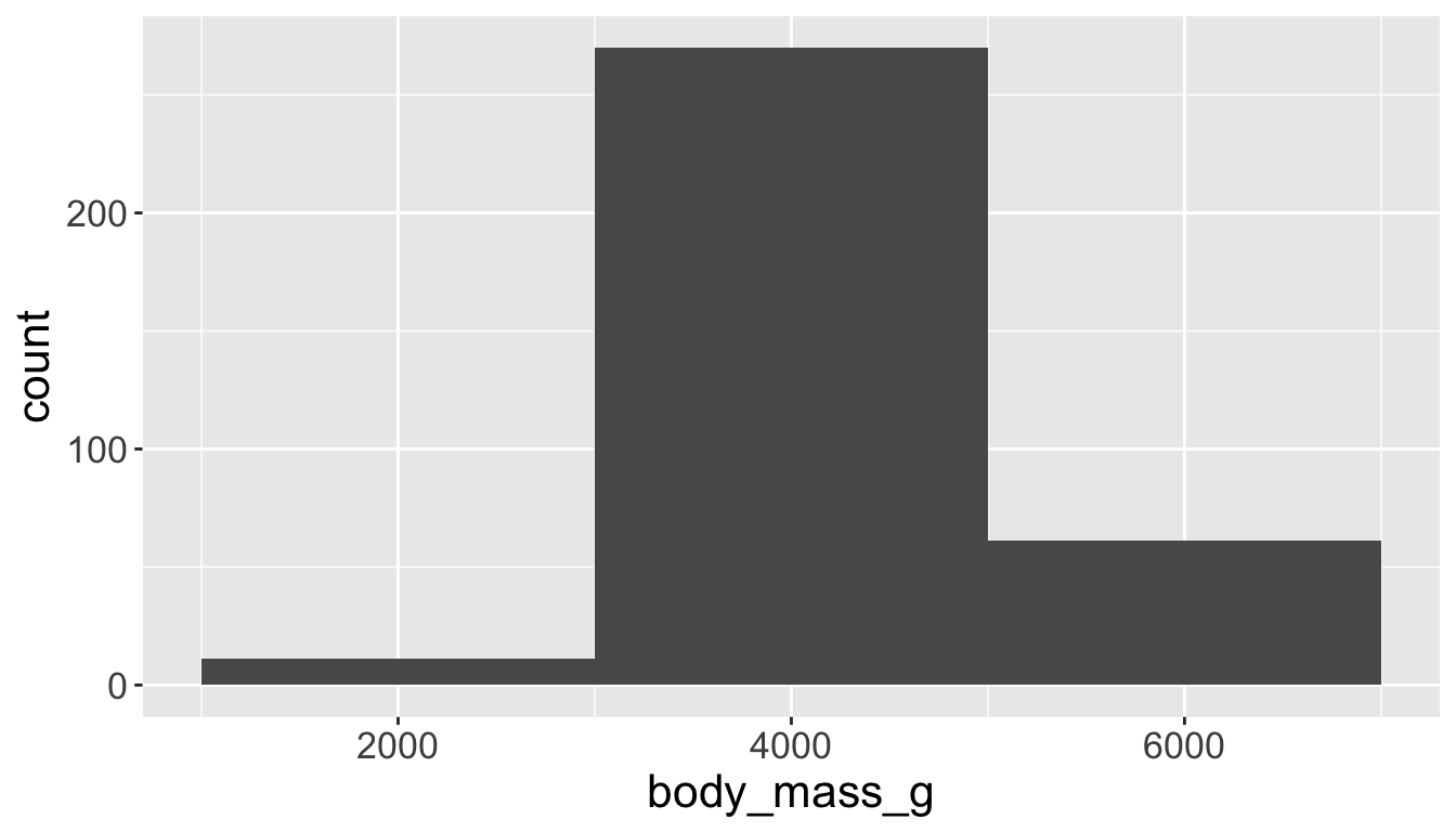
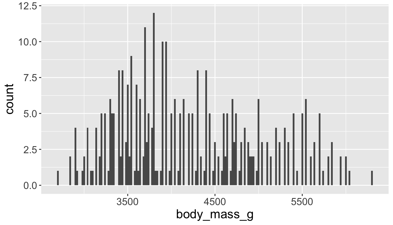
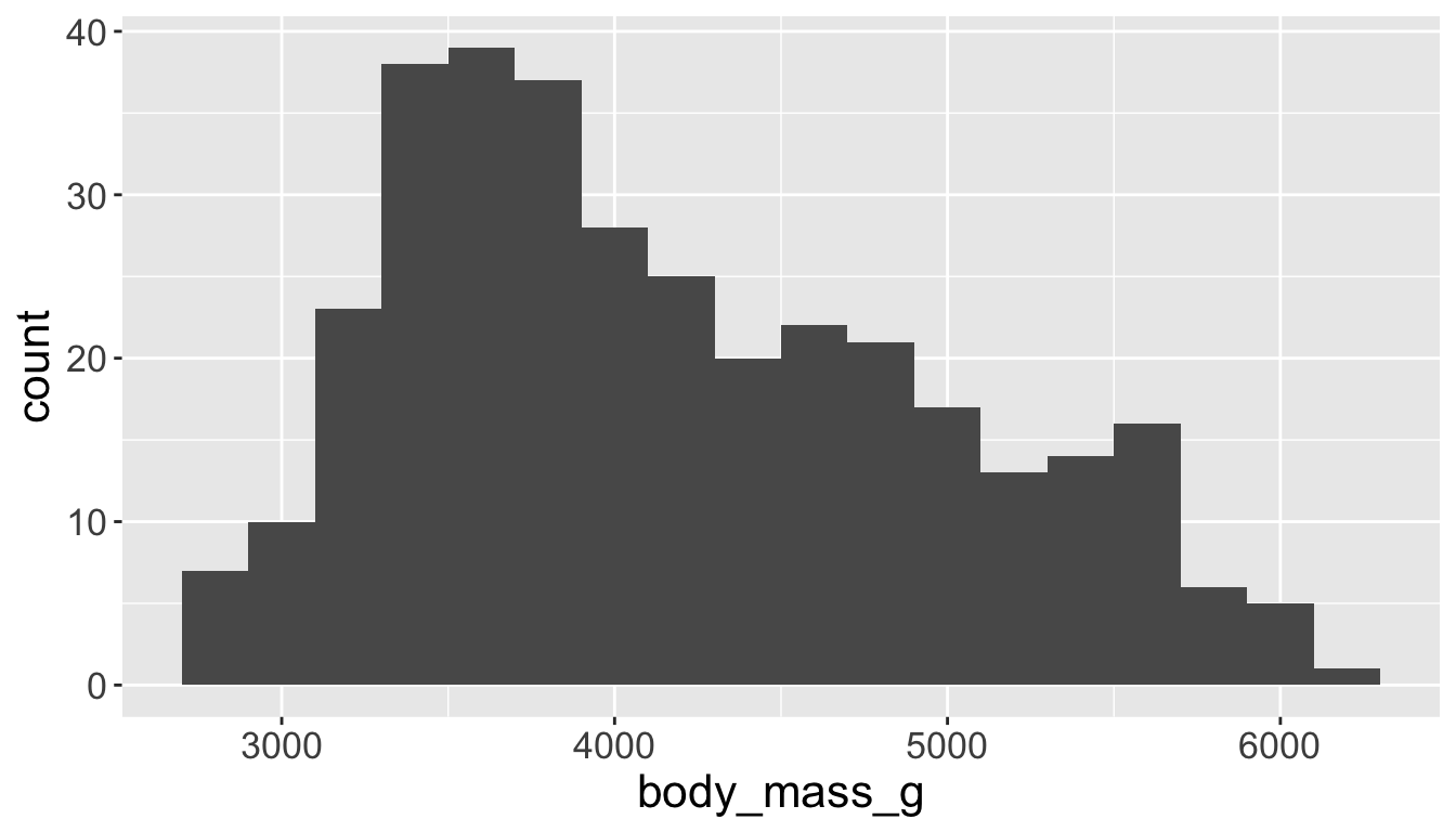
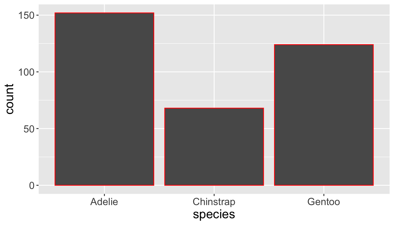
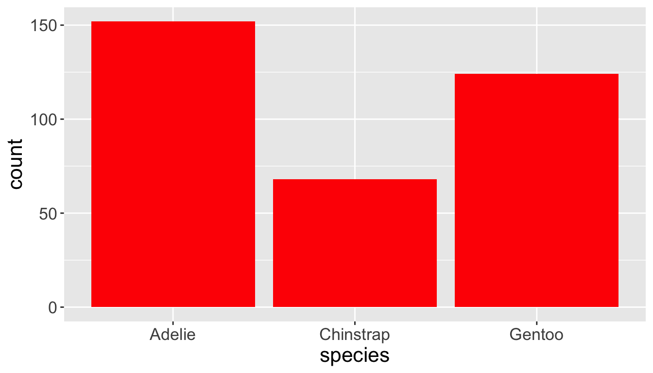
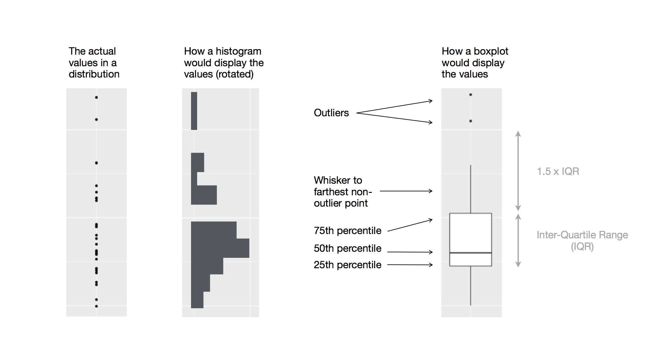
geom_point(), geom_smooth(), geom_histogram(), geom_boxplot(), etc.
Creating a ggplot
Start with function ggplot()
penguins |>ggplot()
Creating a ggplot
Start with function ggplot()
Add global aesthetics (i.e., aesthetics applied to every layer in plot).
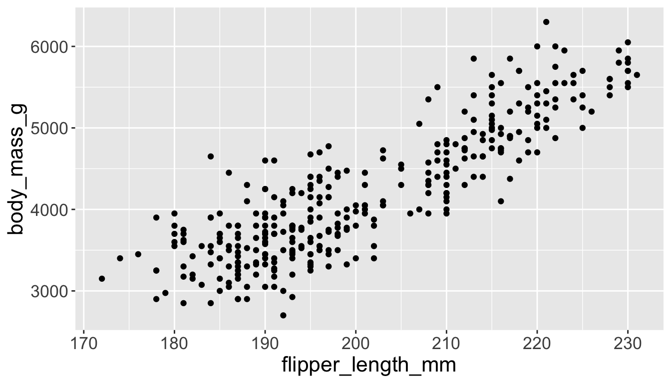
penguins |>ggplot(aes(x = flipper_length_mm, y = body_mass_g))
Creating a ggplot
Start with function ggplot()
Add global aesthetics (i.e., aesthetics applied to every layer in plot).
Add layers.
Display data using geom: geometrical object used to represent data
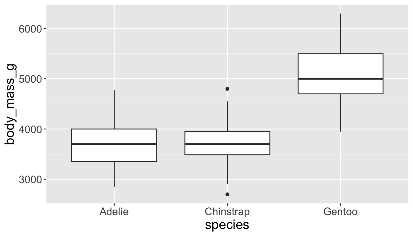
geom_bar(): bar chart; geom_line(): lines; geom_boxplot(): boxplot; geom_point(): scatterplot
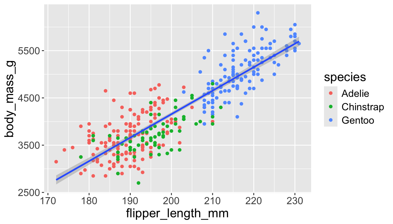
penguins |>ggplot(aes(x = flipper_length_mm, y = body_mass_g)) +geom_point()
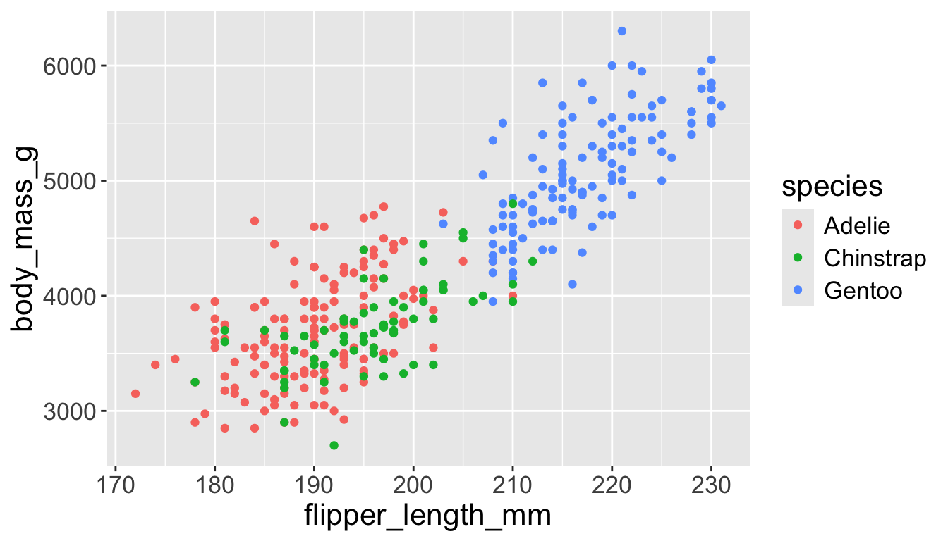
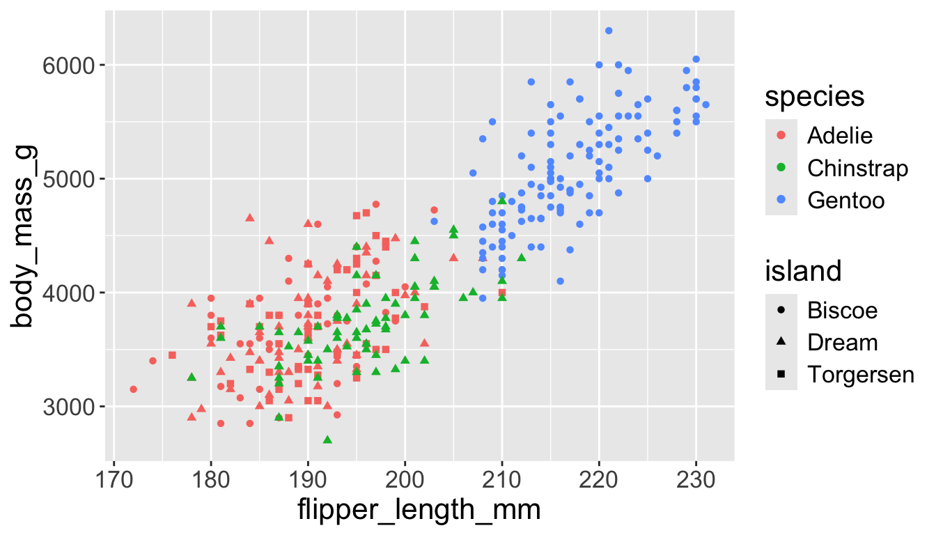
Adding aesthetics and layers
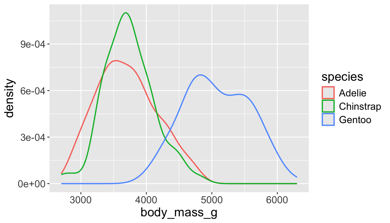
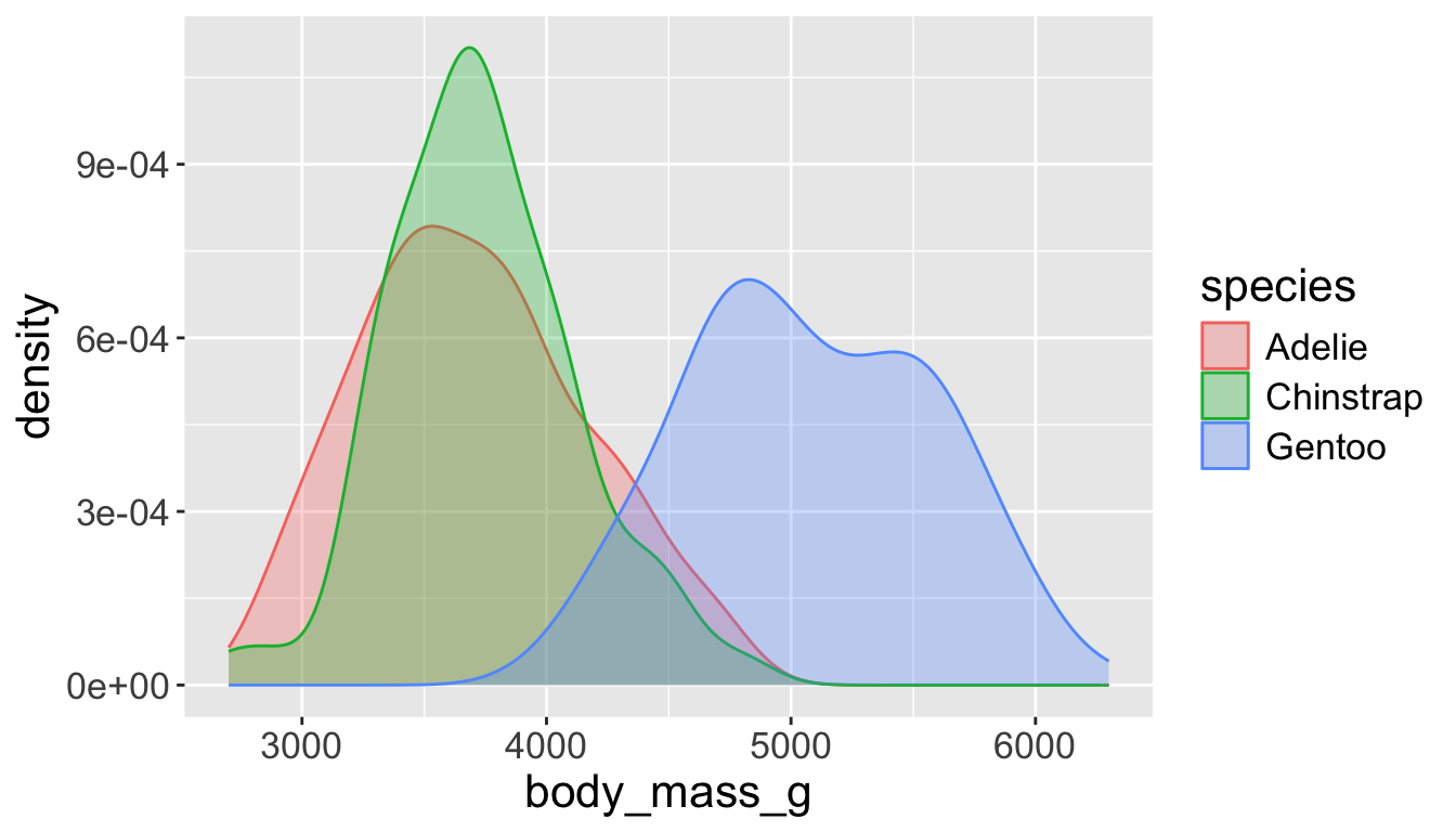
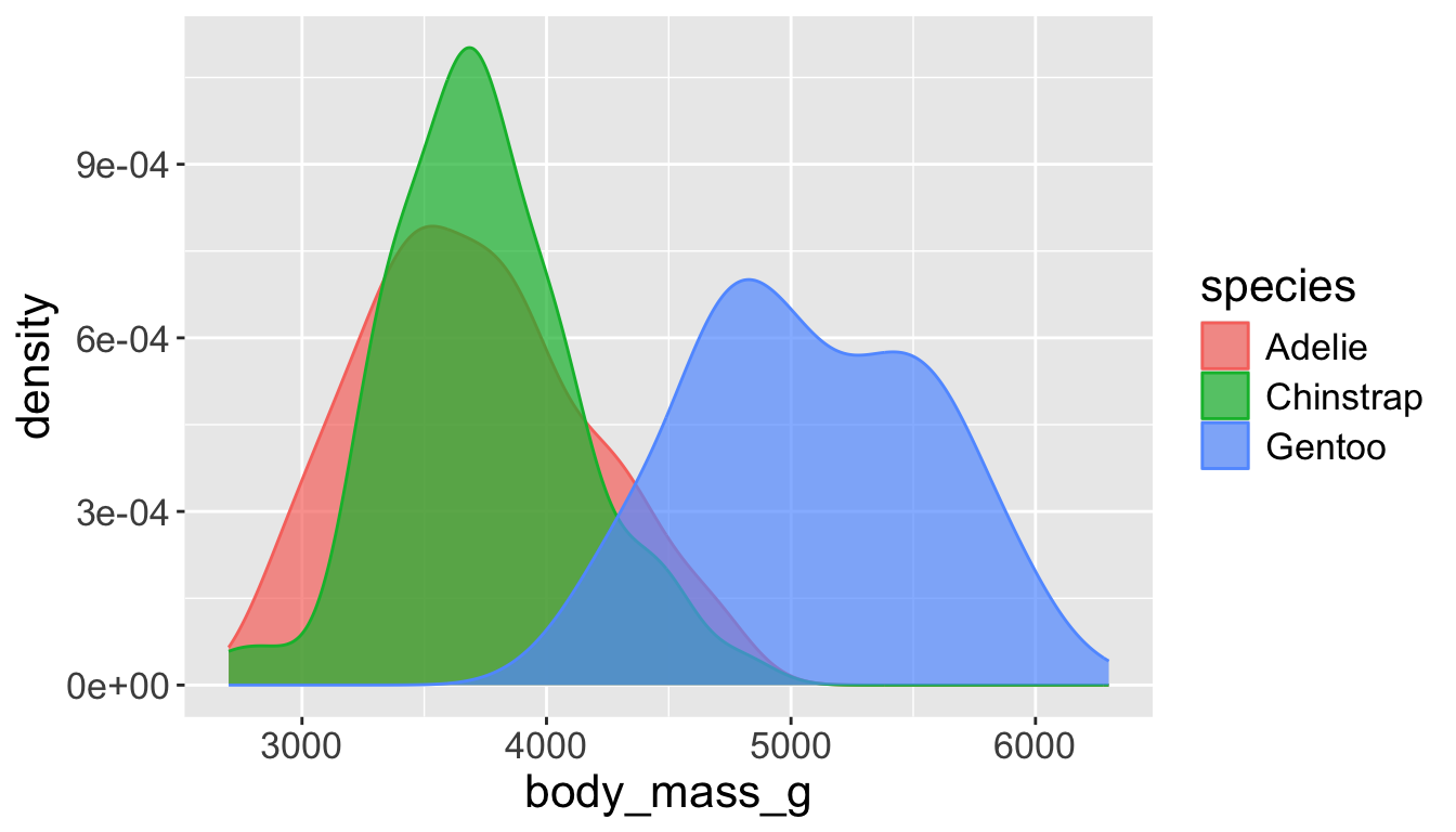
We can have aesthetics change as a function of variables inside the tibble
e.g. we can differentiate penguin species via colors
When a categorical variable is mapped to an aesthetic, each unique level of the variable (here: species) gets assigned a unique aesthetic value (here: unique color)