# A tibble: 344 × 8
   species island    bill_length_mm bill_depth_mm flipper_length_mm body_mass_g
   <fct>   <fct>              <dbl>         <dbl>             <int>       <int>
 1 Adelie  Torgersen           39.1          18.7               181        3750
 2 Adelie  Torgersen           39.5          17.4               186        3800
 3 Adelie  Torgersen           40.3          18                 195        3250
 4 Adelie  Torgersen           NA            NA                  NA          NA
 5 Adelie  Torgersen           36.7          19.3               193        3450
 6 Adelie  Torgersen           39.3          20.6               190        3650
 7 Adelie  Torgersen           38.9          17.8               181        3625
 8 Adelie  Torgersen           39.2          19.6               195        4675
 9 Adelie  Torgersen           34.1          18.1               193        3475
10 Adelie  Torgersen           42            20.2               190        4250
# ℹ 334 more rows
# ℹ 2 more variables: sex <fct>, year <int>10: data visualization
STA35B: Statistical Data Science 2
Creating a ggplot

Creating a ggplot
Creating a ggplot
- Start with function
ggplot() - Add global aesthetics (i.e., aesthetics applied to every layer in plot).
- Add layers.
- Display data using geom: geometrical object used to represent data
geom_bar(): bar chart;geom_line(): lines;geom_boxplot(): boxplot;geom_point(): scatterplot
Adding aesthetics and layers
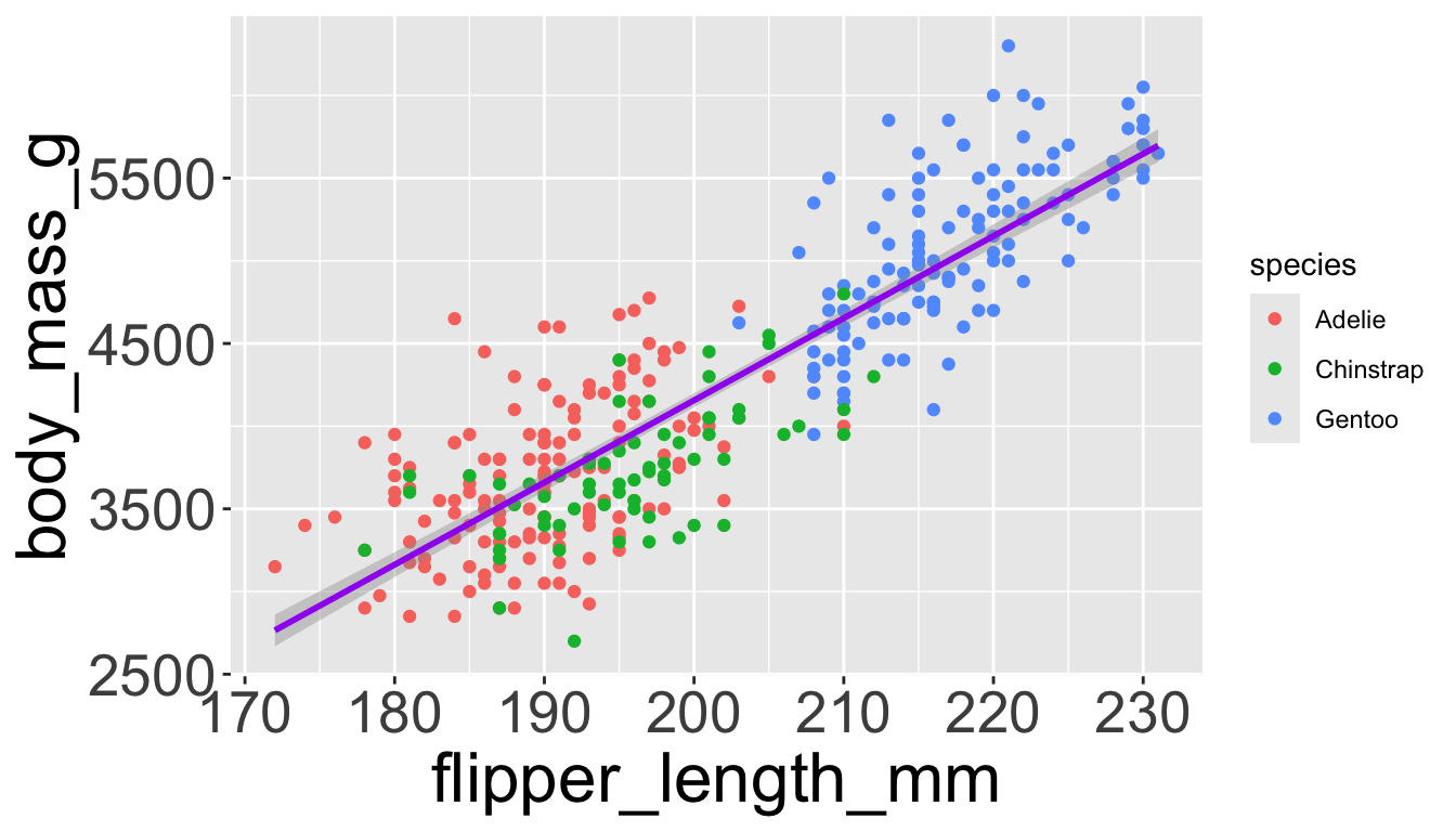
We can have aesthetics change as a function of variables inside the tibble
- e.g. we can differentiate penguin species via colors
- When a categorical variable is mapped to an aesthetic, each unique level of the variable (here: species) gets assigned a unique aesthetic value (here: unique color)

Adding aesthetics and layers
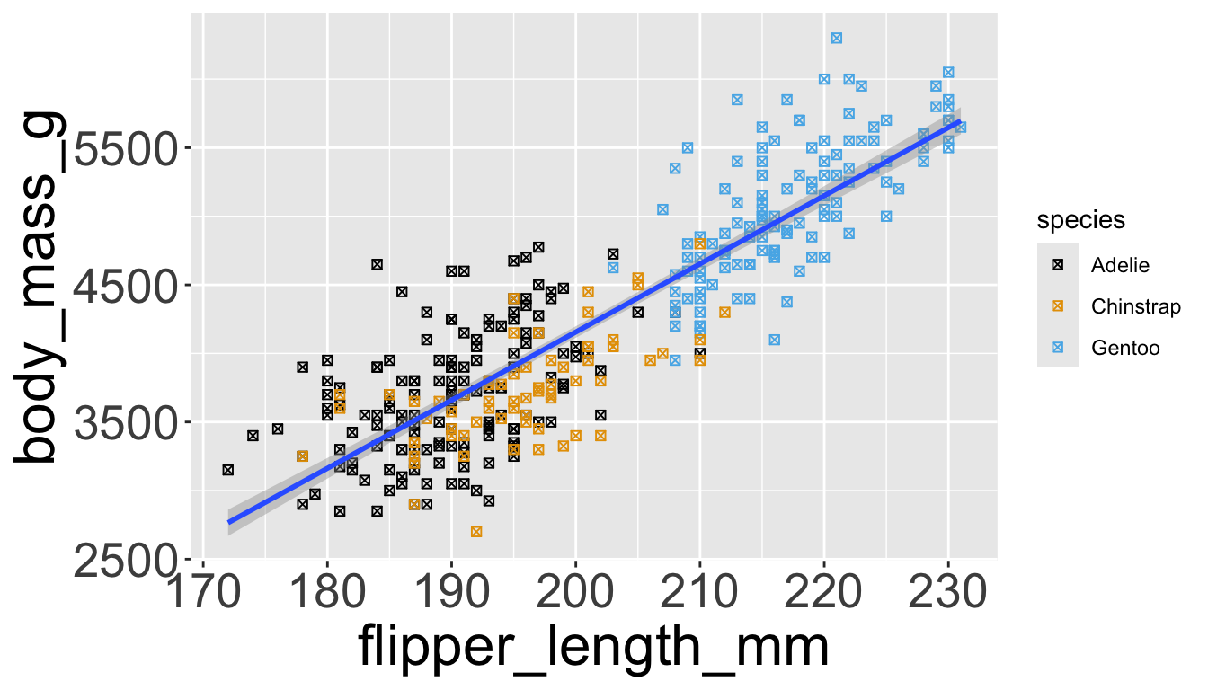
Let’s add a new layer, geom_smooth(method="lm"), which visualizes line of best fit based on a linear model
- When an aesthetic mapping is added inside
ggplot(), it is applied to all layers.- So
color=speciesinsideggplot()will group all penguins by species. - We now have a line for each species (not one global line).
- So
Adding aesthetics and layers
Let’s add a new layer, geom_smooth(method="lm"), which visualizes line of best fit based on a linear model
- When an aesthetic mapping is added inside a layer, it is applied to just that layer.
- So
color=speciesinsidegeom_point()will group all penguins by species only for that layer. - We now have one global line for all penguins.
- So
Adding aesthetics and layers
Adding aesthetics and layers
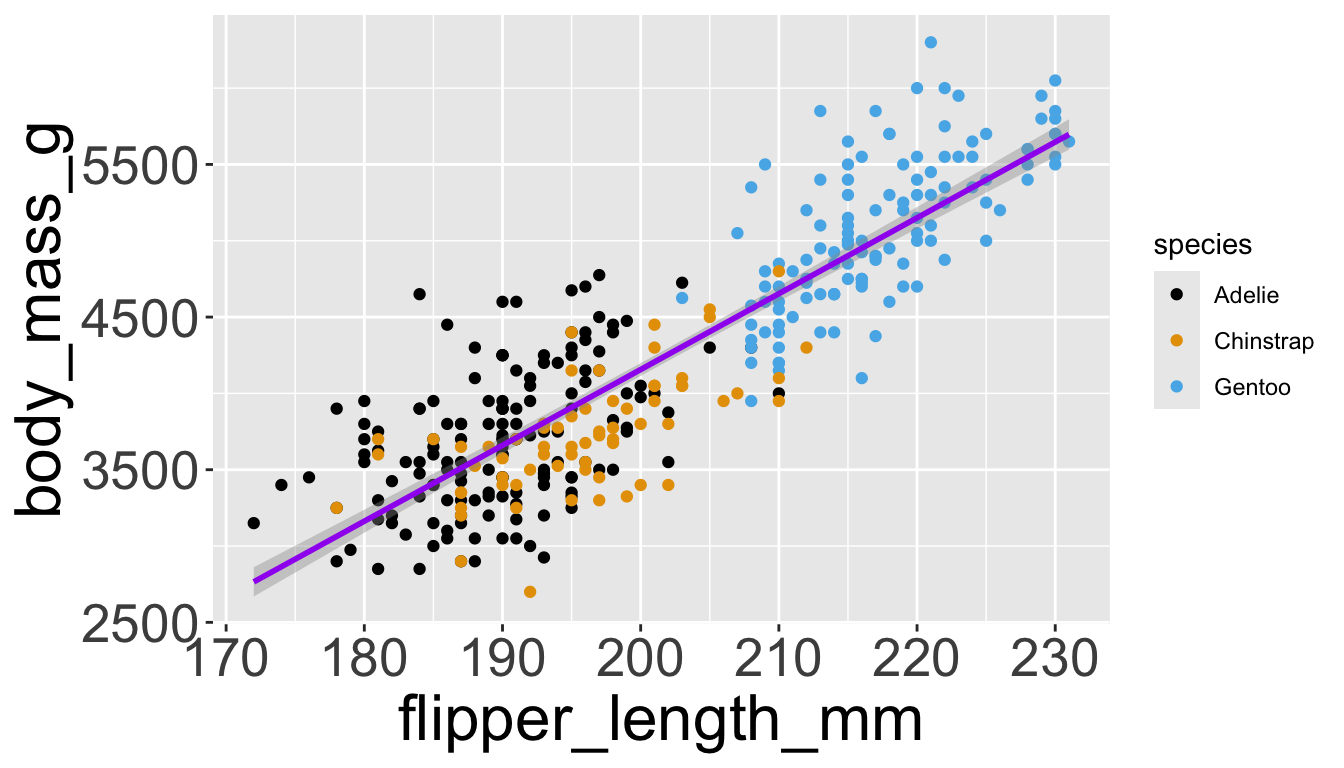
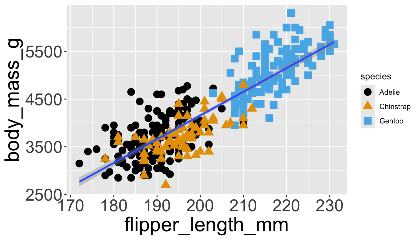
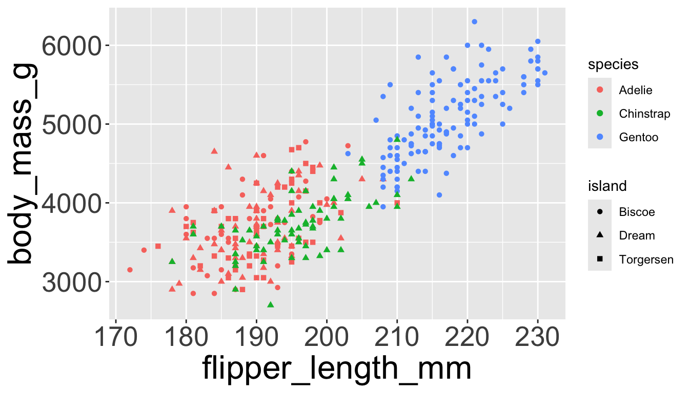
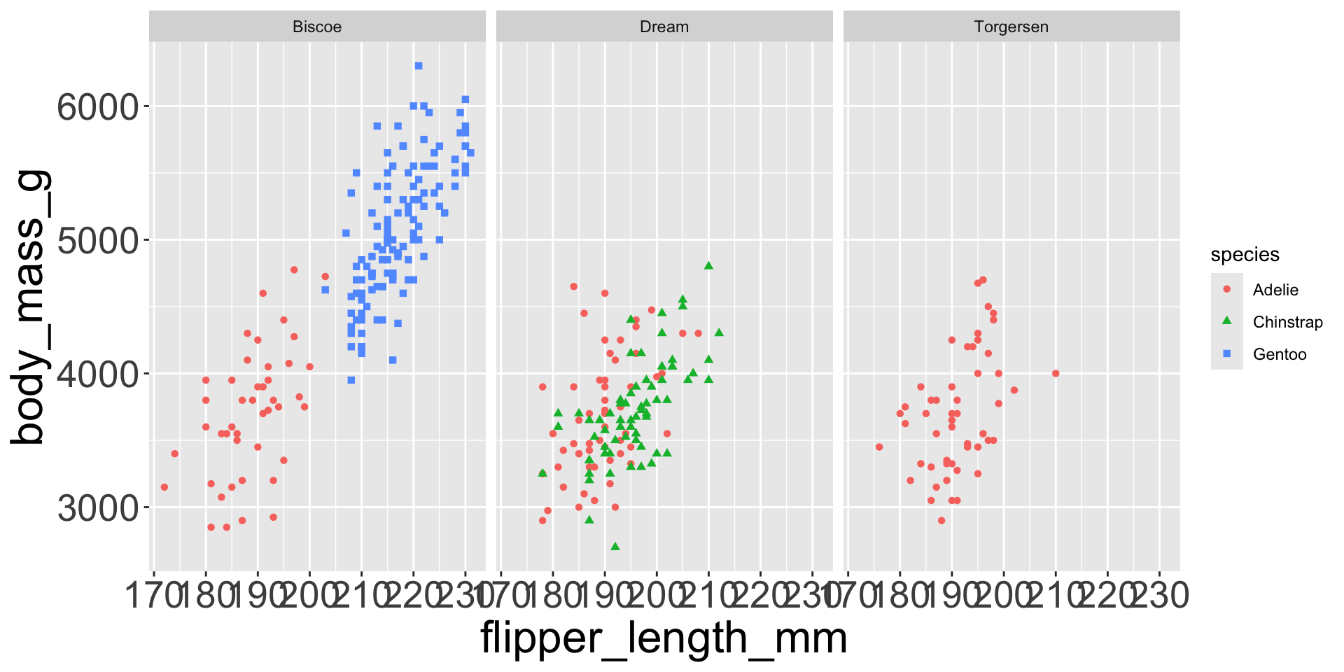
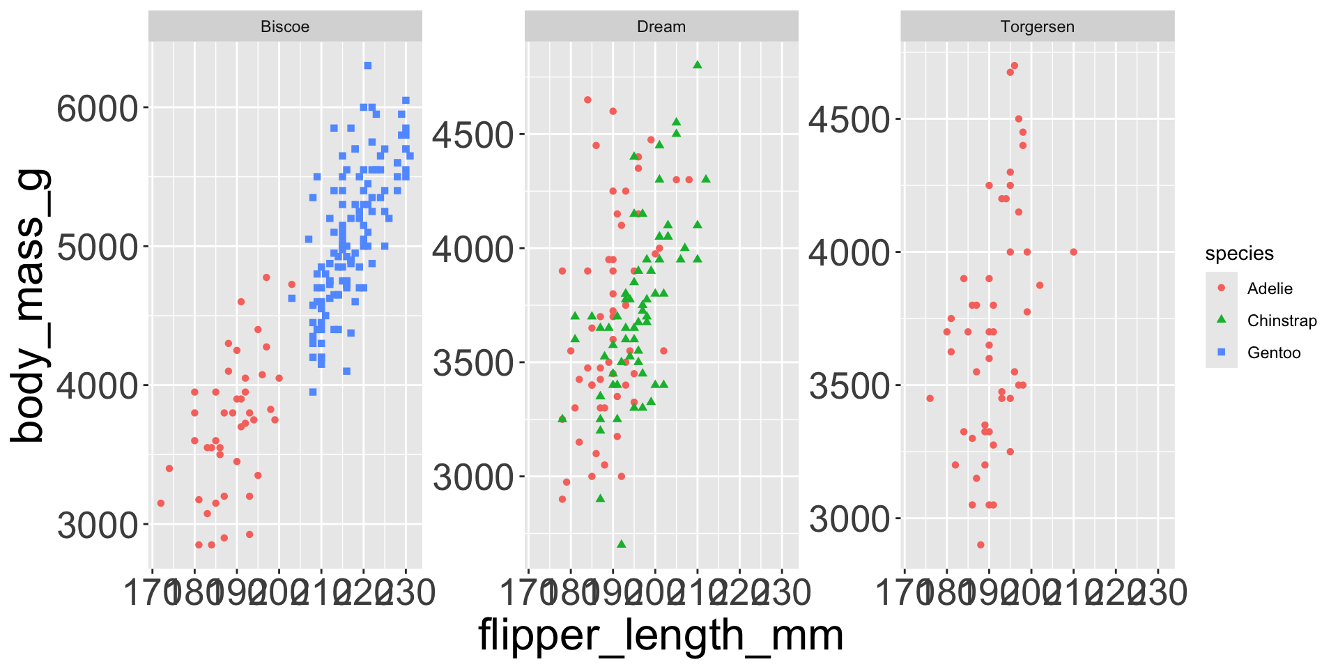
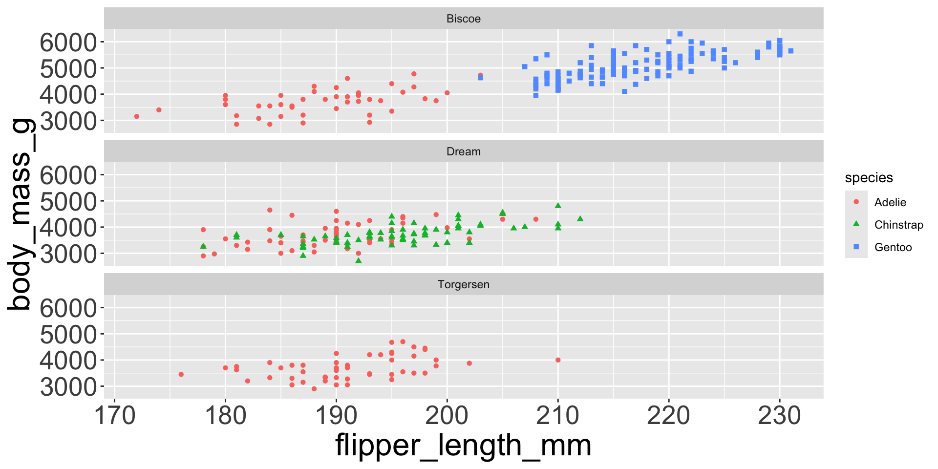
Let’s further differentiate different species via shapes.
- We can specify this in a local aesthetic mapping of points using
shape= - The legend will be updated to show this too!
Adding aesthetics and layers
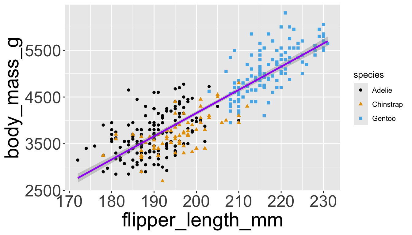
Let’s further differentiate different species via shapes.
- We can make all points the same color by specifying
color=outside ofaes()
Adding aesthetics and layers
Adding aesthetics and layers
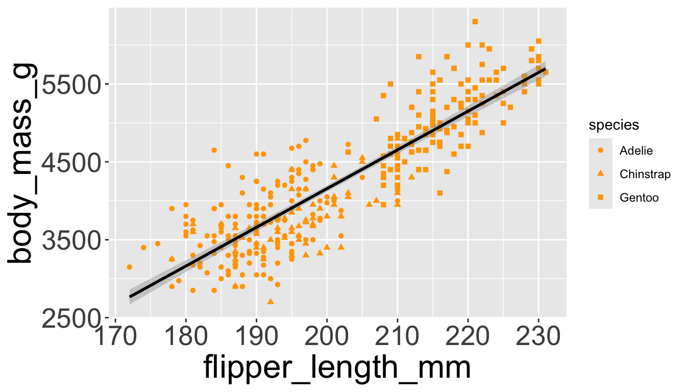
Let’s further differentiate different species via shapes.
- We can also specify
shape=outside ofaes()
color and fill aesthetics. The hollow shapes (0–14) have a border determined by color; the solid shapes (15–20) are filled with color; the filled shapes (21–24) have a border of color and are filled with fill.
Adding aesthetics and layers
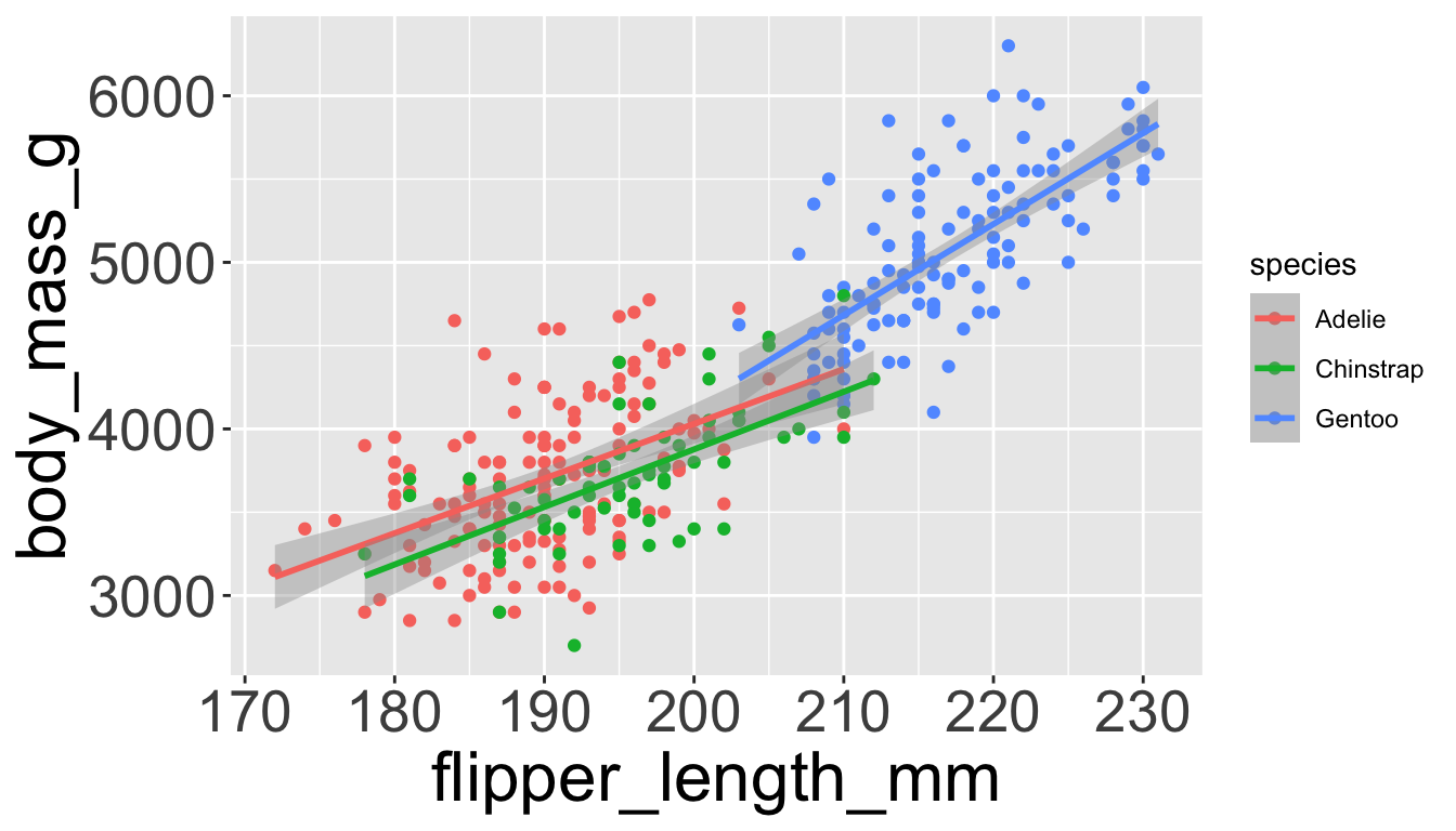
Now just need to add title and axis labels
penguins |>
    ggplot(aes(x = flipper_length_mm,
y = body_mass_g)) +
geom_point(aes(color = species,
shape = species)) +
geom_smooth(method = "lm") +
labs(
title = "Body mass and flipper length",
subtitle = "Dimensions for Adelie, Chinstrap, and Gentoo Penguins",
x = "Flipper length (mm)", y = "Body mass (g)",
color = "Species", shape = "Species"
) +
scale_color_colorblind()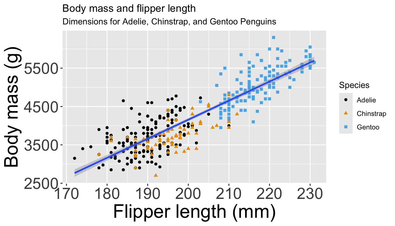
Visualizing distributions
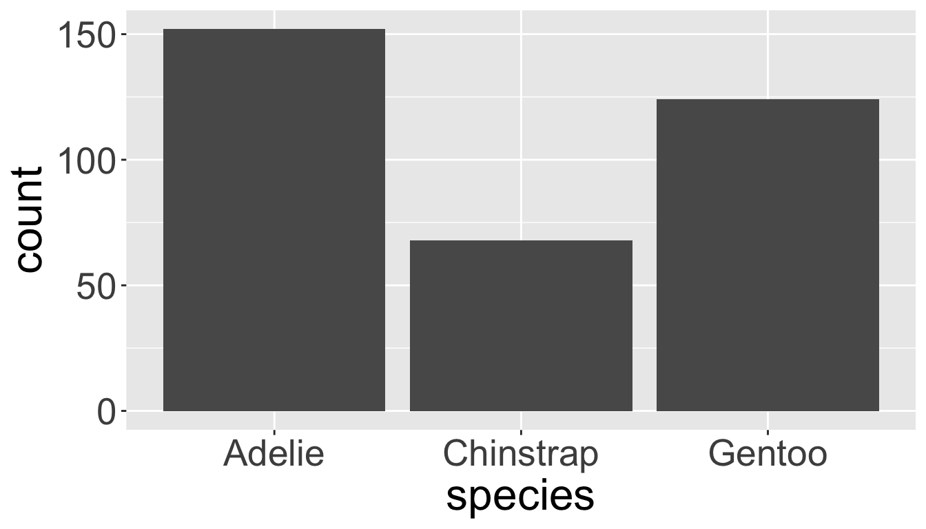
Categorical variables take only one of a finite set of values
- Bar charts are useful for visualizing categorical variables
Visualizing distributions
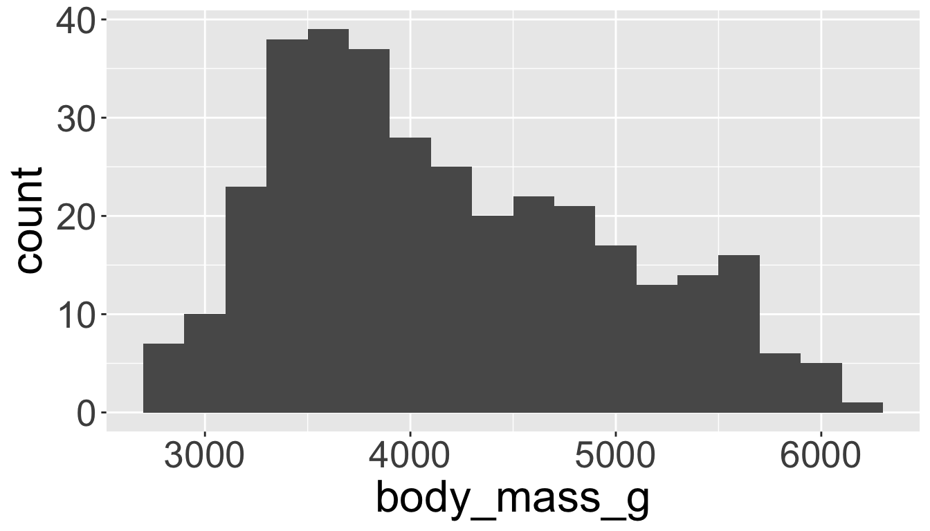
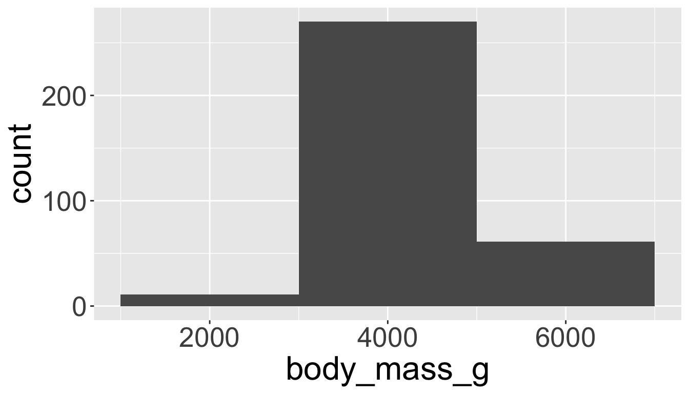
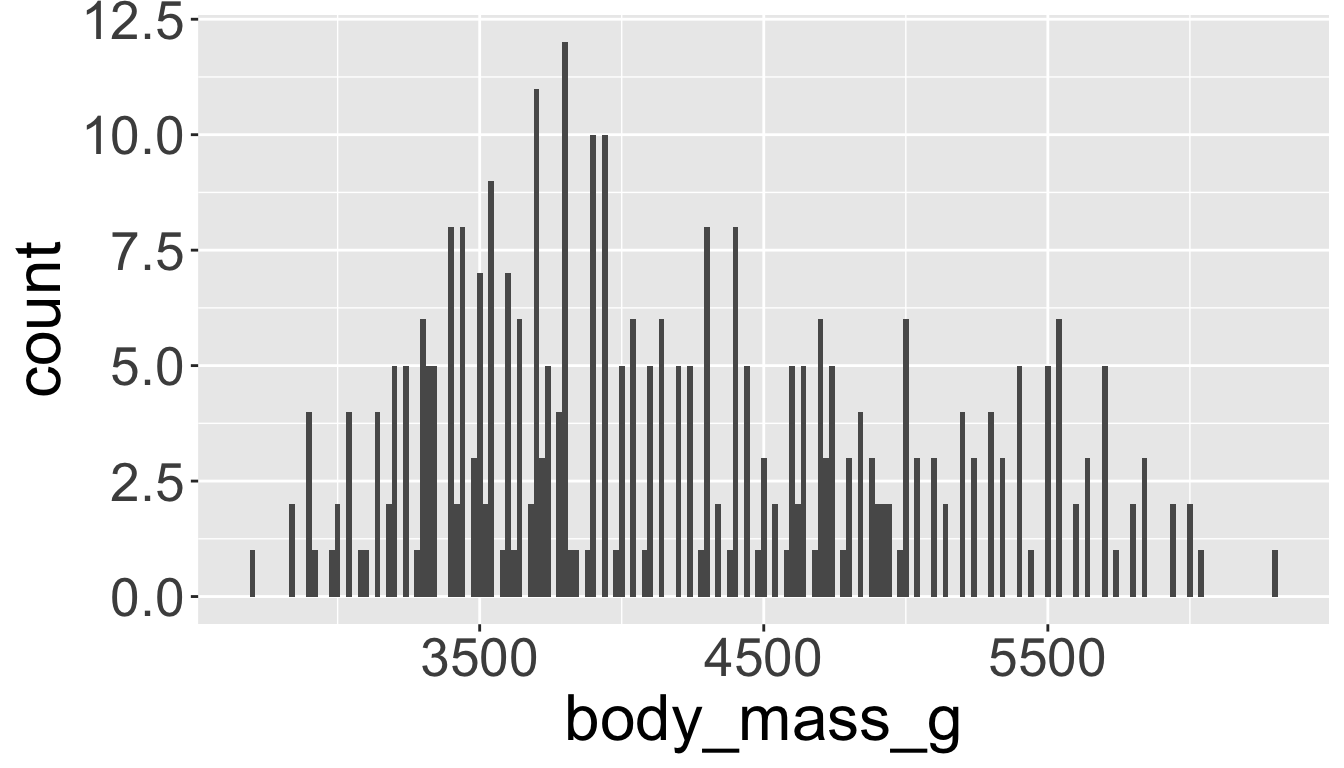
You will likely need to spend time tuning the binwidth parameter
Visualizing distributions
- A smoothed out version of histogram which is supposed to approximate a probability density function
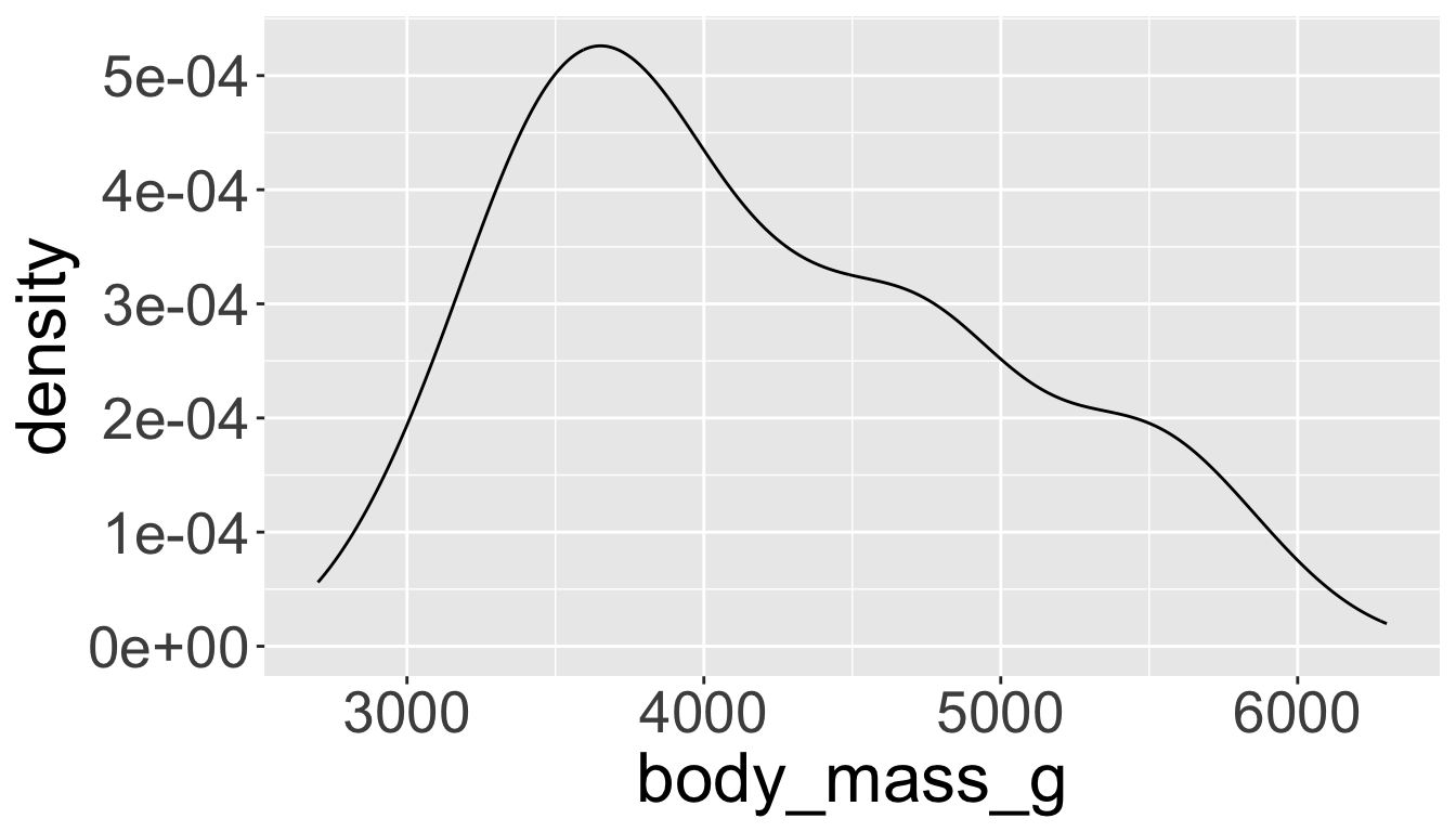

Visualizing distributions
- Let’s check the difference between setting
color =vsfill =withgeom_bar:
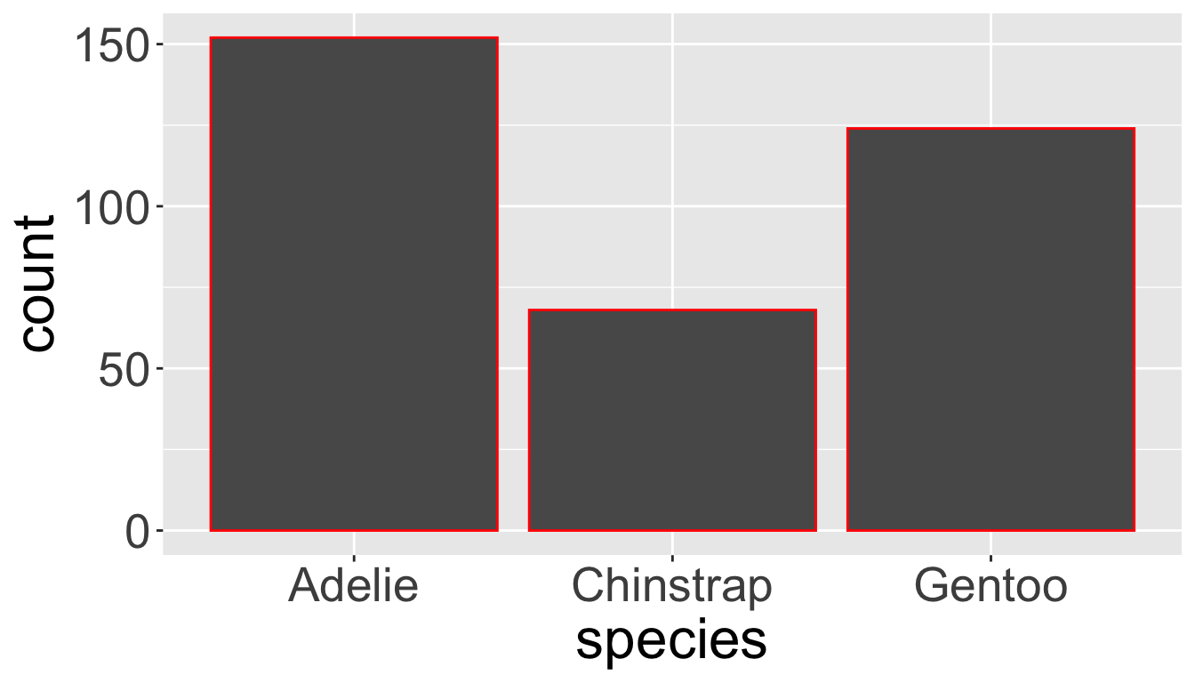
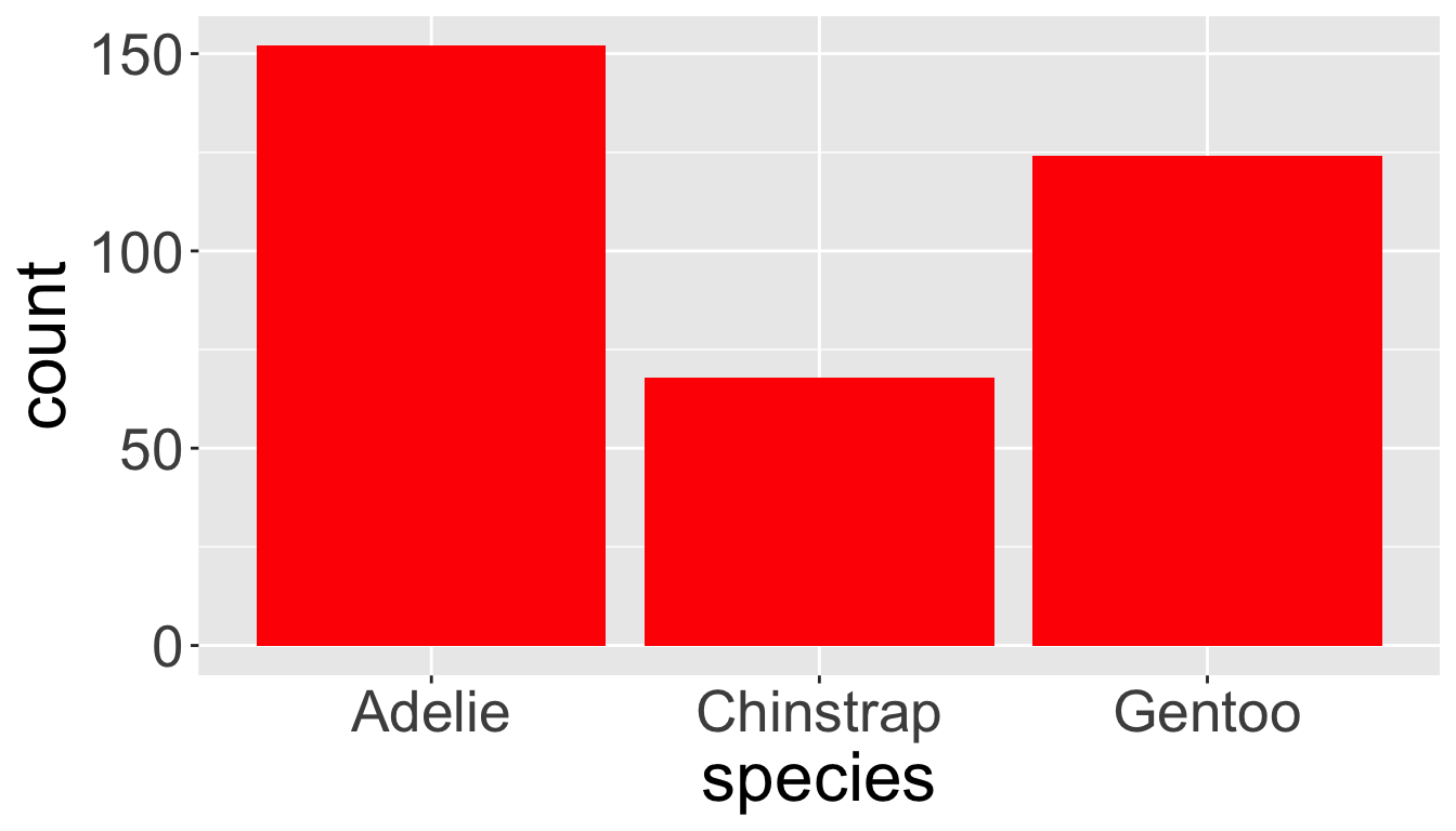
Visualizing distributions
- Let’s check the difference between setting
color =vsfill =withgeom_bar:


Visualizing distributions
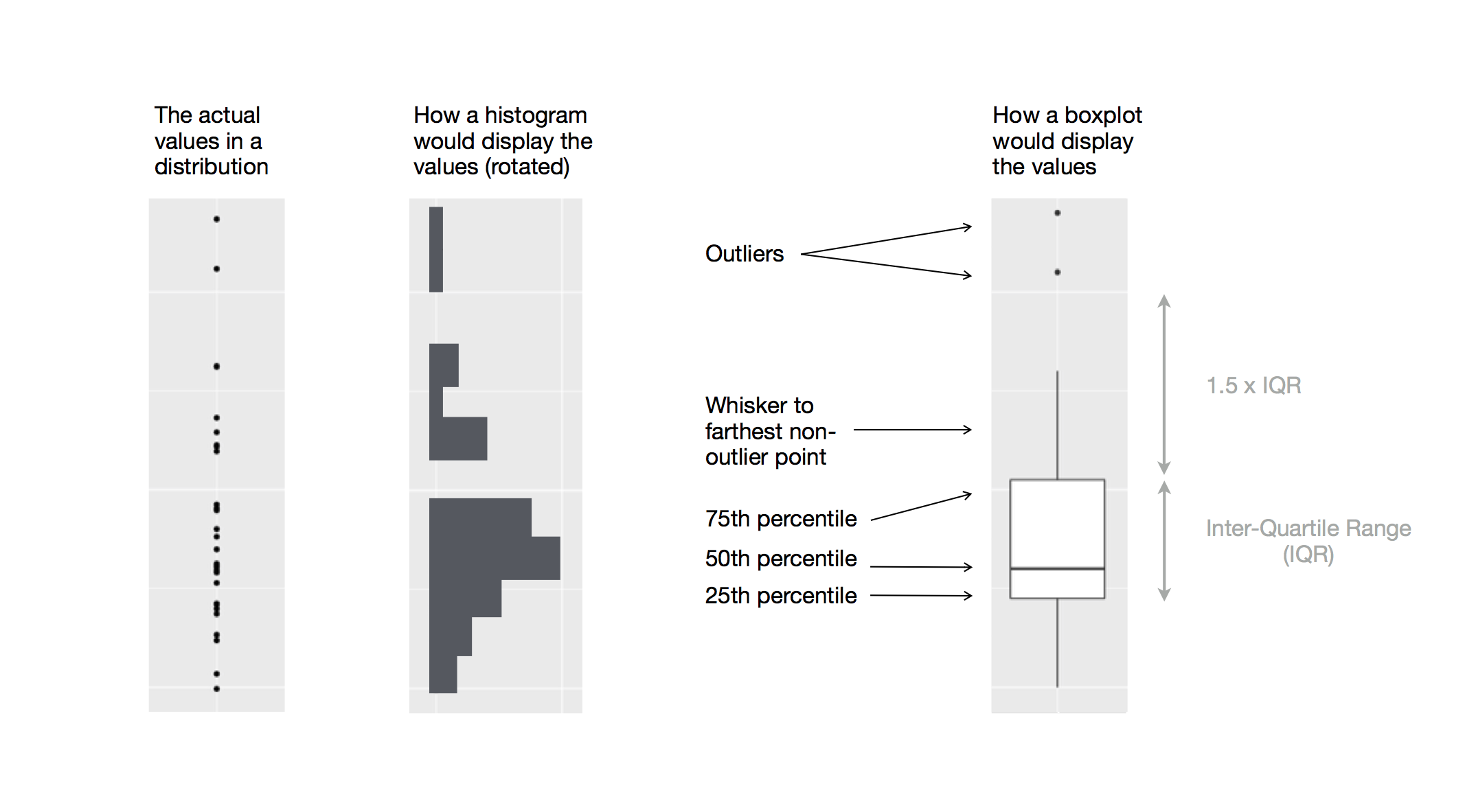
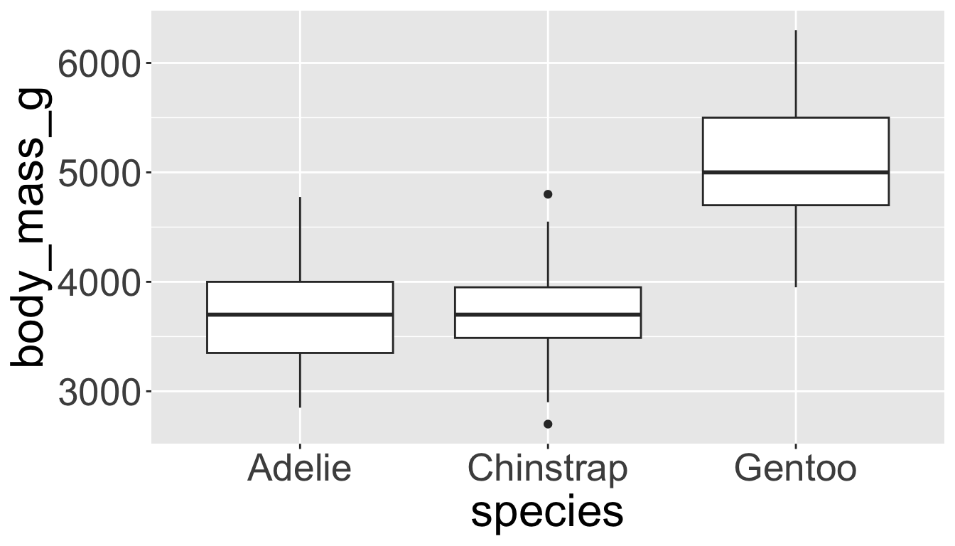
- Box plots allow for visualizing the spread of a distribution
- Makes it easy to see 25th percentile, median, 75th percentile, and outliers (>1.5*IQR from 25th or 75th percentile)
Visualizing distributions
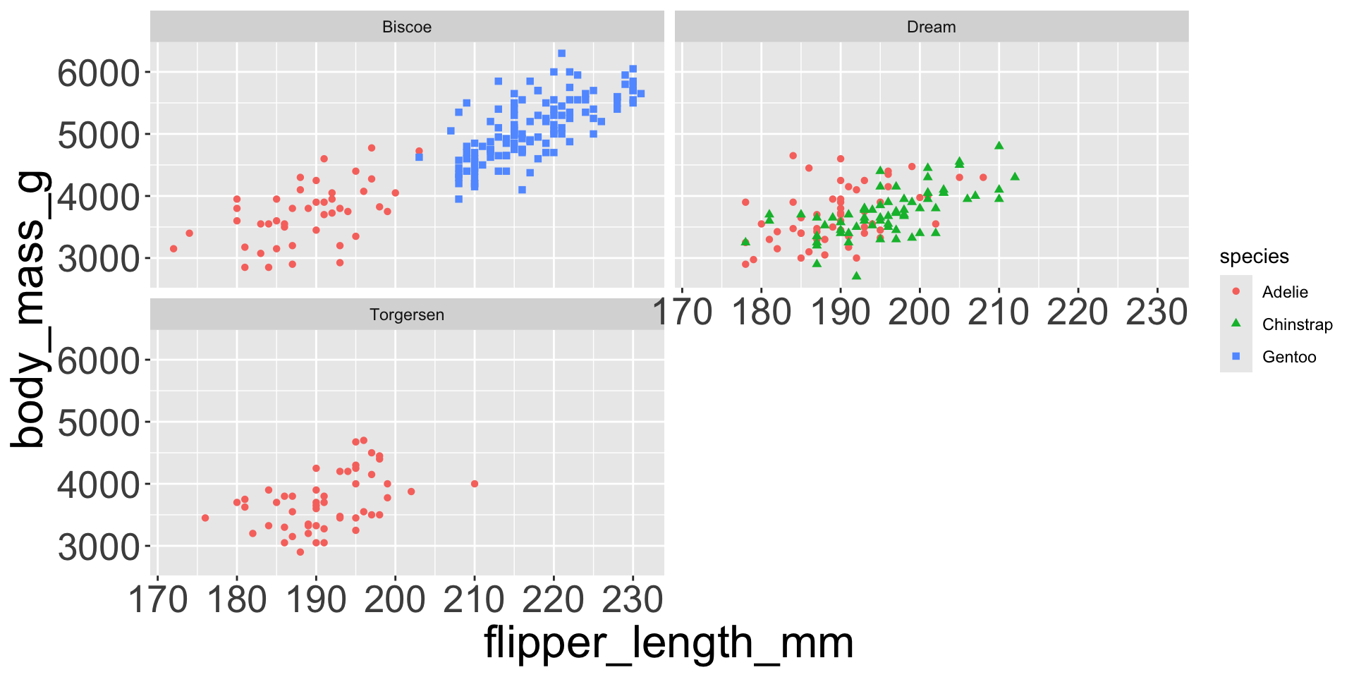
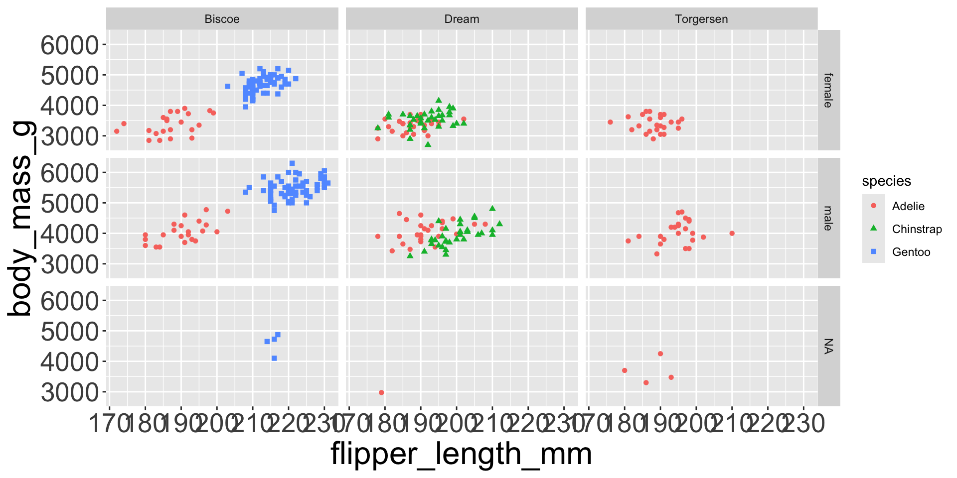
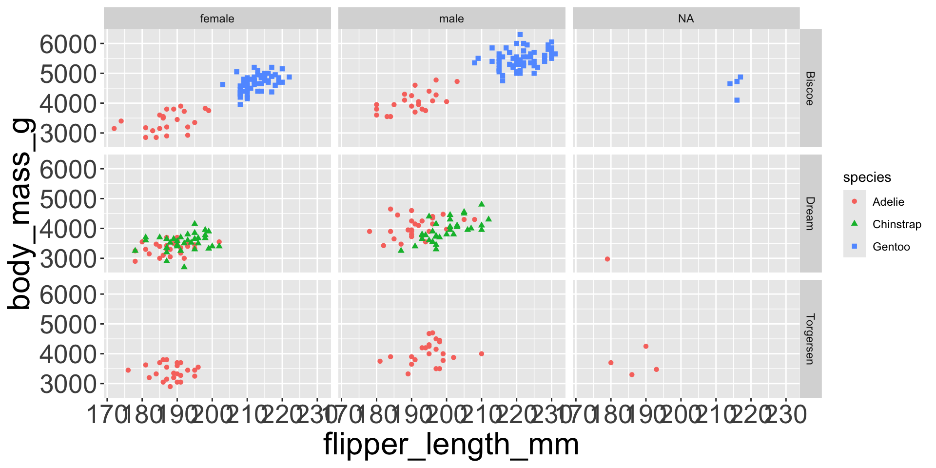
Let’s see distribution of body mass by species…
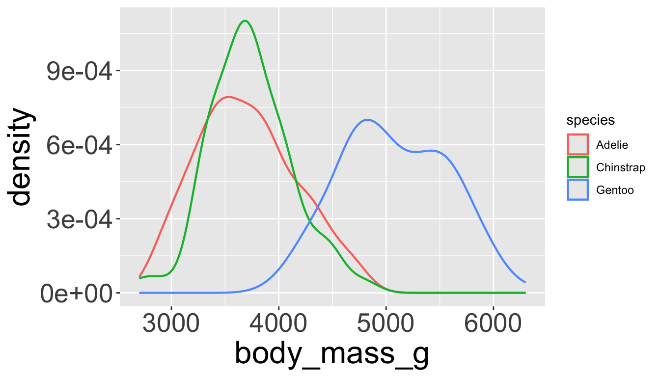
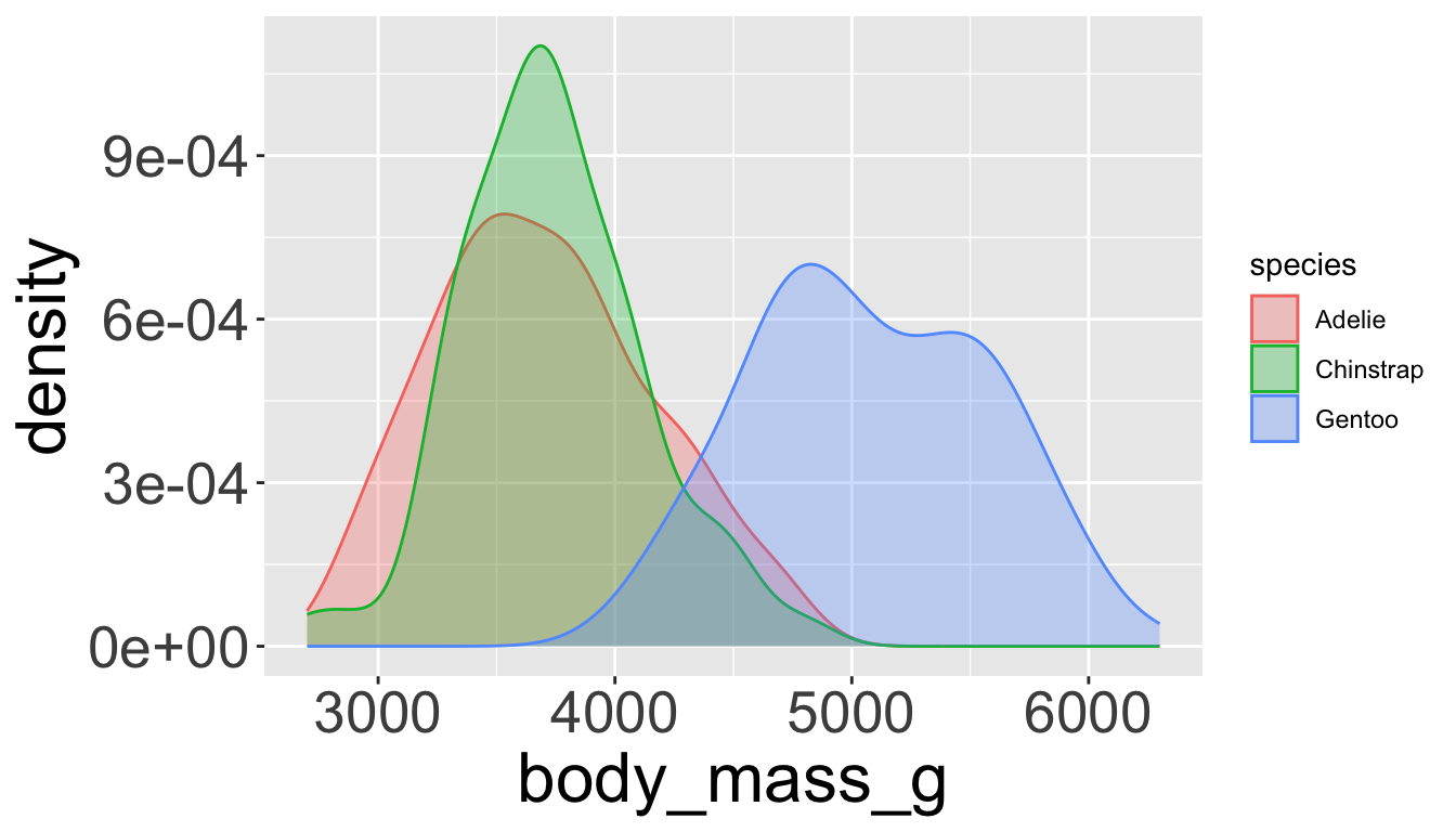
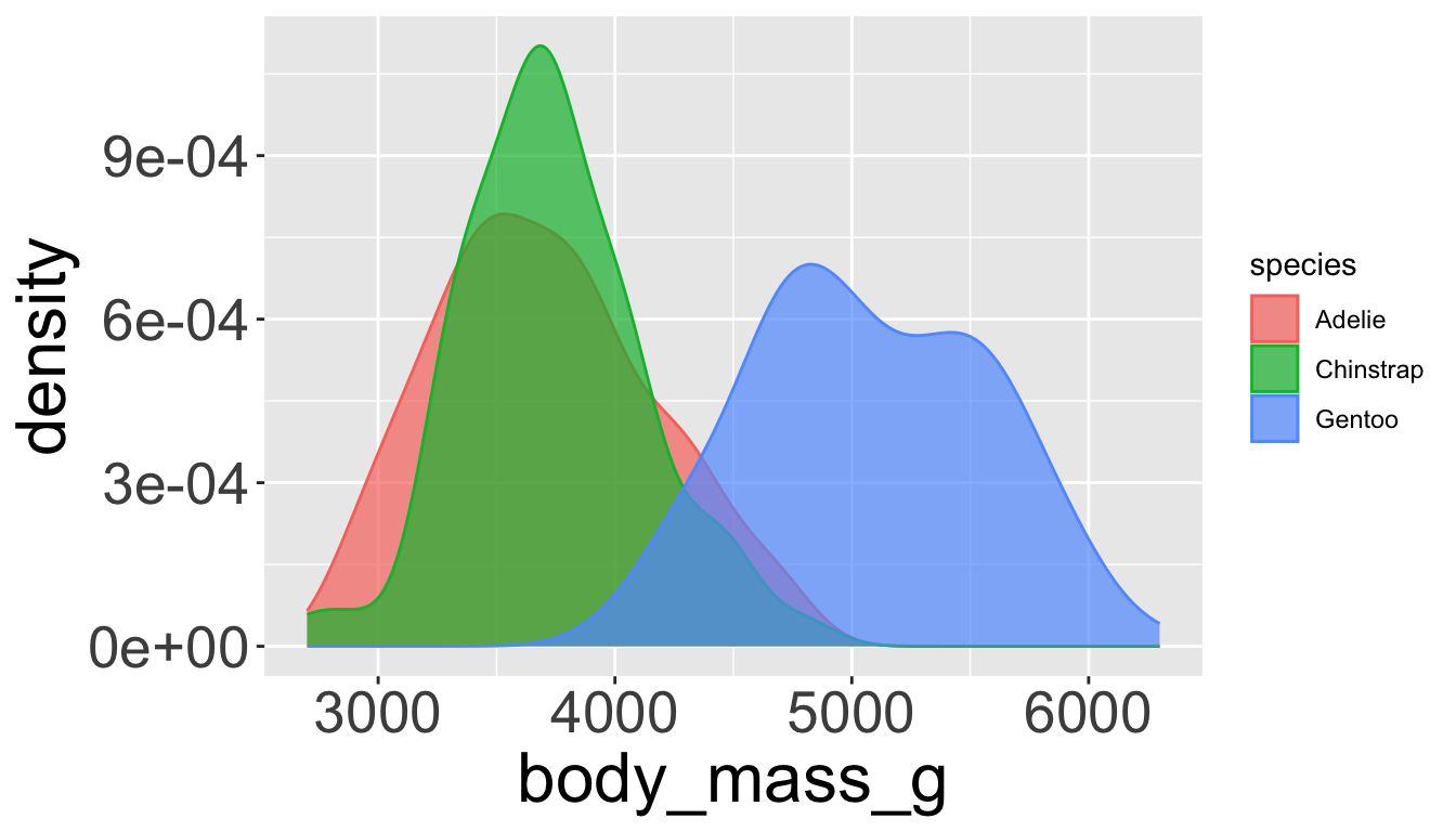
Playing with visual parameters
Use alpha to add transparency
alphais a number between 0 and 1; 0 = transparent, 1 = opaque
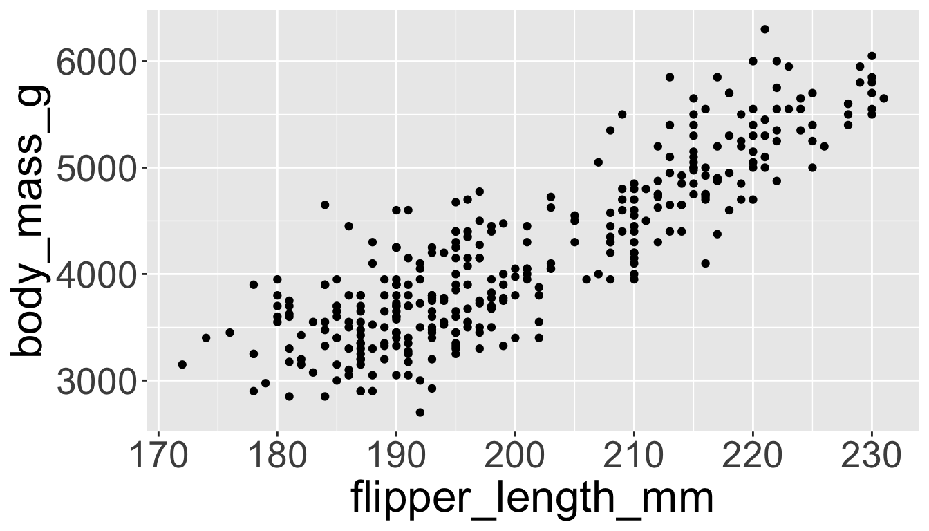
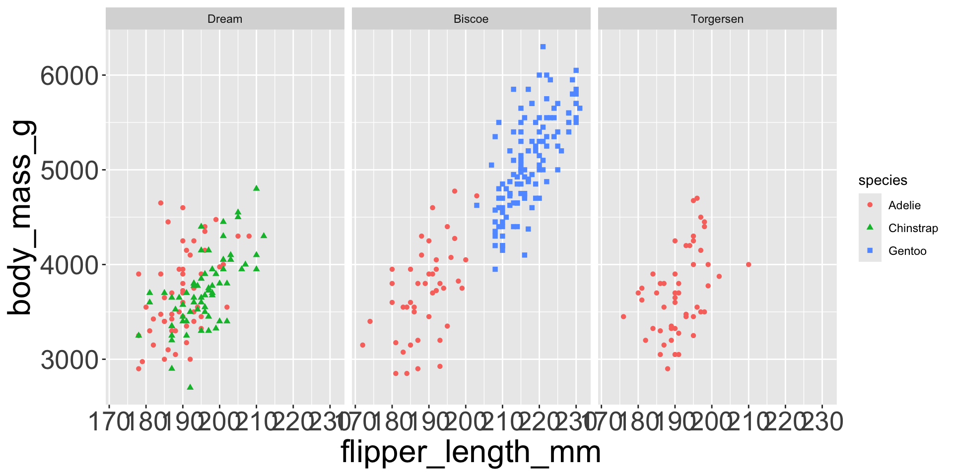
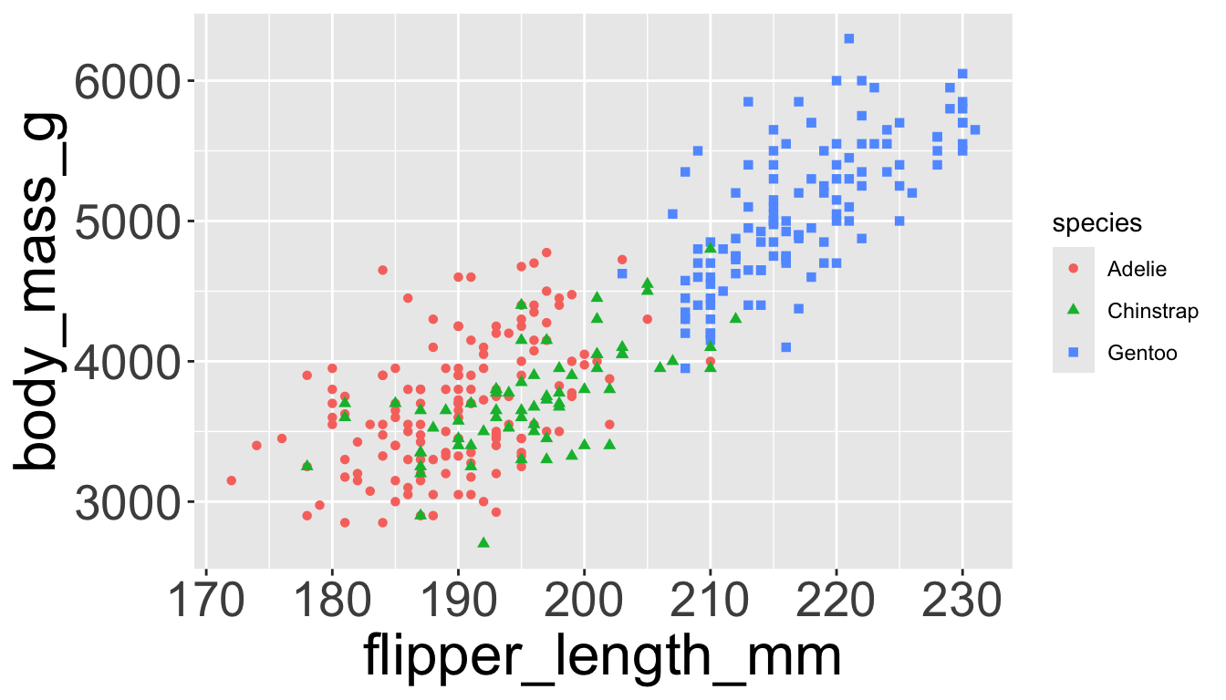
Multiple numerical variables
Already saw how to use scatter plots to visualize two numeric variables
Multiple numerical variables
Too many aesthetic changes (shape, color, fill, size, etc) can clutter plots
Multiple numerical variables
Too many aesthetic changes (shape, color, fill, size, etc) can clutter plots
Multiple numerical variables
Too many aesthetic changes (shape, color, fill, size, etc) can clutter plots
Multiple numerical variables
Too many aesthetic changes (shape, color, fill, size, etc) can clutter plots
Multiple numerical variables
Too many aesthetic changes (shape, color, fill, size, etc) can clutter plots
Multiple numerical variables
Too many aesthetic changes (shape, color, fill, size, etc) can clutter plots
Multiple numerical variables
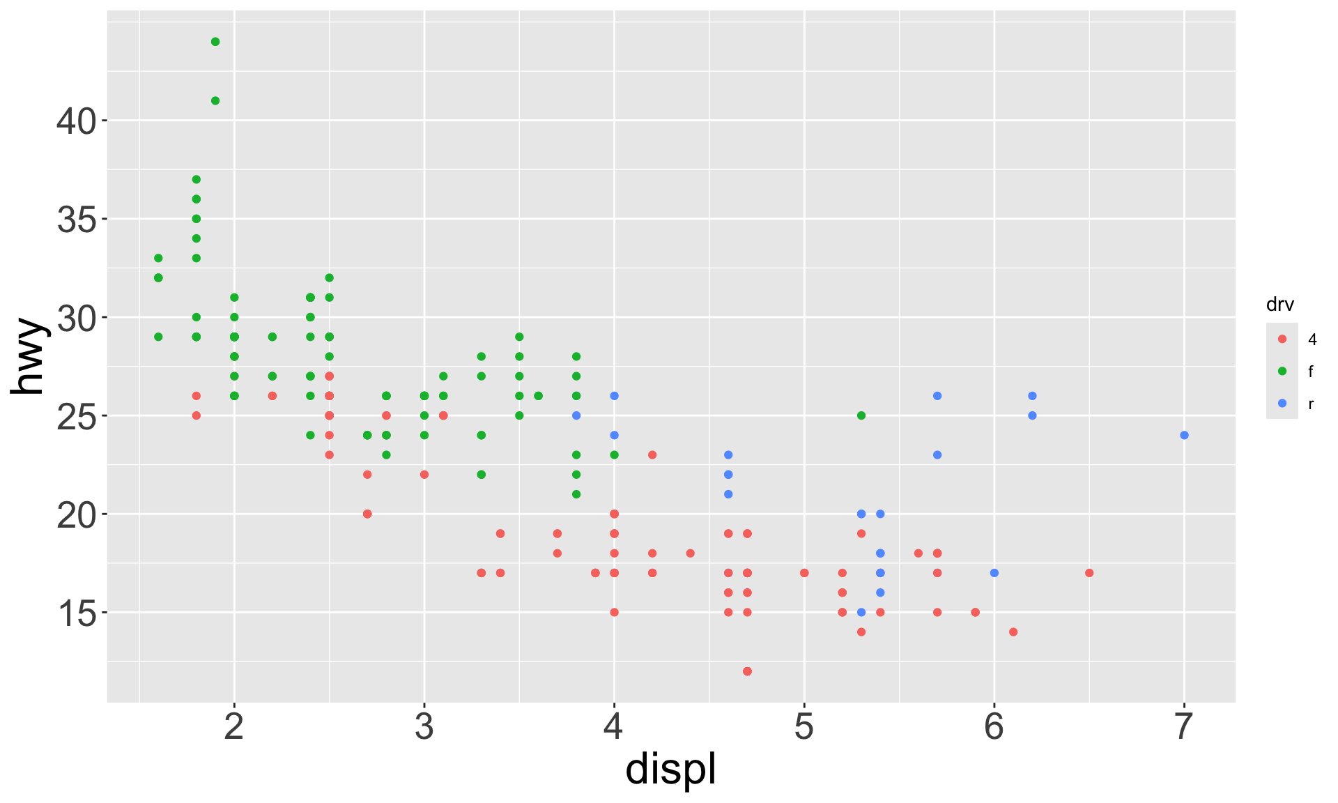
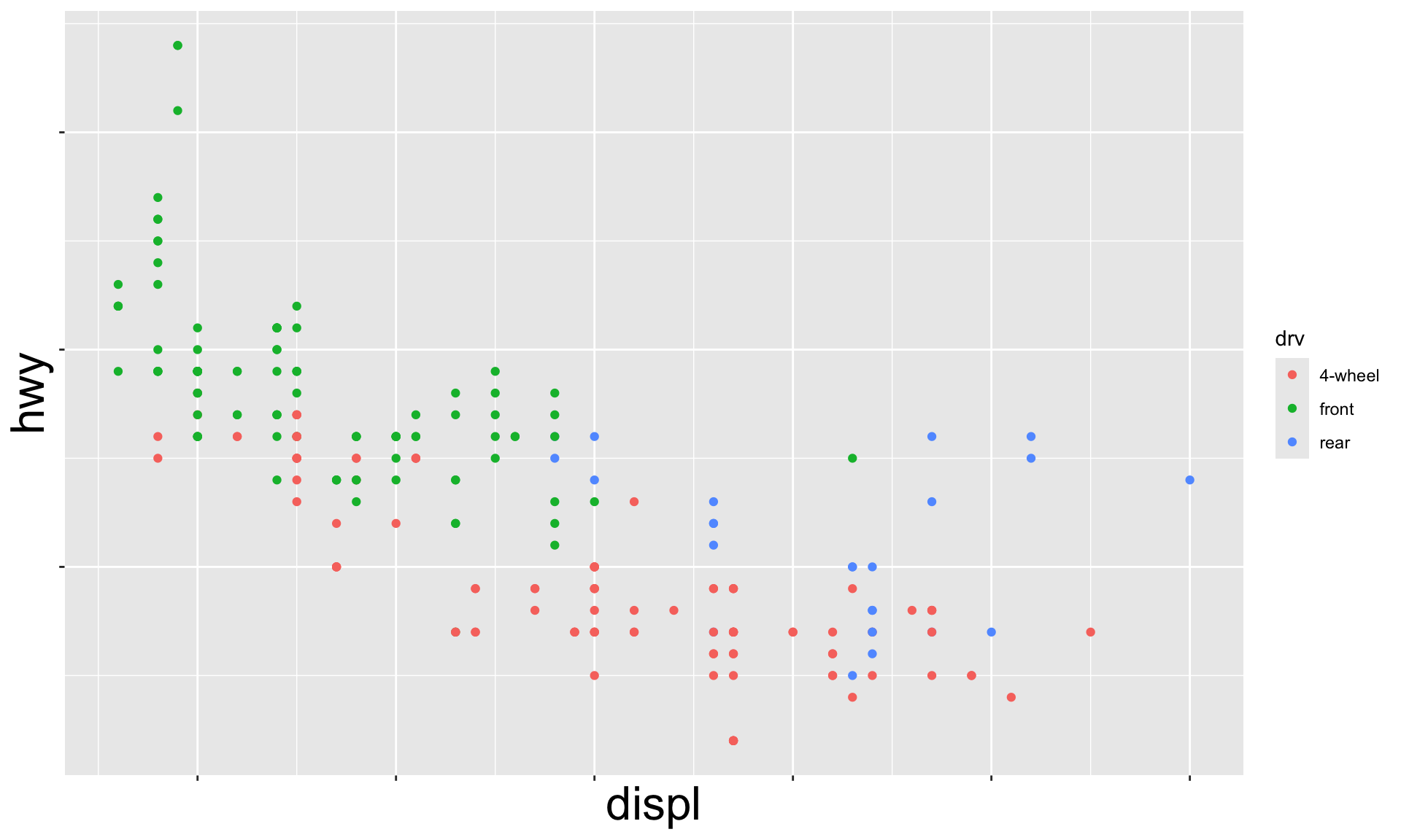
Which of the following makes it easier to compare engine size (displ) across cars with different drive trains?
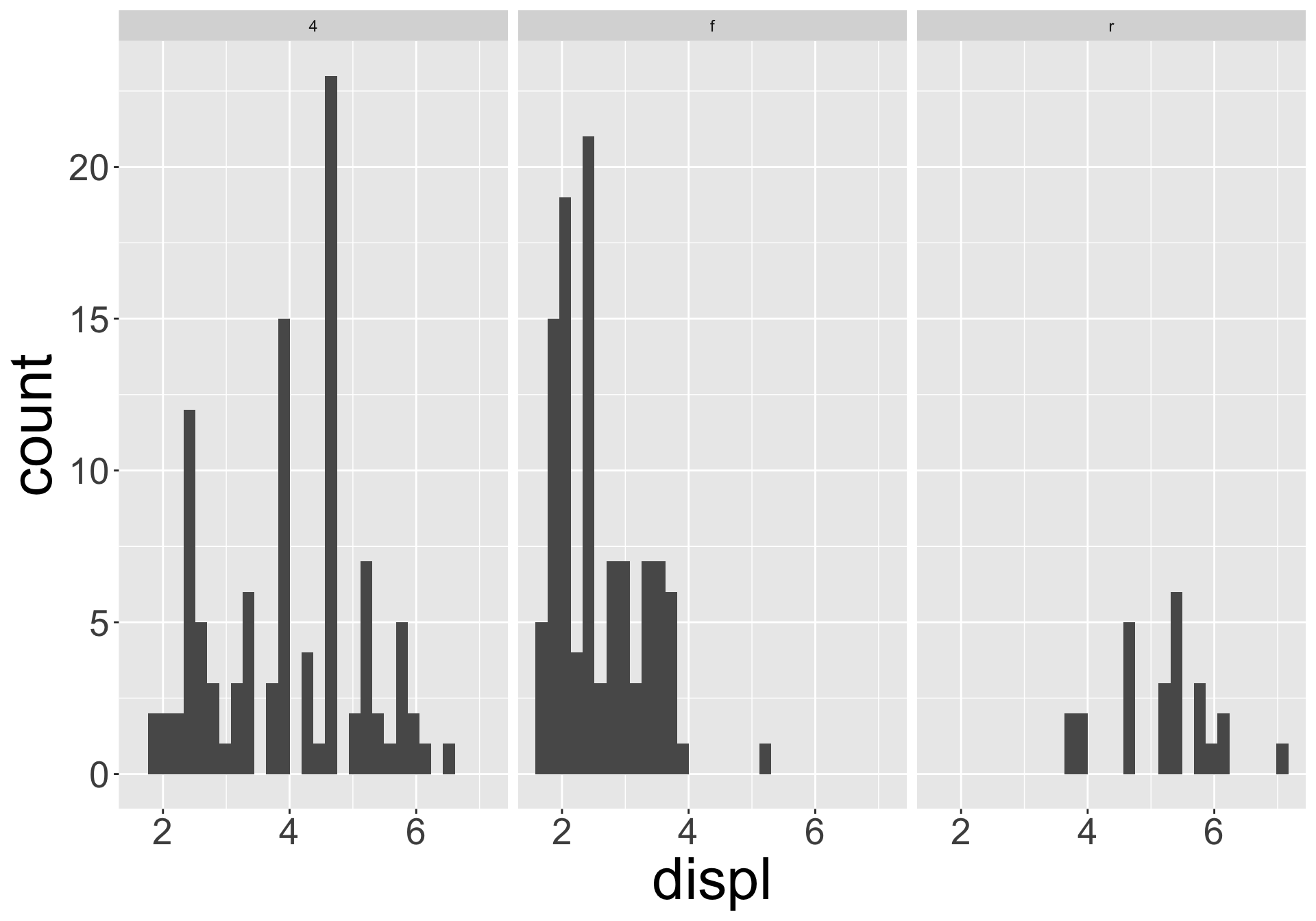
Can change order of levels in factors
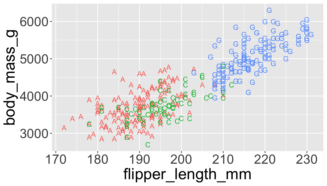
Shapes can be difficult to distinguish
Sometimes easier to read by replacing shape with first letter
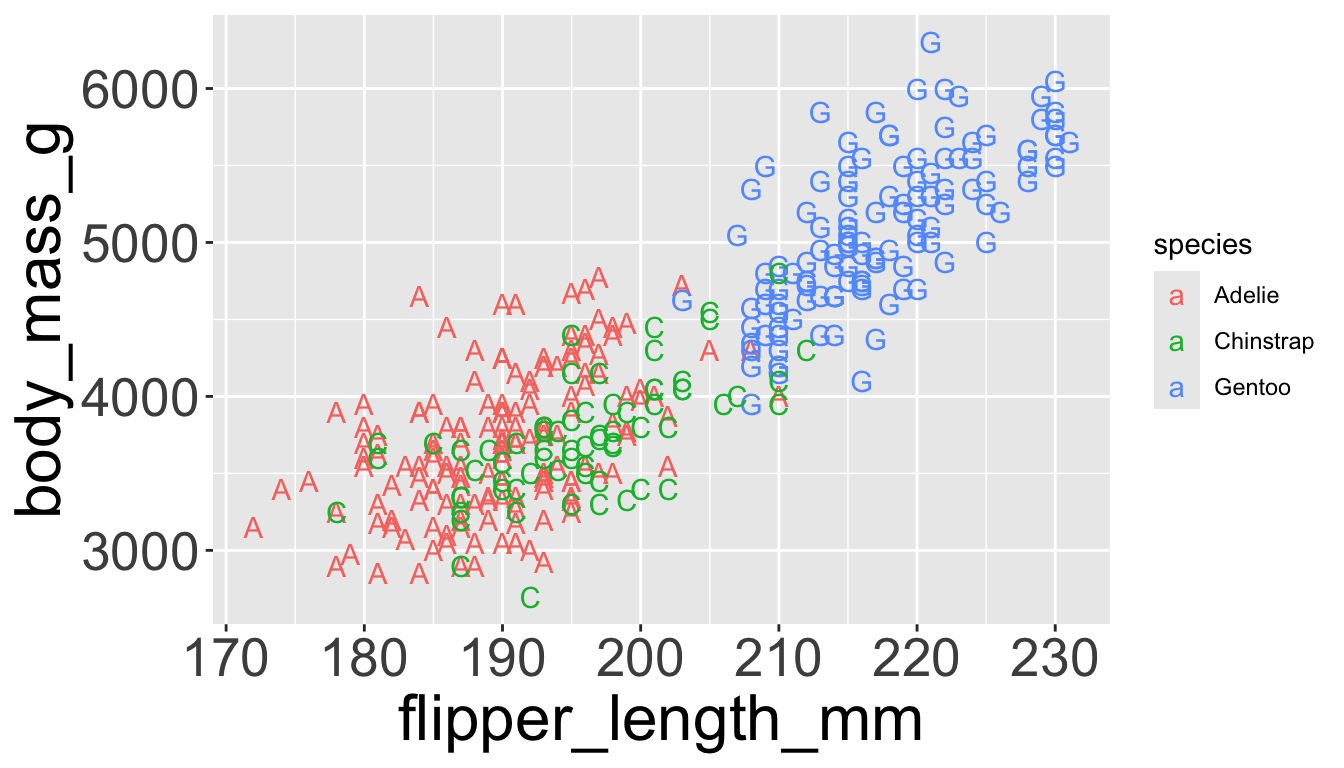
Might allow you to remove the legend
Geometric objects
How are these two plots similar?
- Both plots contain the same x and y variables; both plots describe same data.
- Each plot uses a different geometric object,
geom, to represent the data.
Geometric objects
- Can utilize multiple
geoms together to elucidate relationship
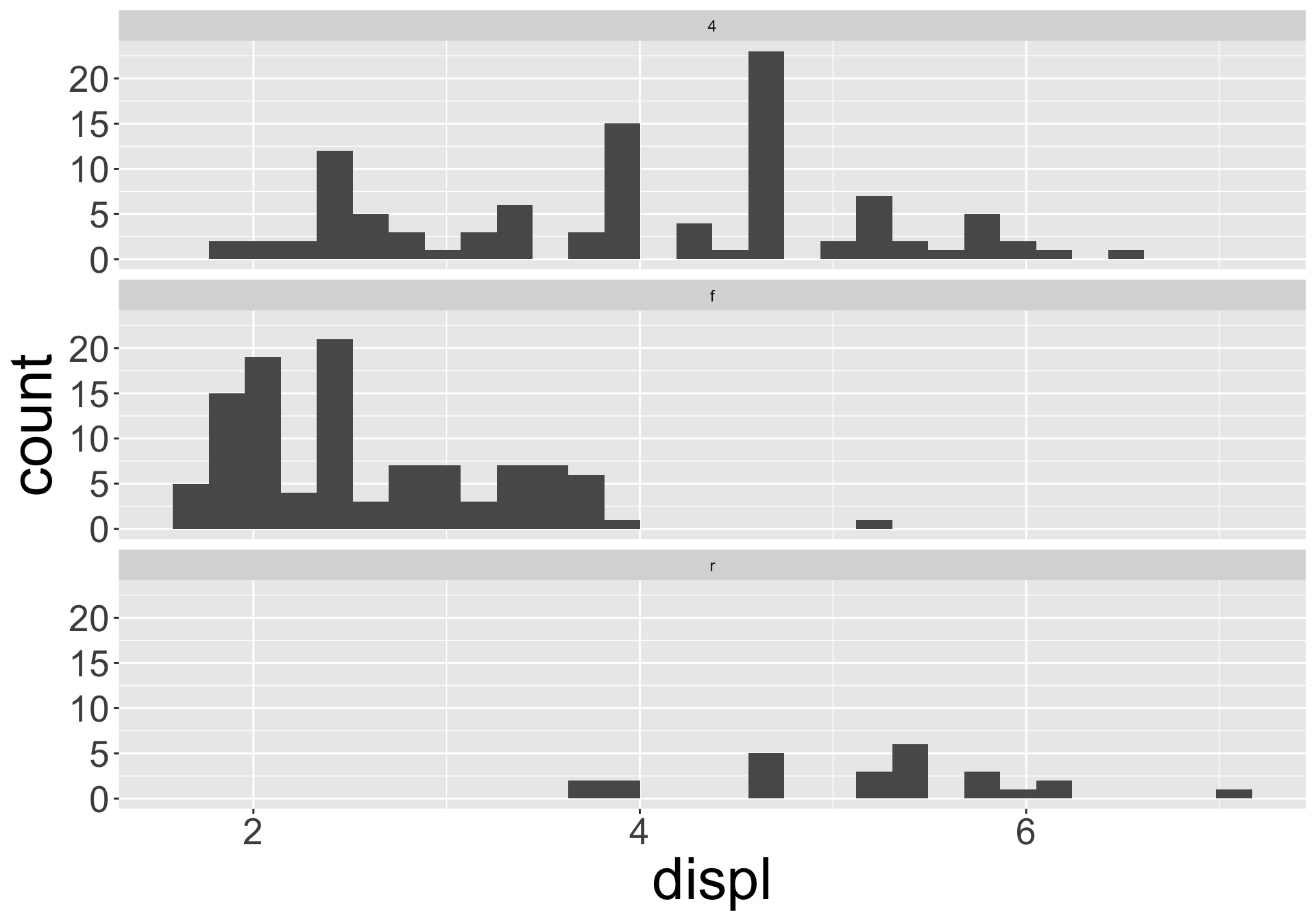
Statistical transformations
Let’s create a bar chart across cuts:
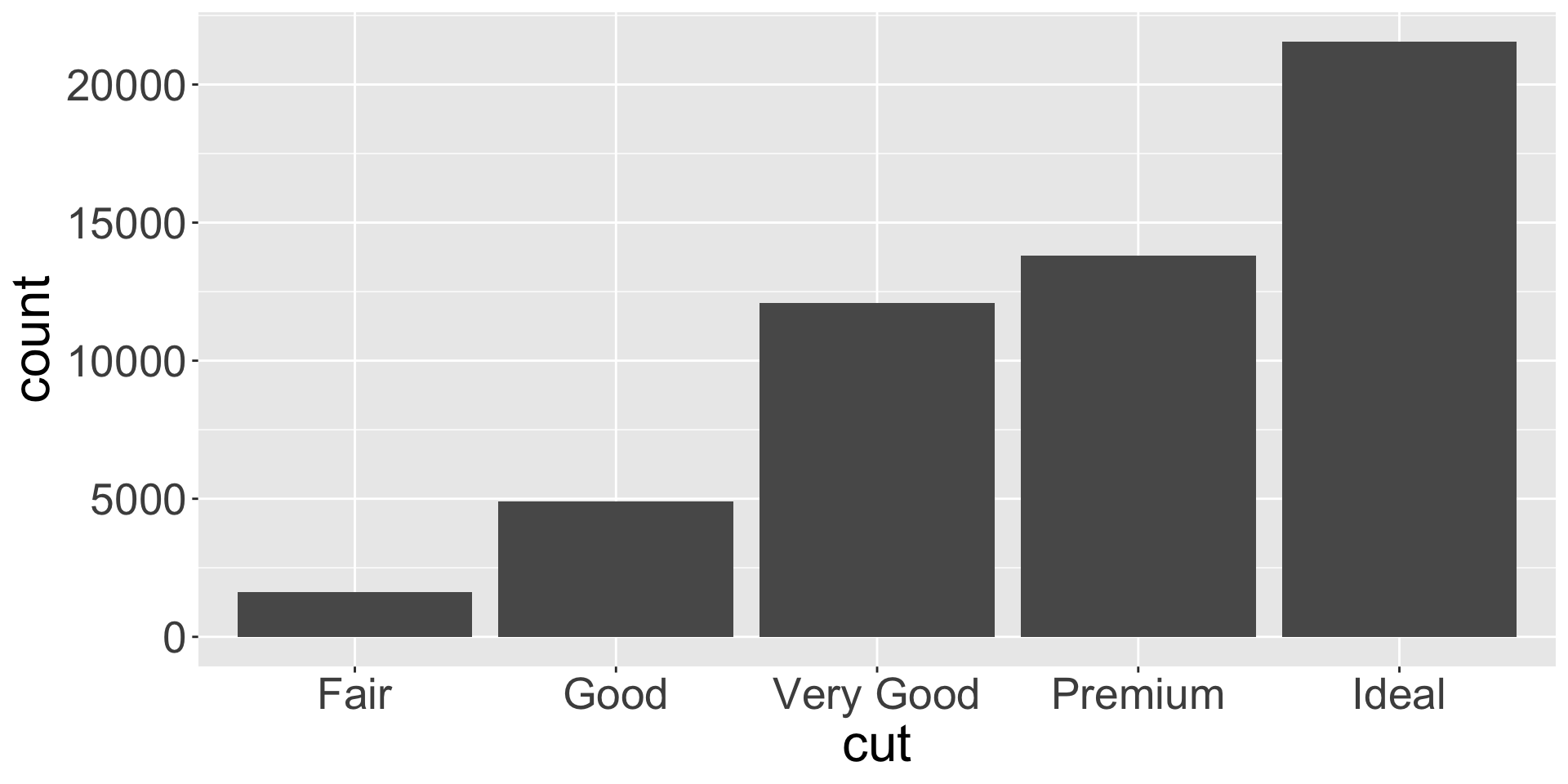
countis not a variable in diamonds, so how is it creating this?
Statistical transformations
The algorithm used to calculate new values for a graph is called a stat.
- (stat is short for statistical transformation)
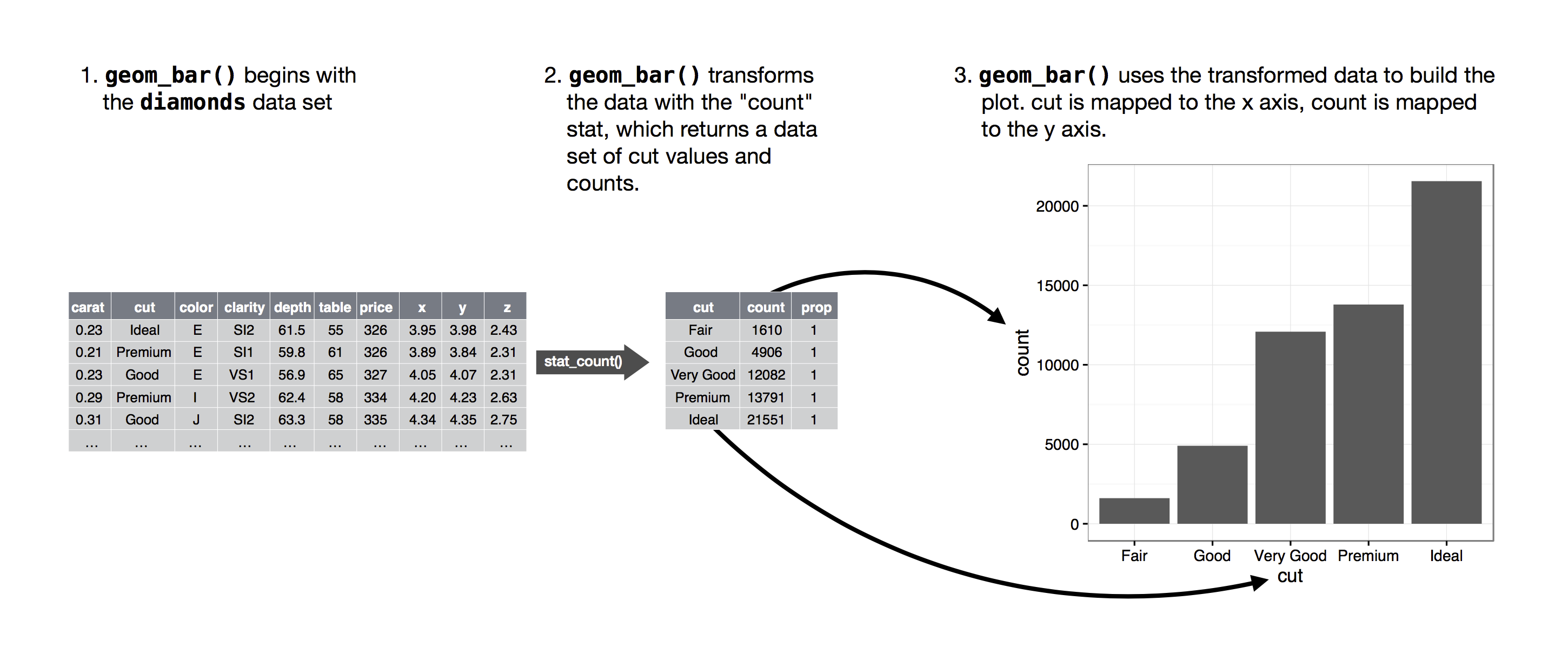
Figure 2
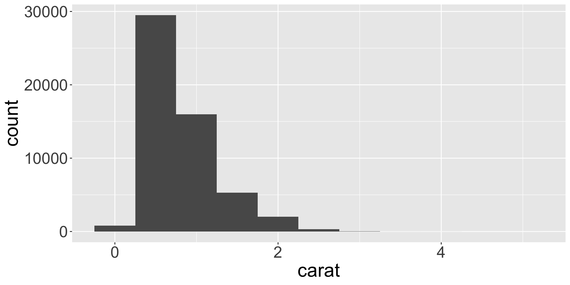
Variation
Variation is tendency for values of a variable to change from measurement to measurement
- Can be due to measurement error (e.g., measuring height with different rulers) or due to within-group variation (different people have different heights)
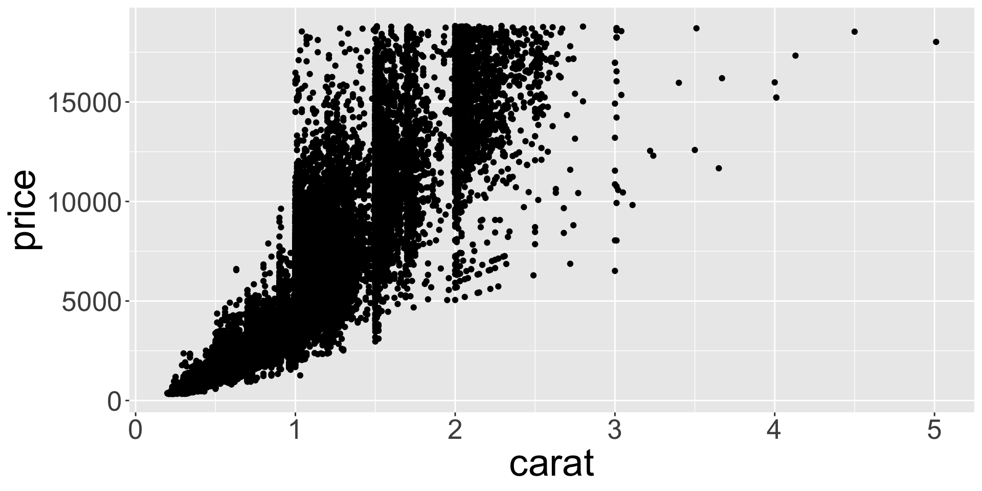
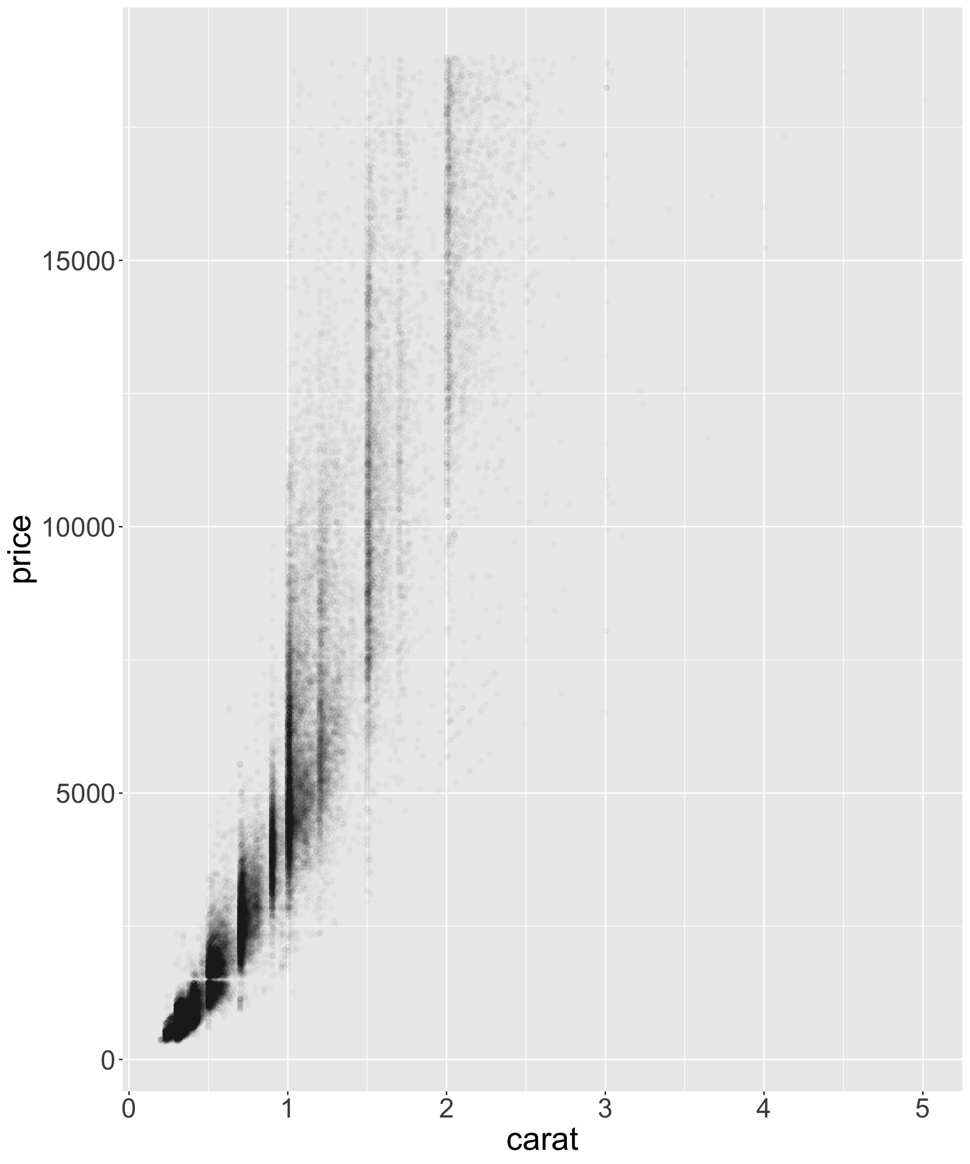
- Let’s explore the distribution of weights (
carat) of the ~50k diamonds fromdiamondsdataset. caratis numerical, can use histogram:
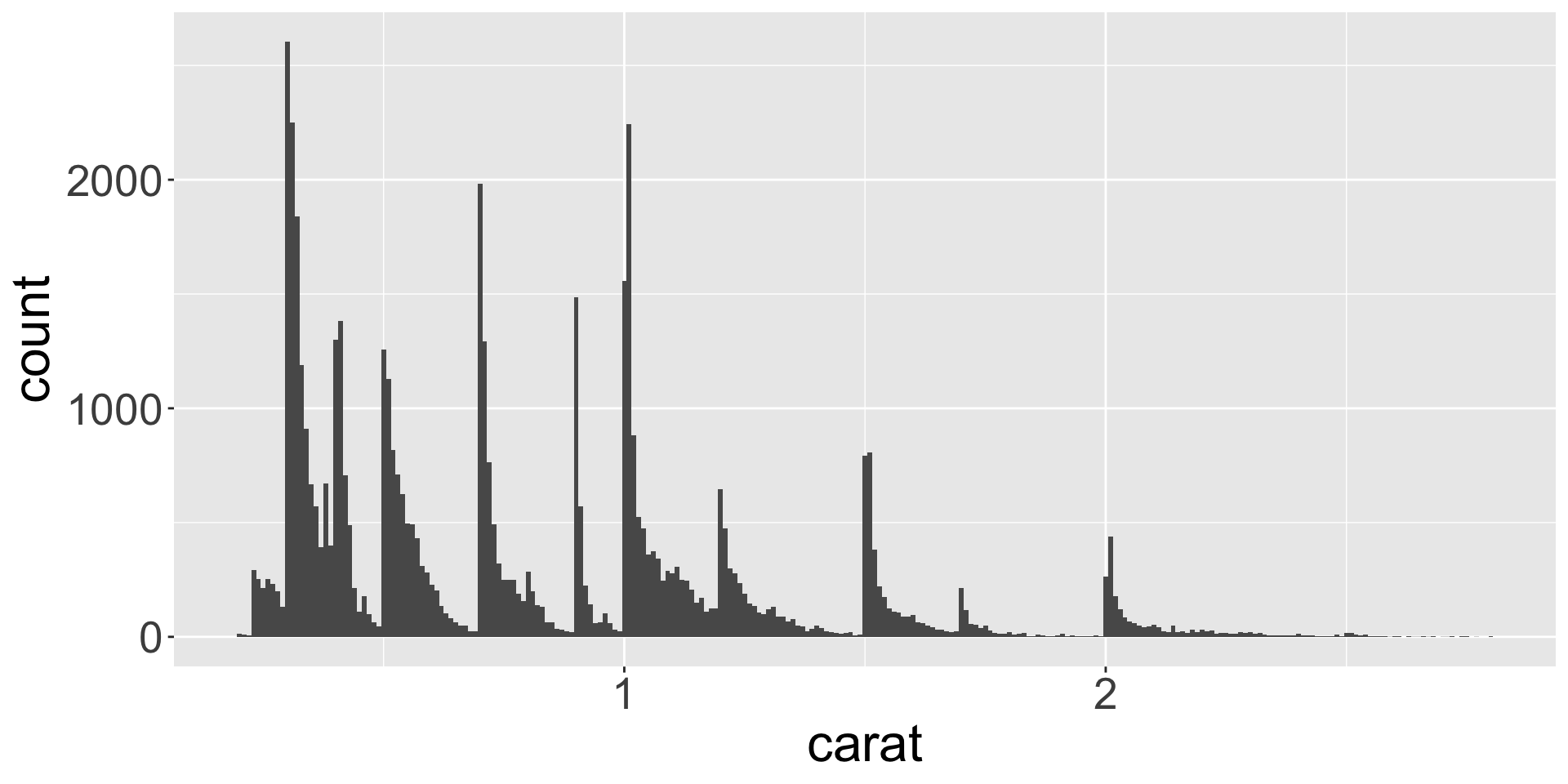
Typical values
- In bar charts and histograms, tall bars = common values; no bars = values not seen
- Questions to ask yourself:
- Which values are the most common? Why?
- Which values are rare? Why? Does that match your expectations?
- Can you see any unusual patterns? What might explain them?
- Let’s look at distribution of weights of smaller diamonds.
Covariation
… is tendency for values of 2+ variables to vary together in a related way
- How does price (numerical) of a diamond vary with quality (categorical)?
- Can use
geom_freqpoly()to show “frequency polygons” (similar to histogram)
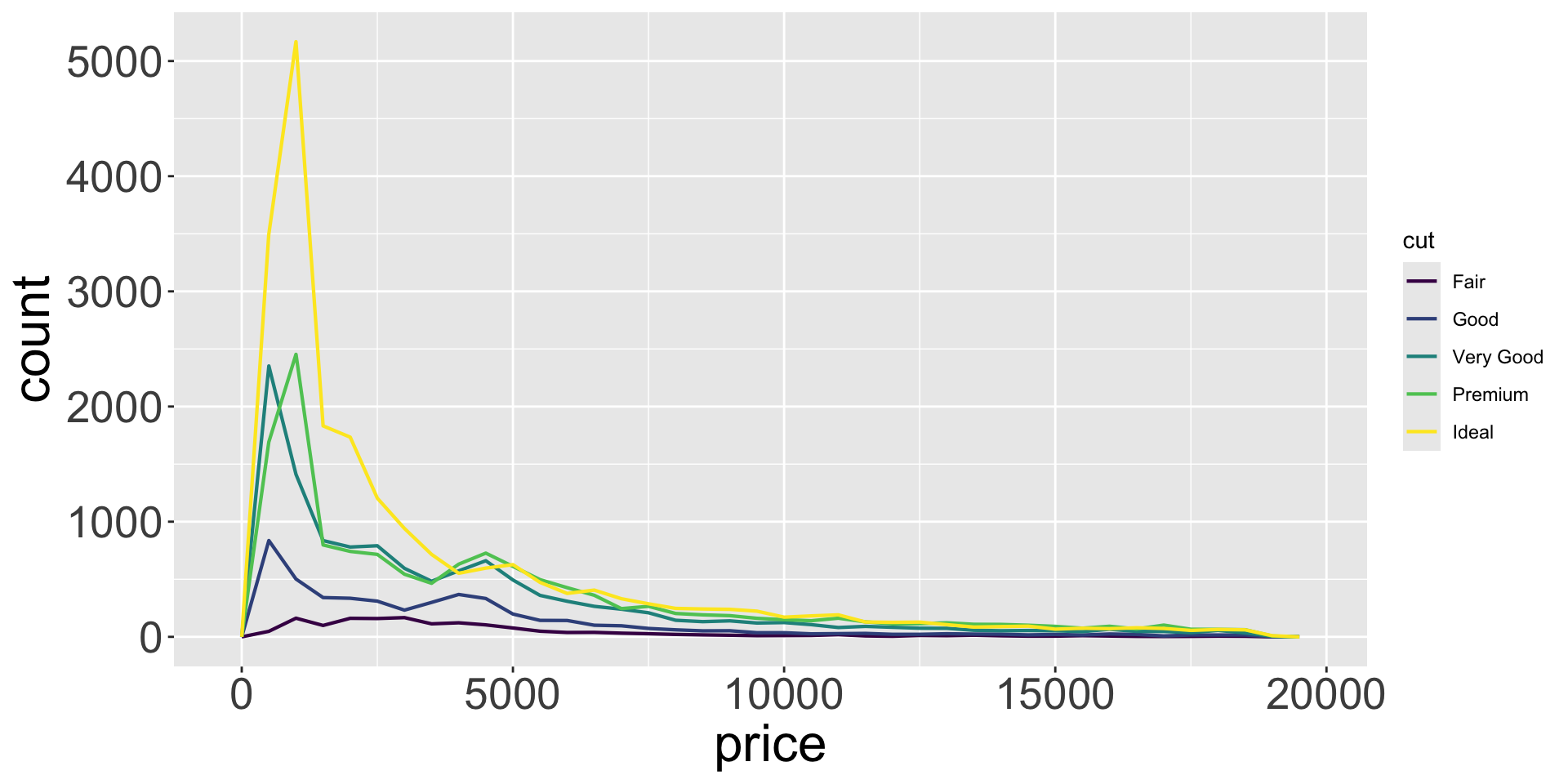
- Not super informative, since the height mainly reflects the count.
Covariation
- More useful to understand the density of the variable (count / total number)
- To do this, we can use
after_stat(density), which does this normalization
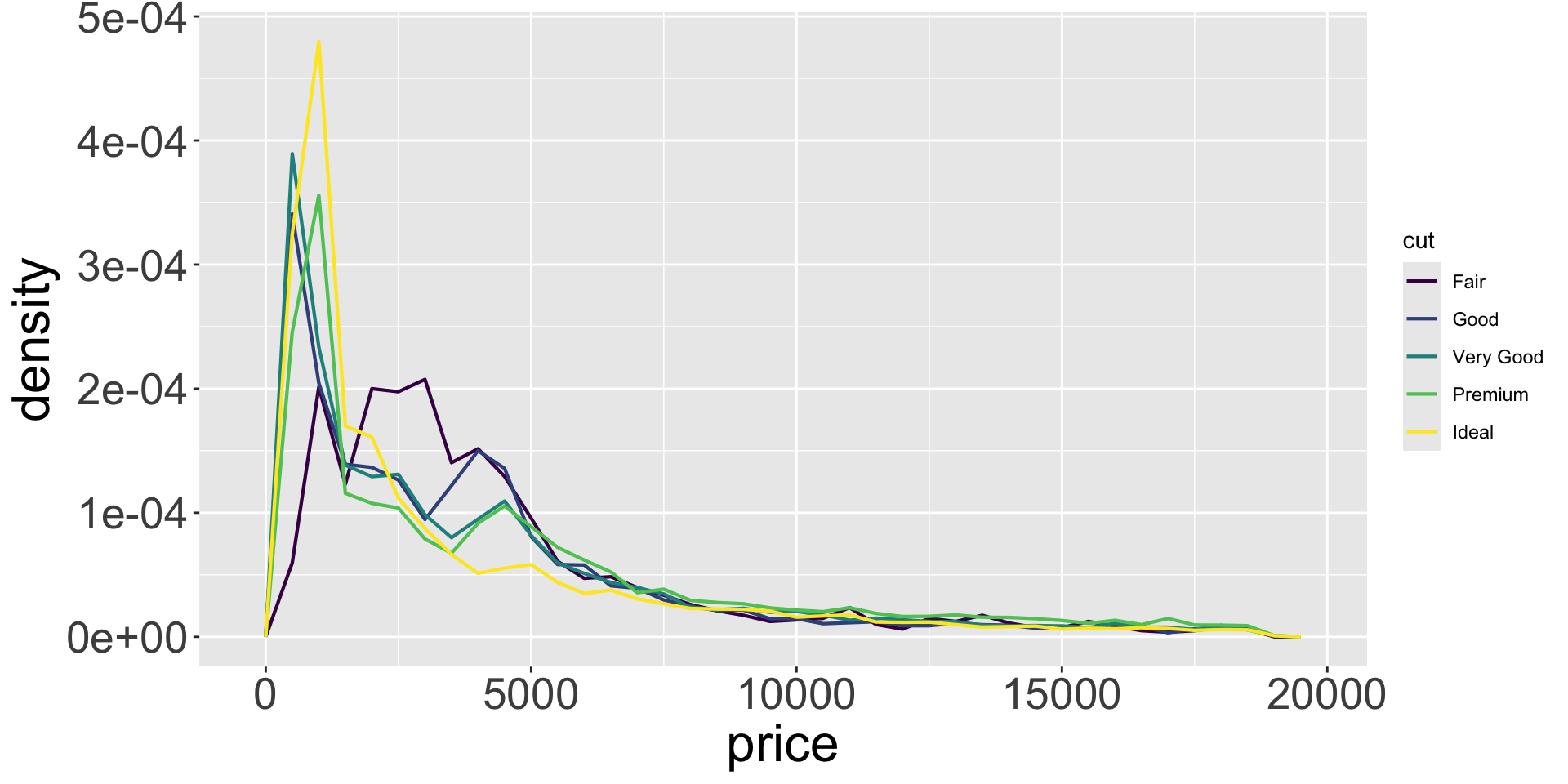
- Seems diamond quality has no significant effect?
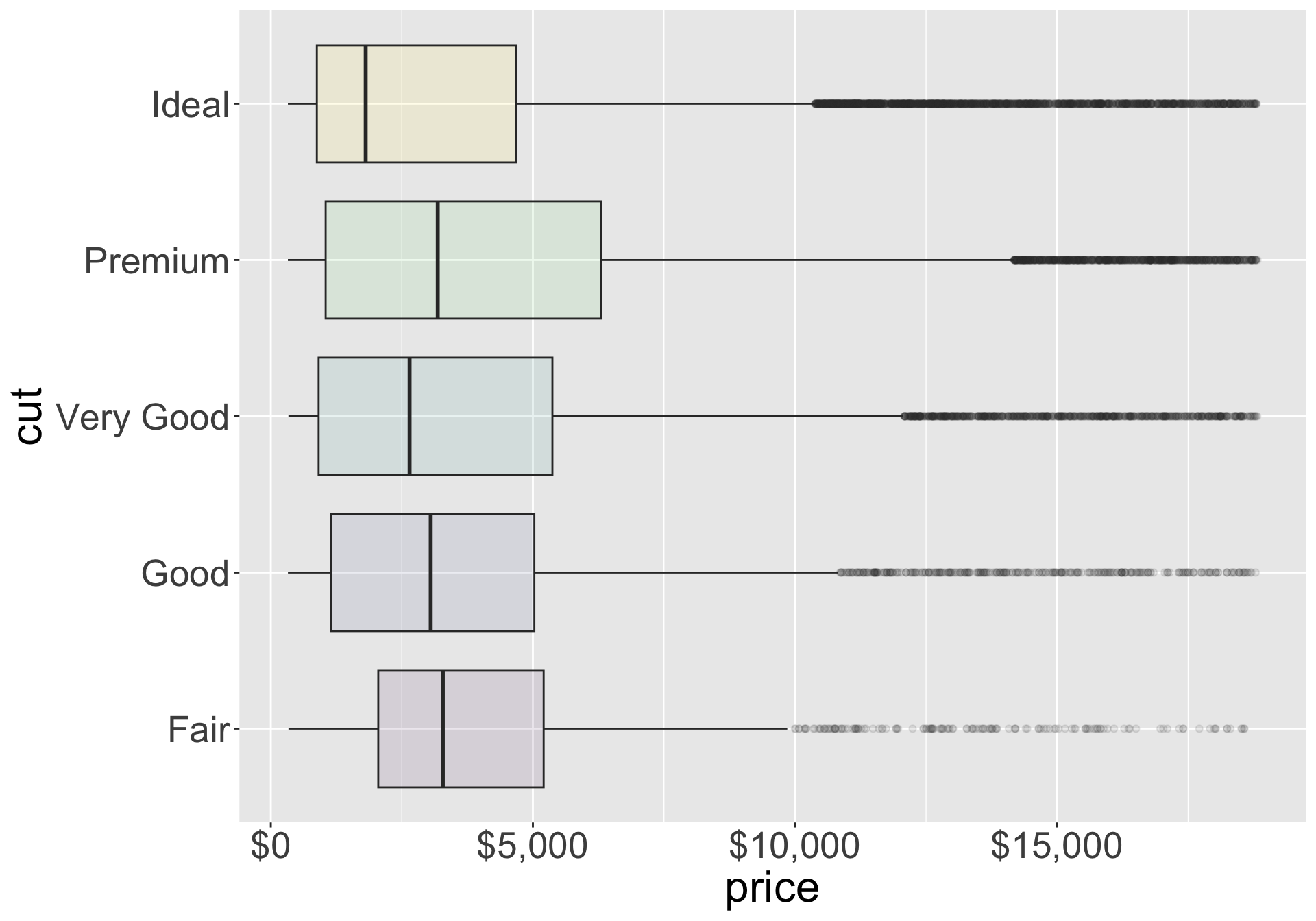
Covariation
- Let’s further inspect with a box plot
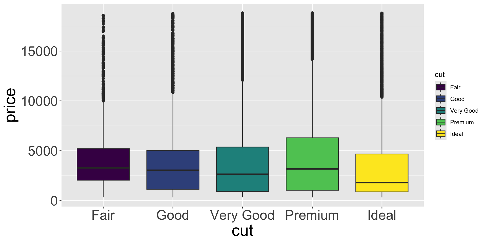
- Can now easily compare medians and 25th/75th percentiles
- Better quality diamonds are typically cheaper?! We’ll investigate why.
Better quality diamonds are typically cheaper?!
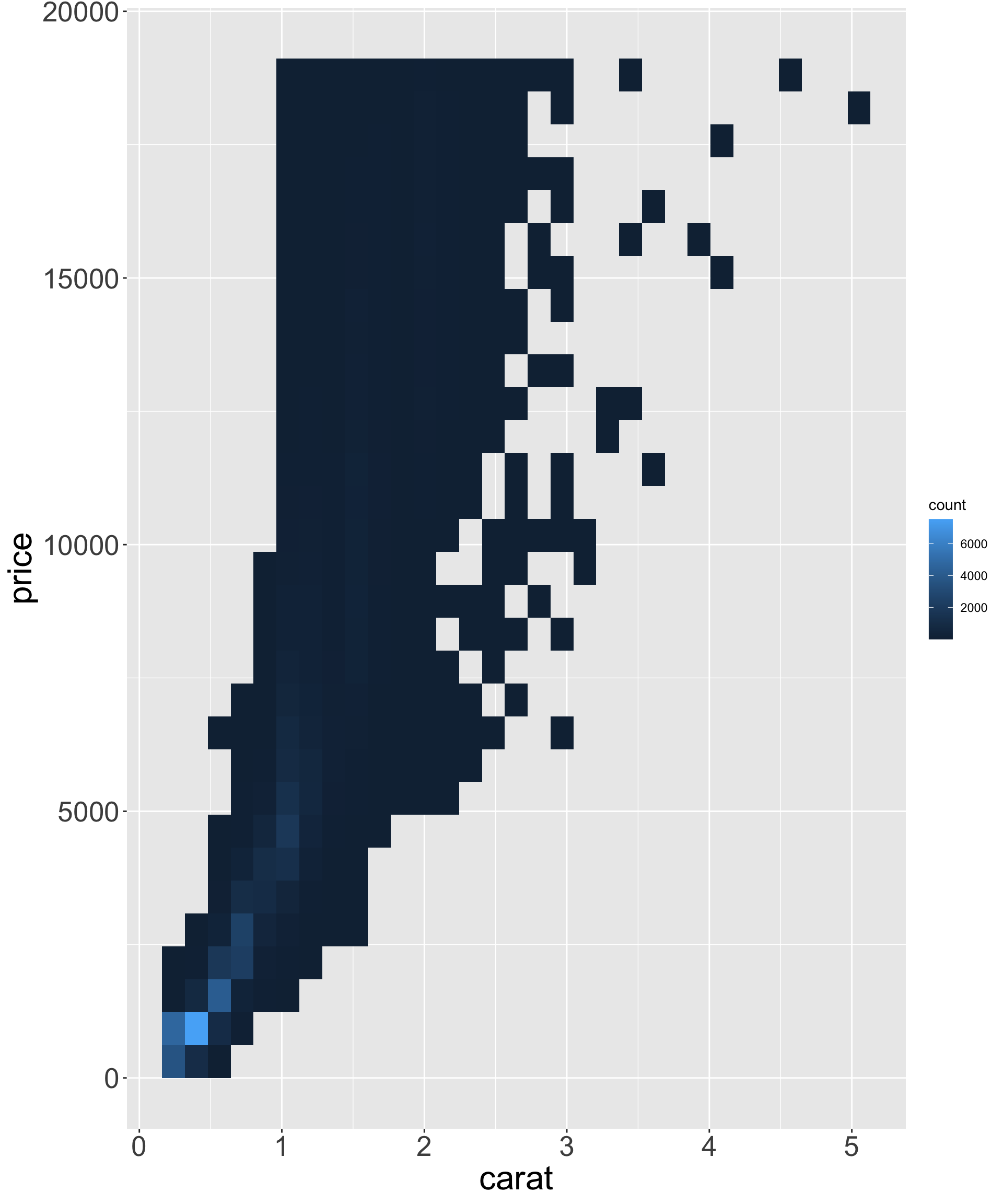
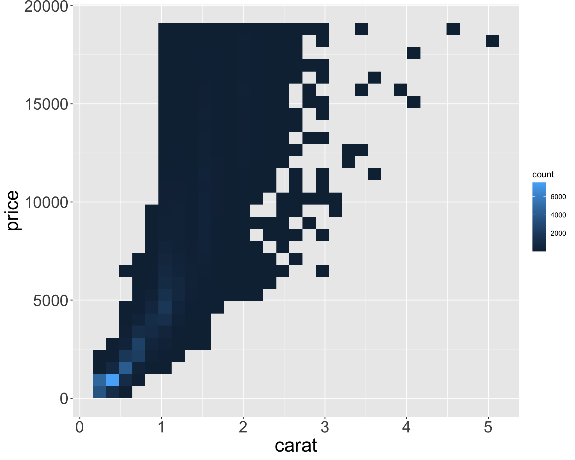
ggplot(diamonds, aes(x, price)) + geom_point() + theme(axis.title = element_text(size=40), axis.text = element_text(size=32))
ggplot(diamonds, aes(y, price)) + geom_point() + theme(axis.title = element_text(size=40), axis.text = element_text(size=32))
ggplot(diamonds, aes(z, price)) + geom_point() + theme(axis.title = element_text(size=40), axis.text = element_text(size=32))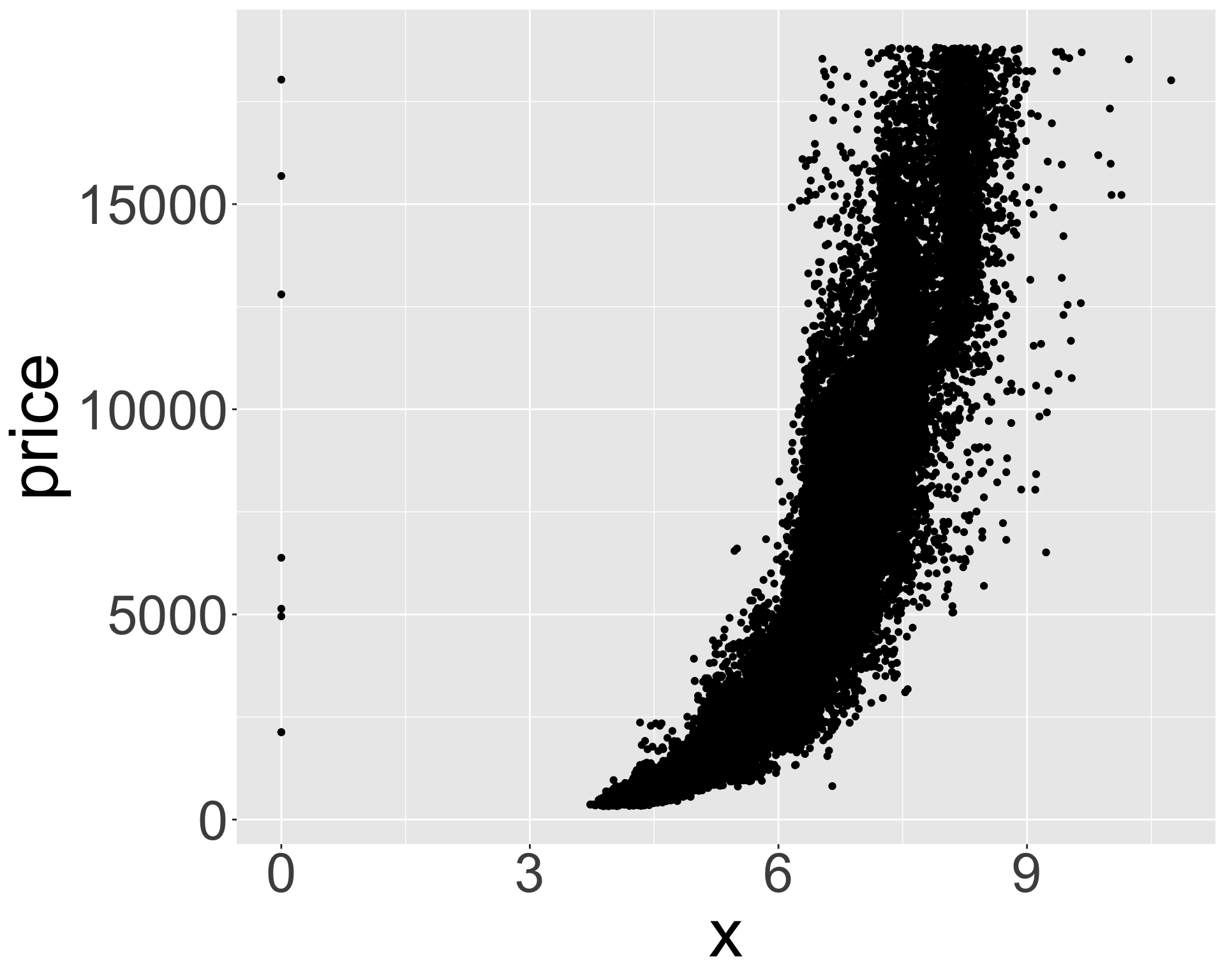
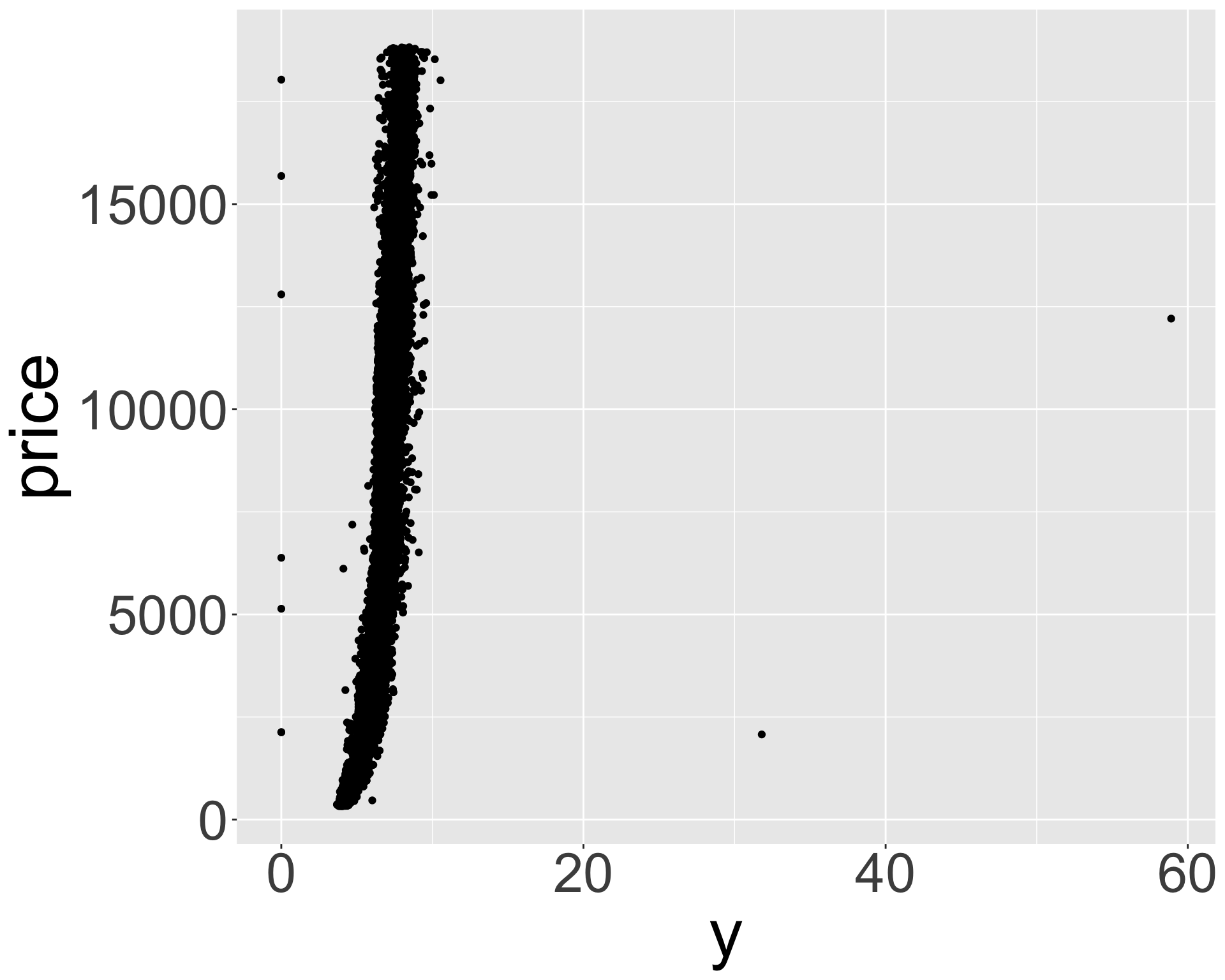
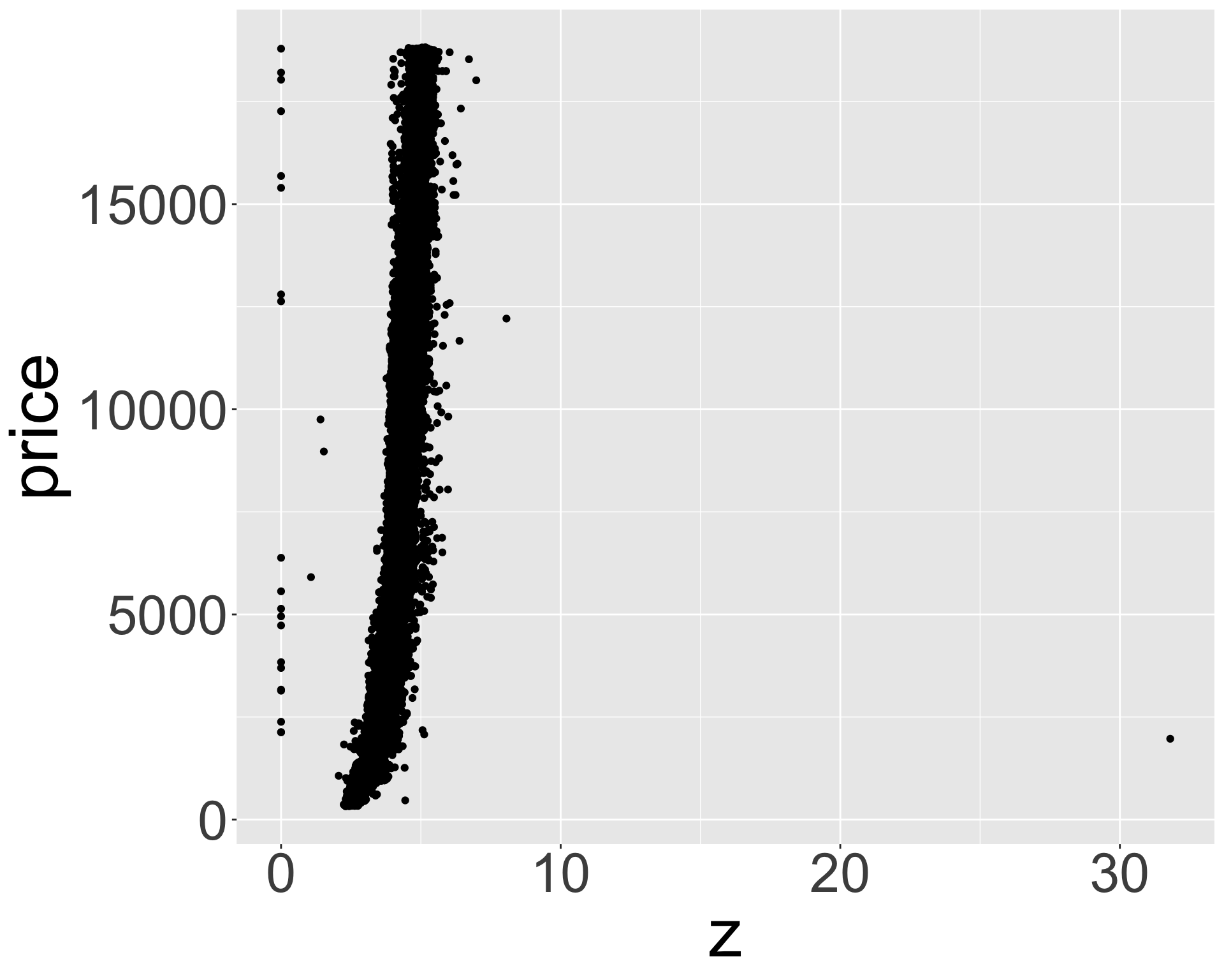
- Clearly some outliers - “zero” length / width / depth diamonds apparently?
- But still some positive correlation between x, y, z and price.
- Let’s clean up the tibble to only view the middle 95% of values for x, y, z.
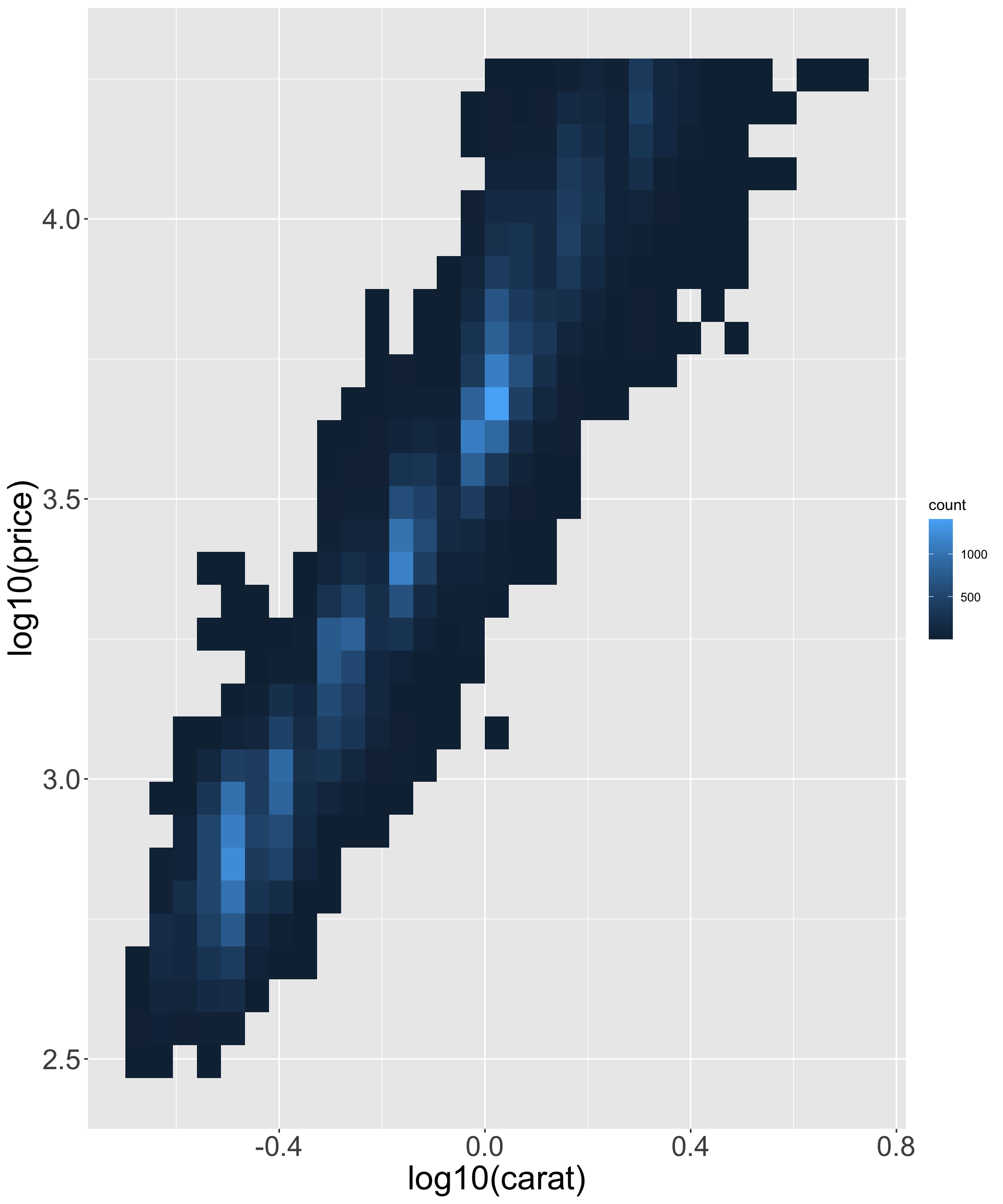
Better quality diamonds are typically cheaper?!
- Let’s clean up the tibble to only view the middle 95% of values for x, y, z
ggplot(diamonds_middle, aes(x, price)) + geom_point() + theme(axis.title = element_text(size=40), axis.text = element_text(size=32))
ggplot(diamonds_middle, aes(y, price)) + geom_point() + theme(axis.title = element_text(size=40), axis.text = element_text(size=32))
ggplot(diamonds_middle, aes(z, price)) + geom_point() + theme(axis.title = element_text(size=40), axis.text = element_text(size=32))
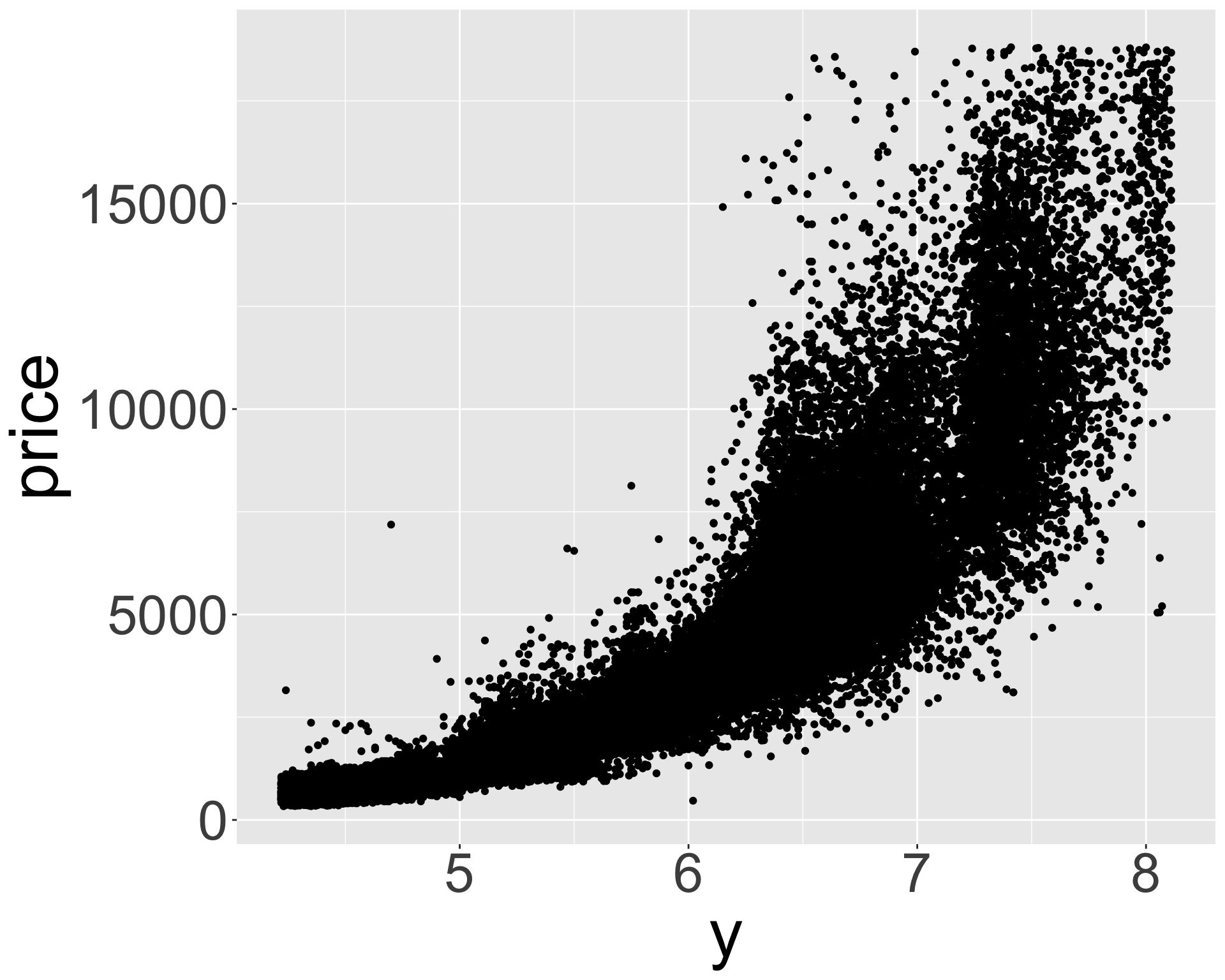
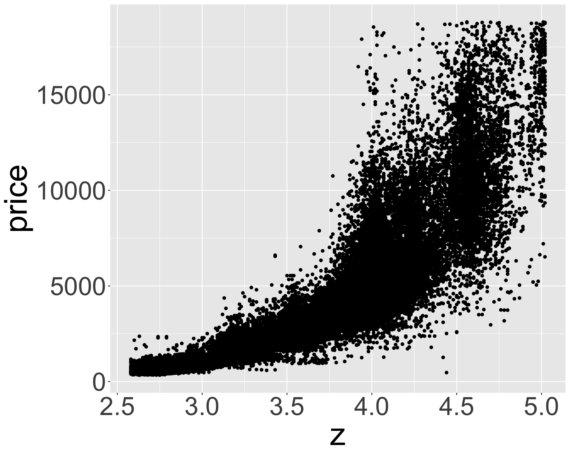
- Appears x, y, z (length/width/depth) are highly correlated with price
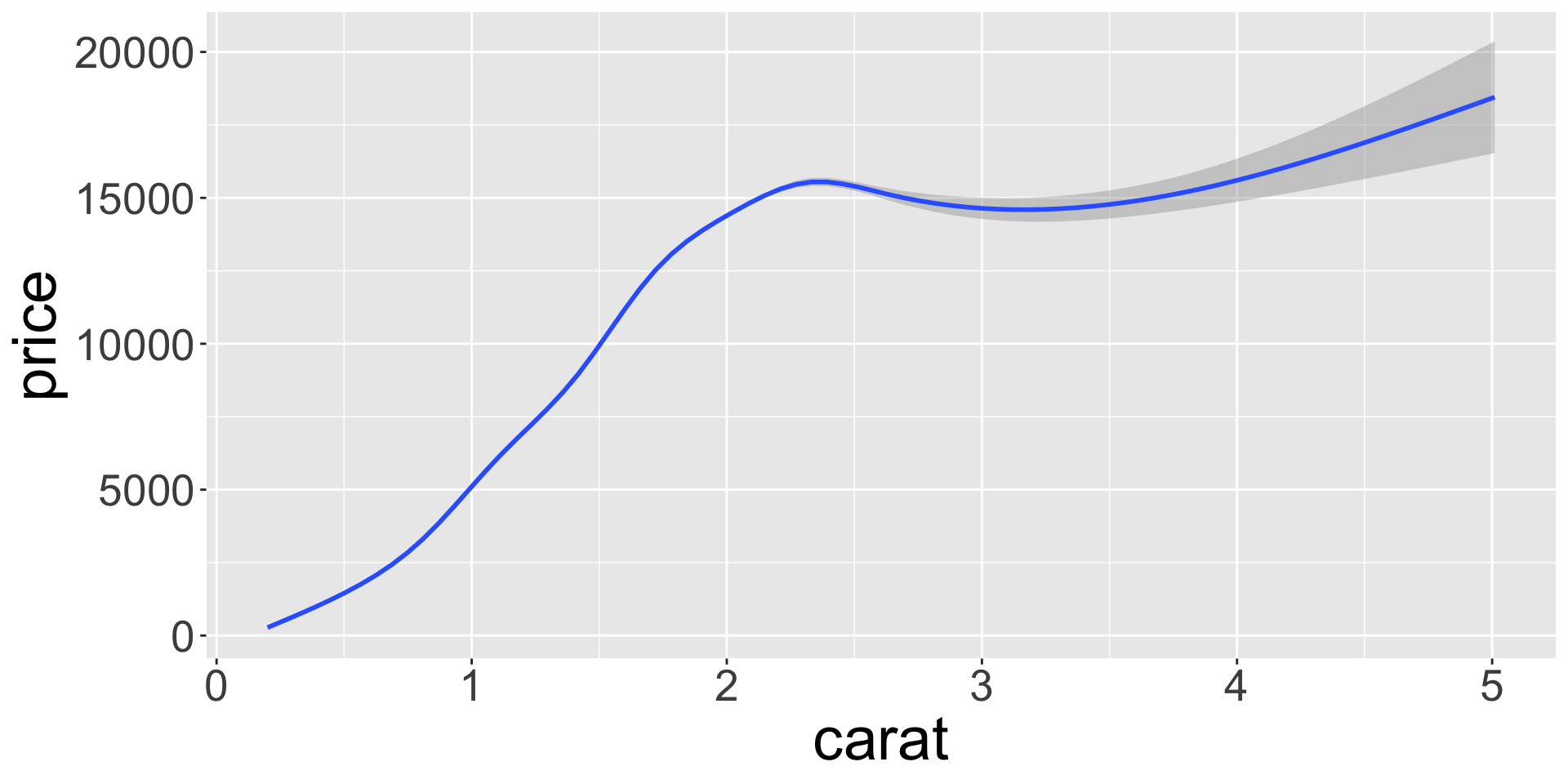
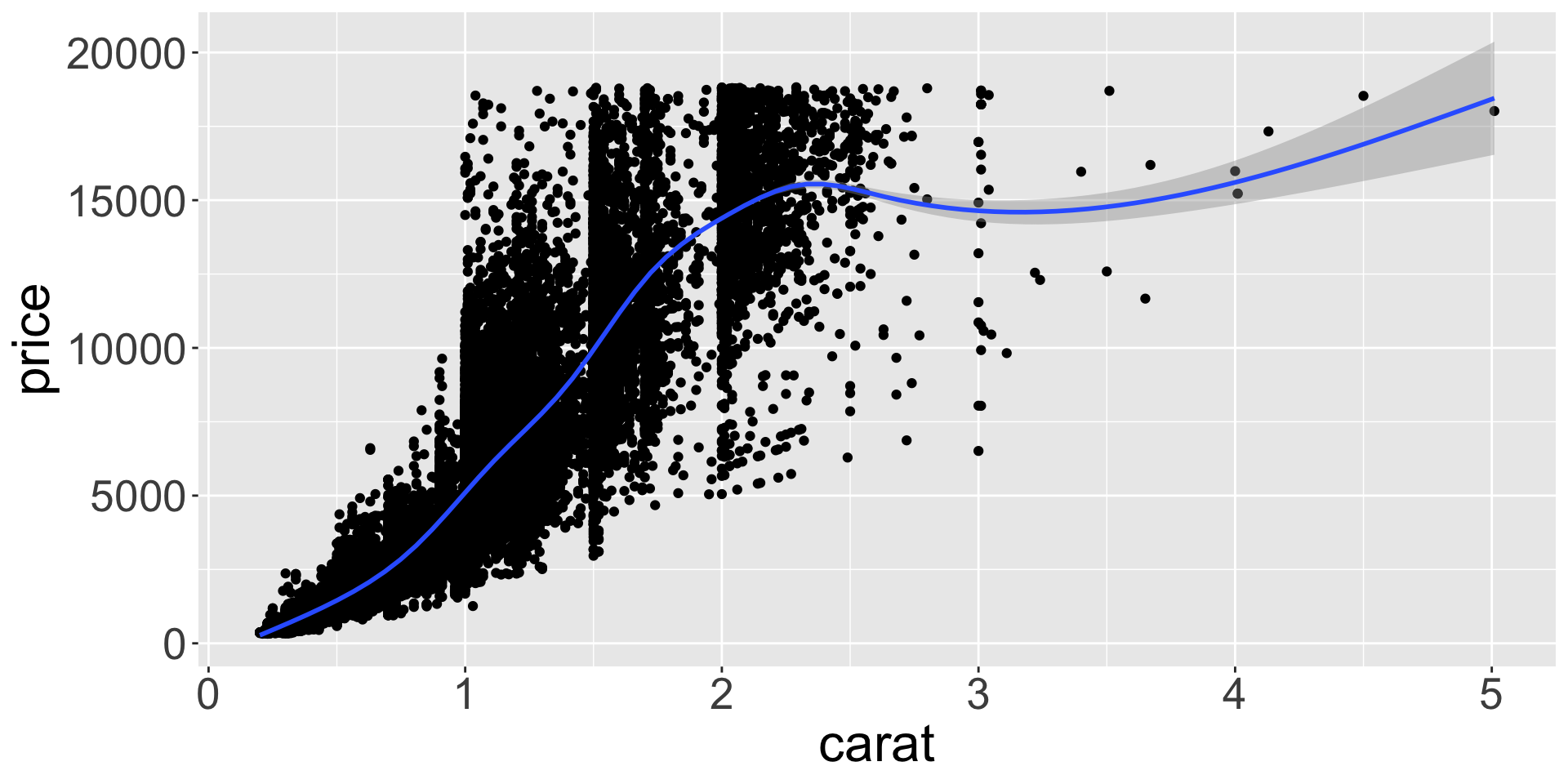
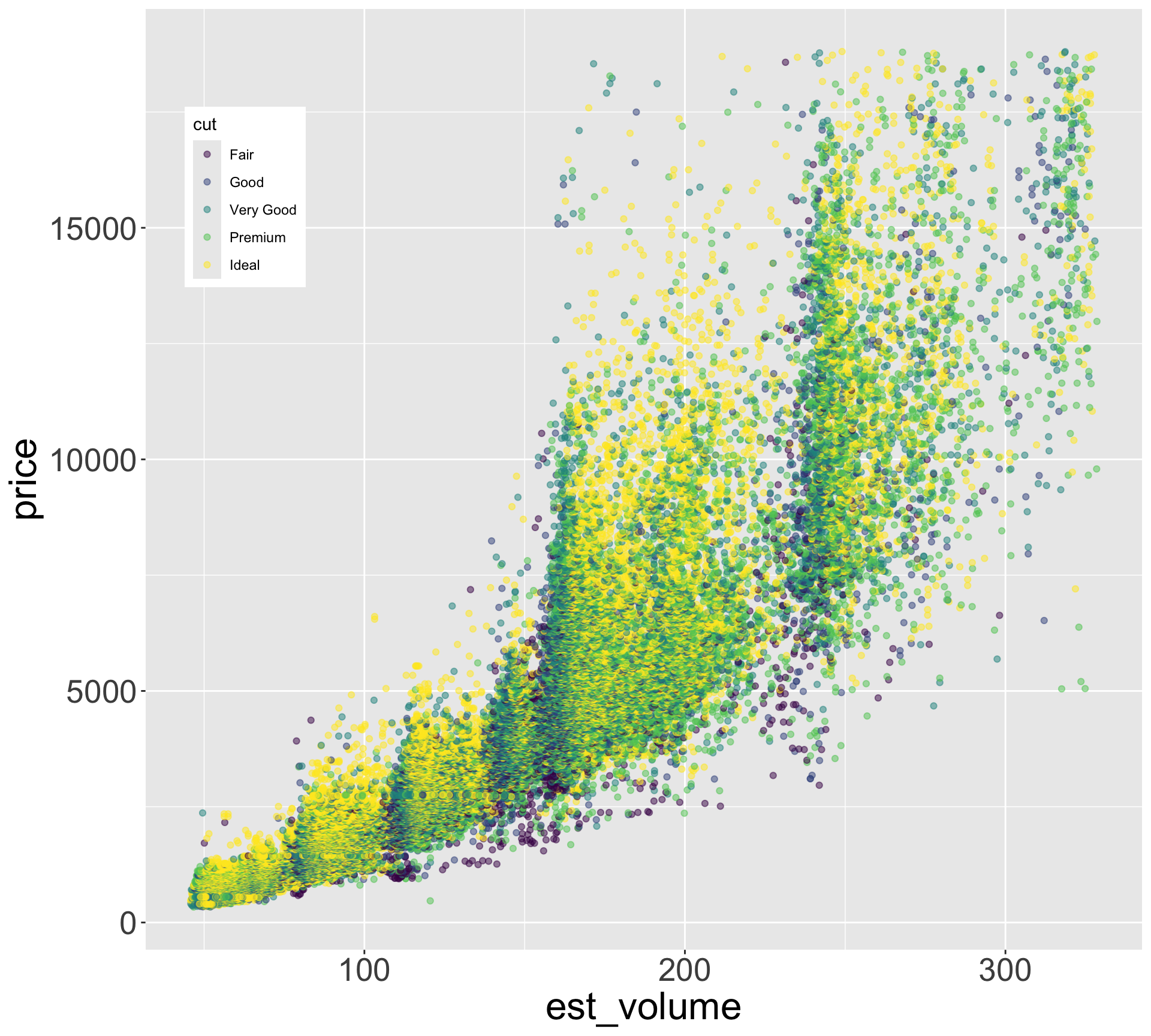
- Let’s explore the relationship between estimated volume (x*y*z) and price
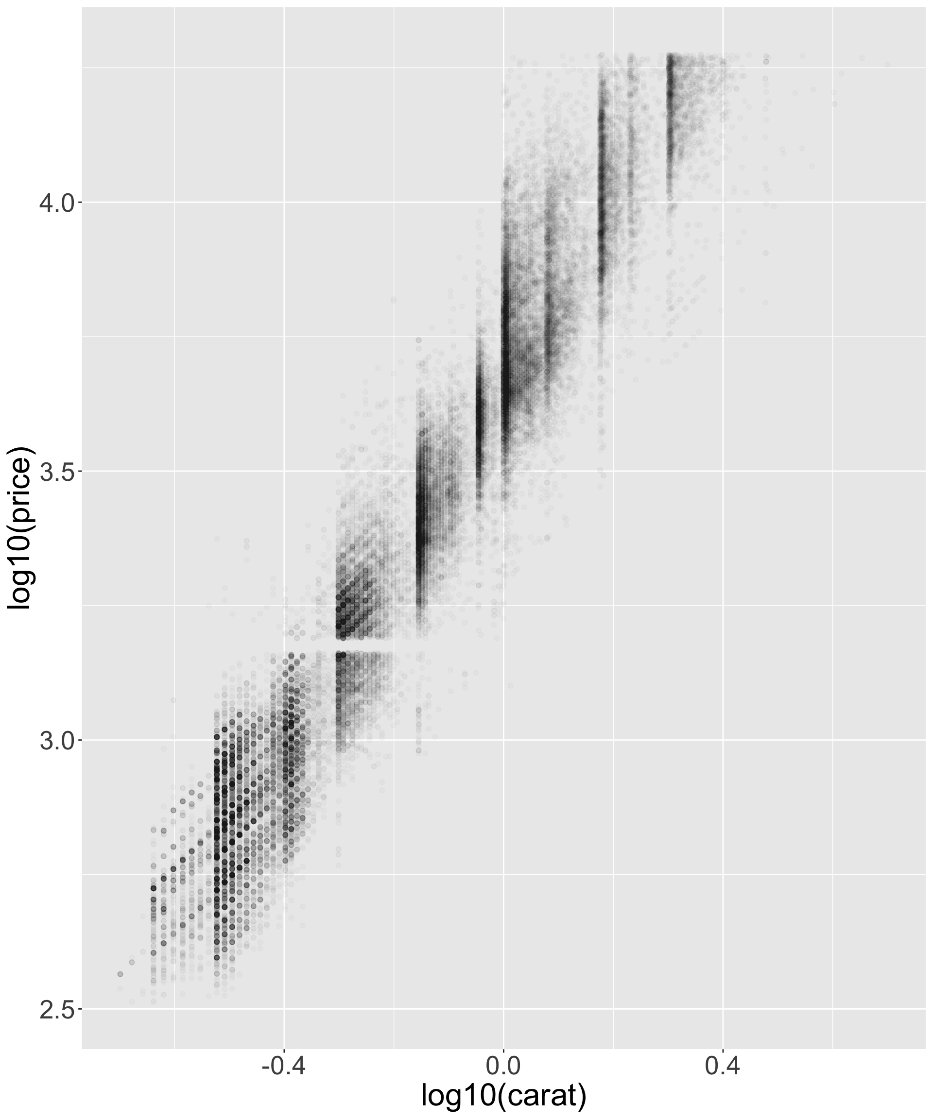
Better quality diamonds are typically cheaper?!
- Let’s look at the relationship between estimated volume (x*y*z) and price
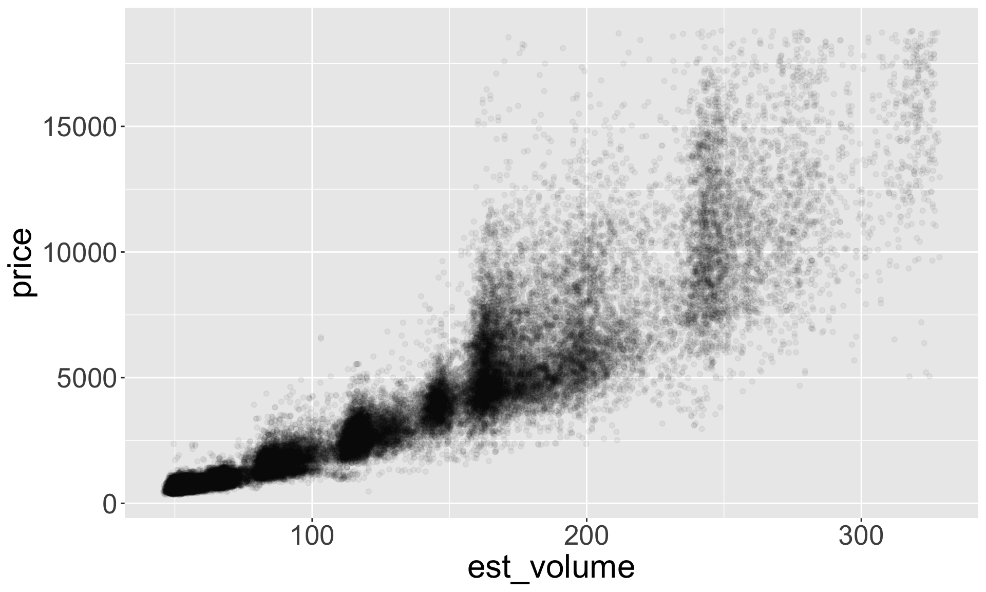
Better quality diamonds are typically cheaper?!
Hypothesis: high quality diamonds are smaller, low quality diamonds are larger.
- To investigate, let’s visualize variation in size for each category of quality
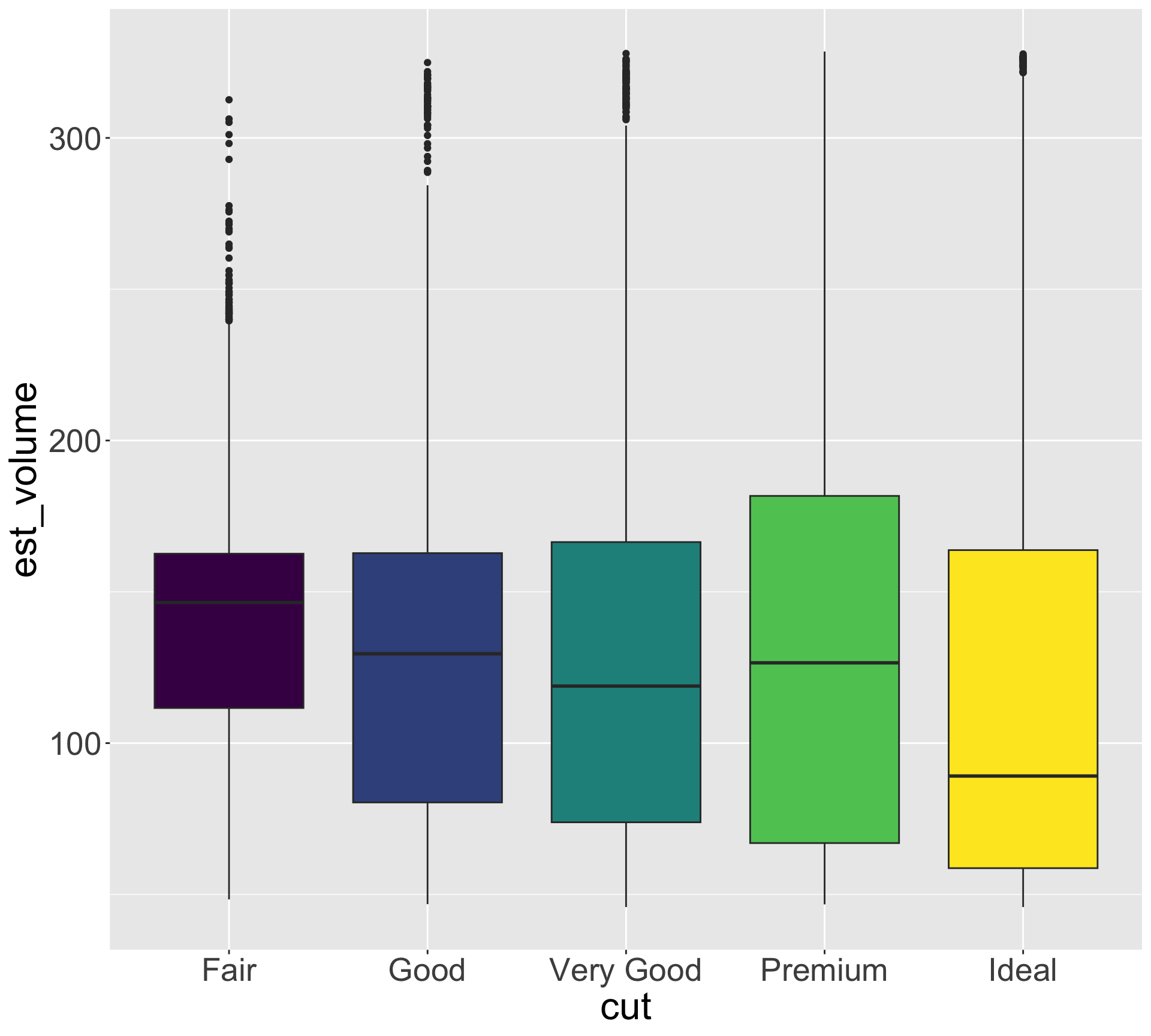
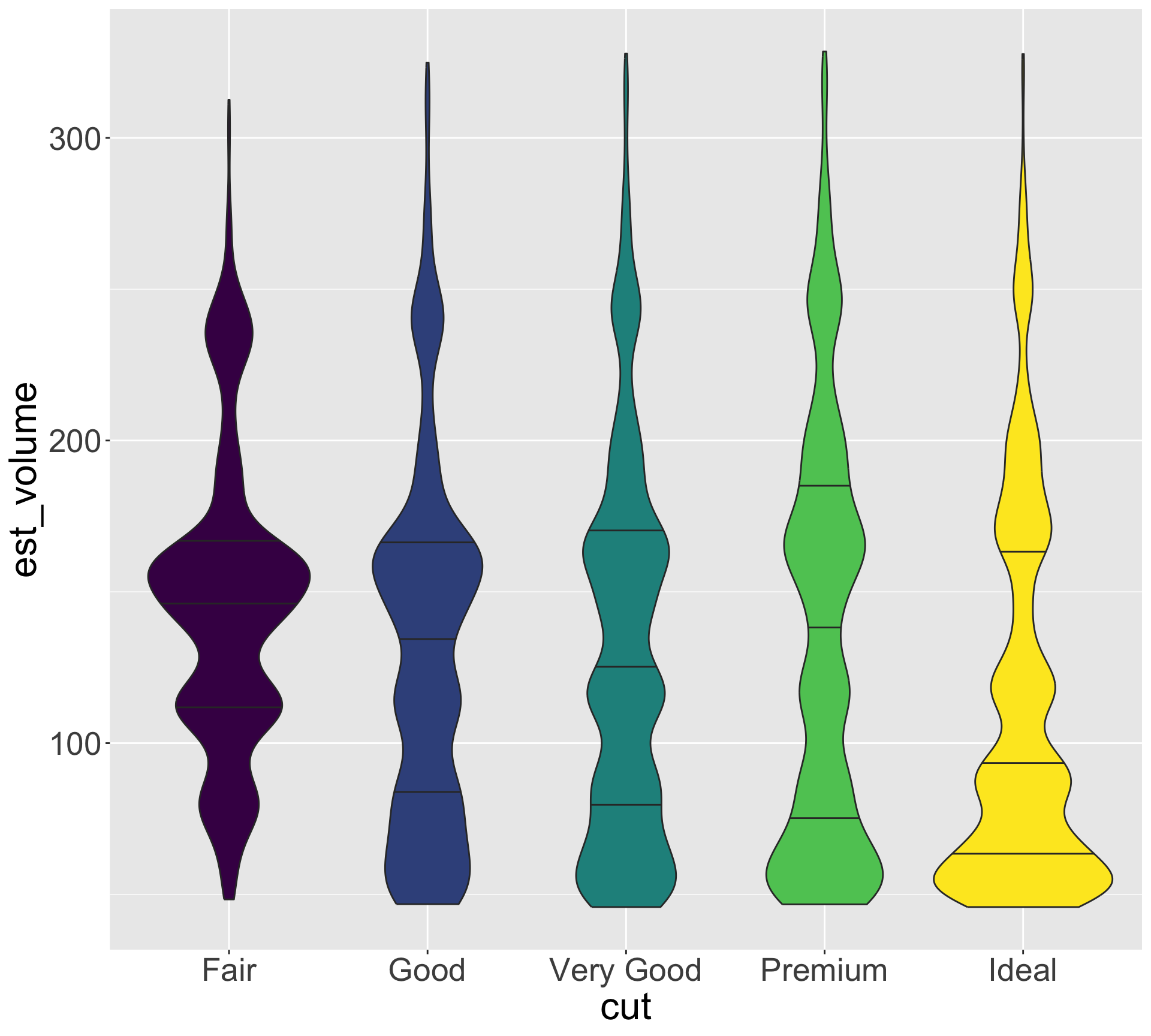
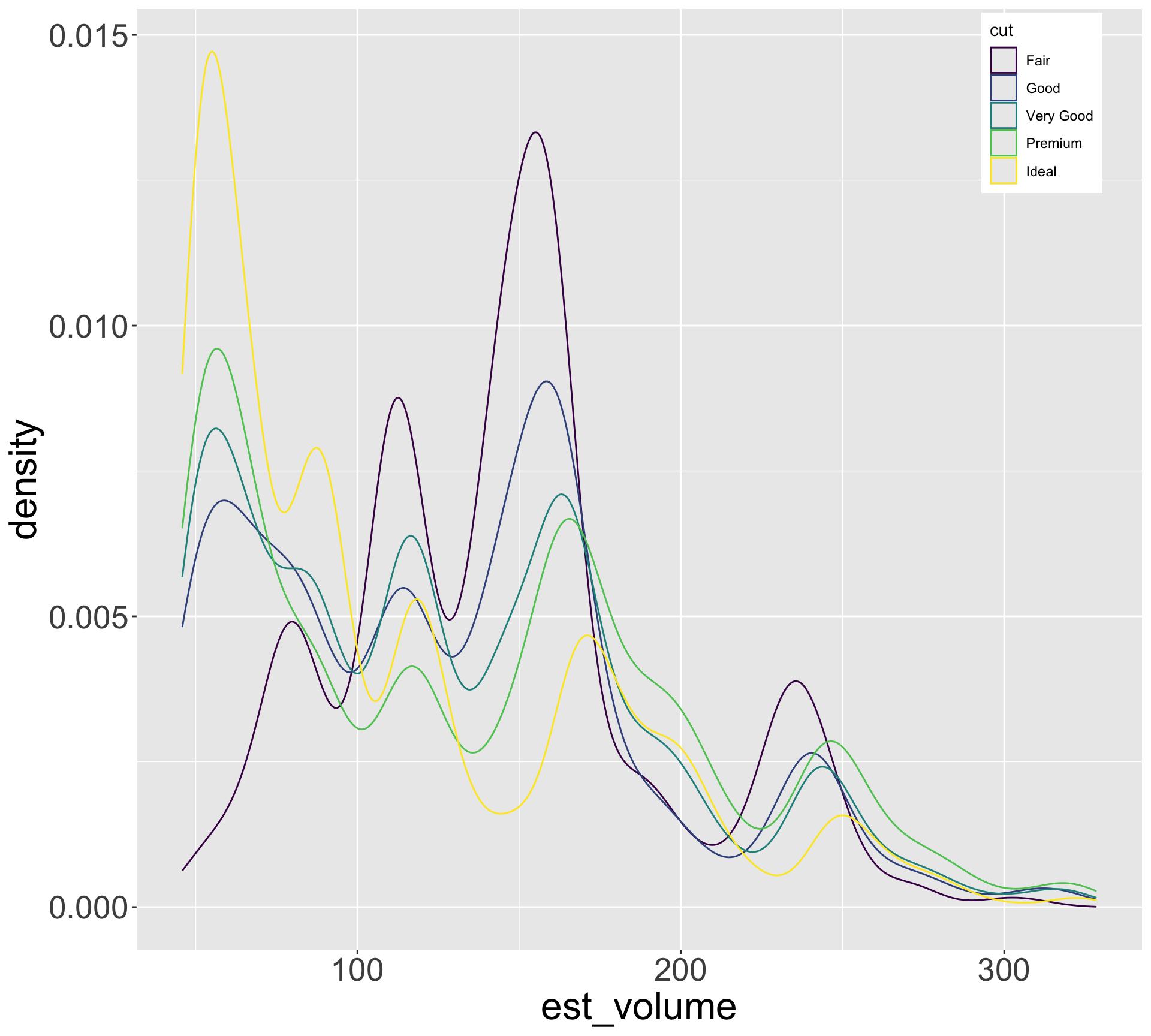
Hypothesis seems reasonable
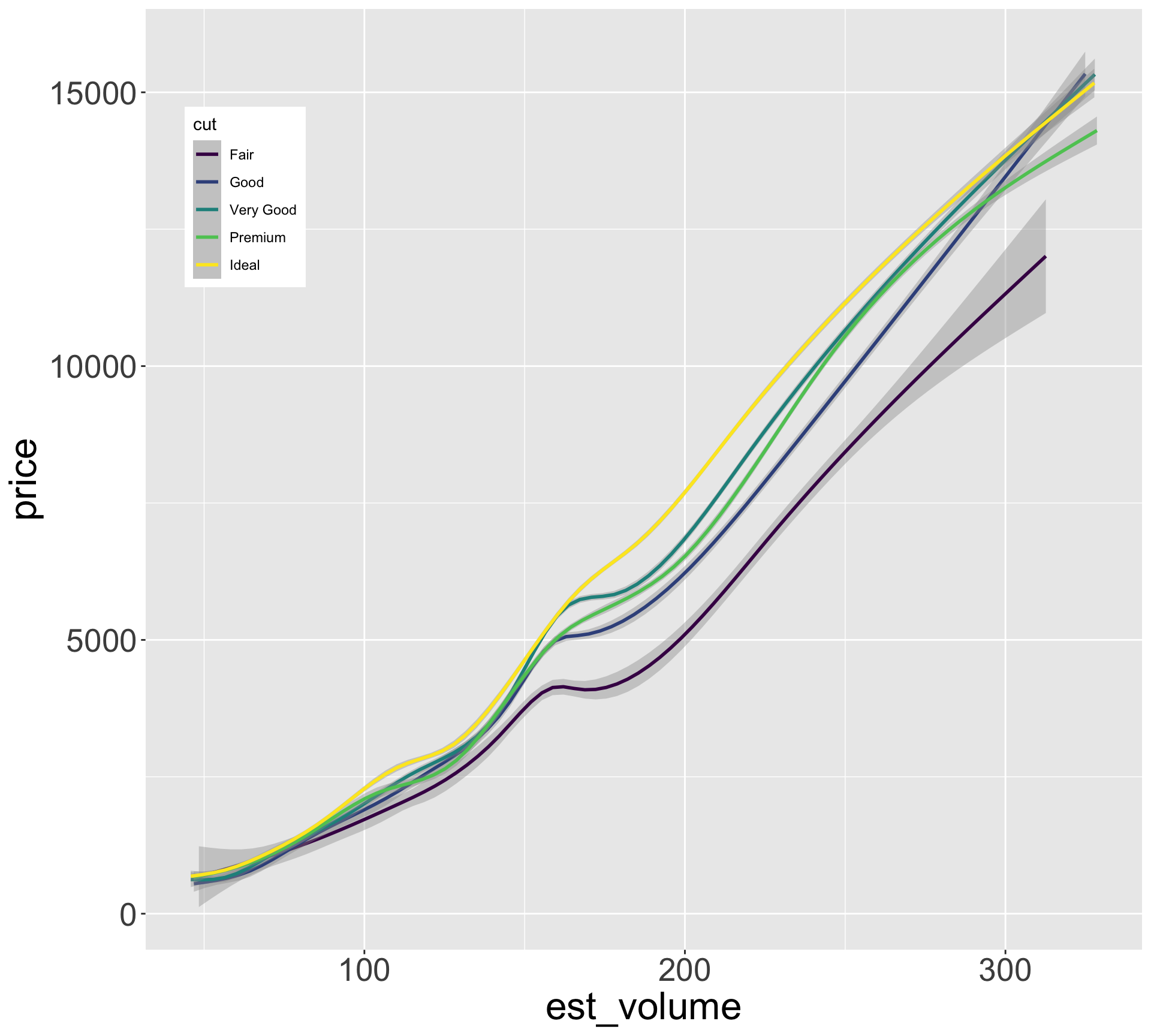
Better quality diamonds are typically cheaper?!
Now let’s look at size vs price for each cut
Communicating ideas
Good labels are crucial to good figures:
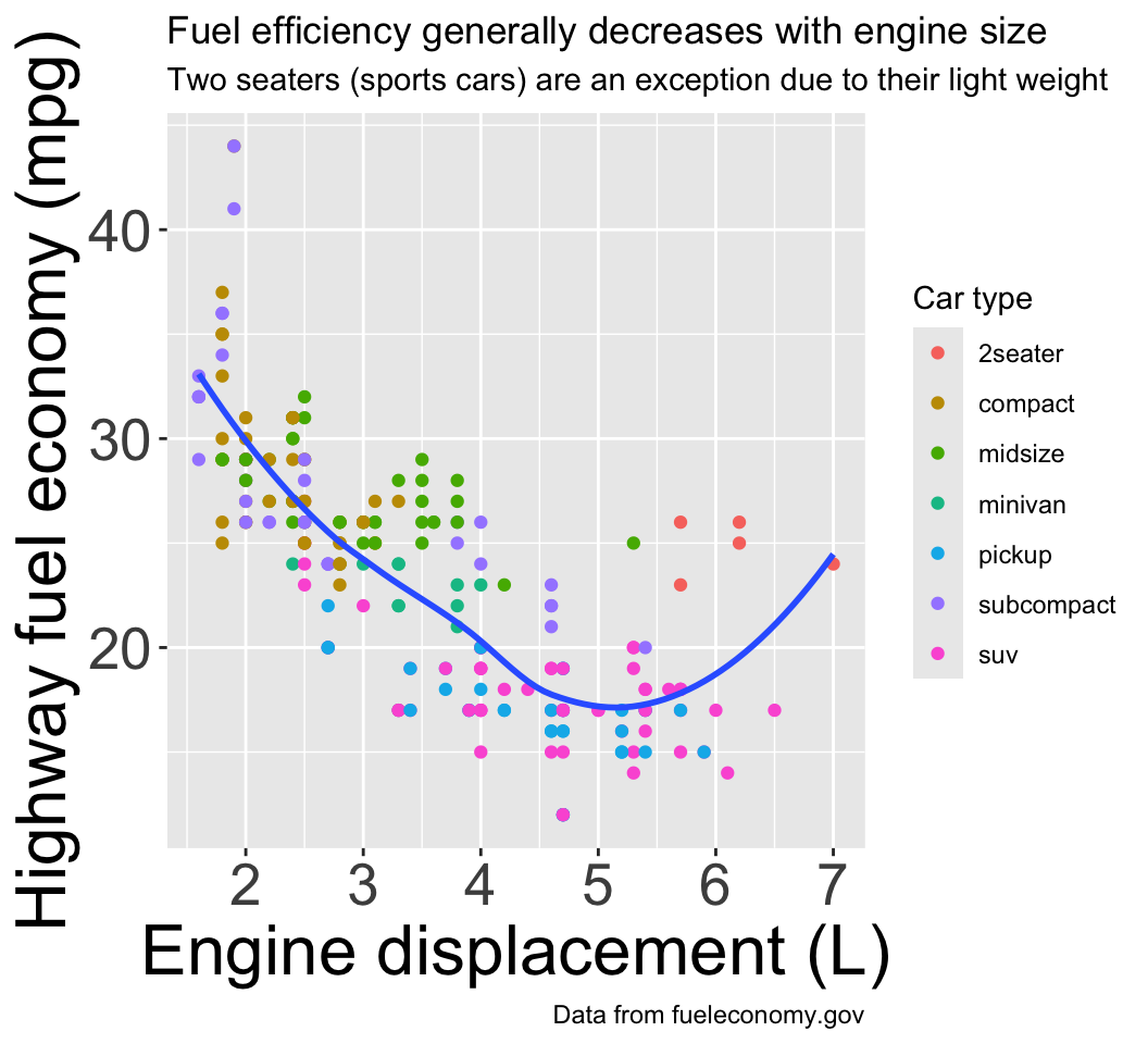
ggplot(mpg, aes(displ, hwy)) +
  geom_point(aes(color = class)) +
  geom_smooth(se = FALSE) +
  labs(
    x = "Engine displacement (L)",
    y = "Highway fuel economy (mpg)",
    color = "Car type",
    title = "Fuel efficiency generally decreases with engine size",
    subtitle = "Two seaters (sports cars) are an exception due to their light weight",
    caption = "Data from fueleconomy.gov"
  )
Annotations
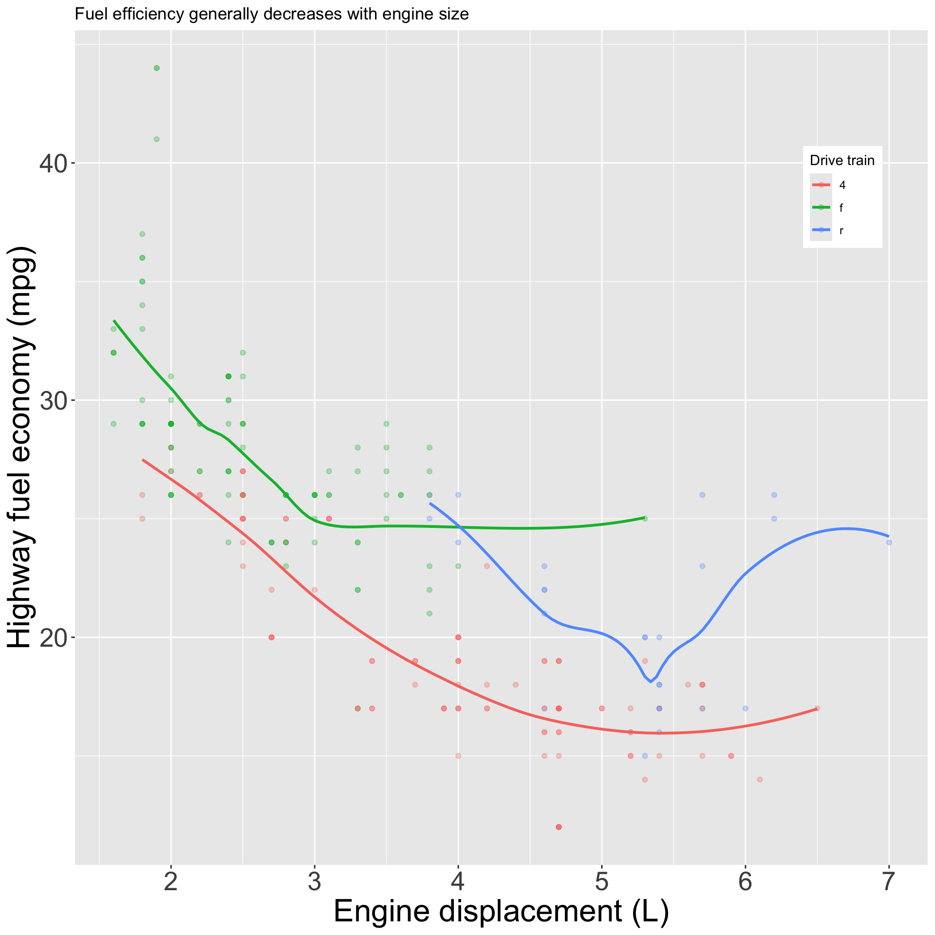
Annotations
pp <- mpg |>
  ggplot(aes(displ, hwy, color = drv)) +
  geom_point(alpha = 0.3) +
  geom_smooth(se = FALSE) +
  geom_text(
    data = label_info,
    aes(label = drive_type),
    size = 8
  ) +
  theme(legend.position = "none") +
  labs(x = "Engine displacement (L)", y = "Highway fuel economy (mpg)", color = "Drive train", title = "Fuel efficiency generally decreases with engine size")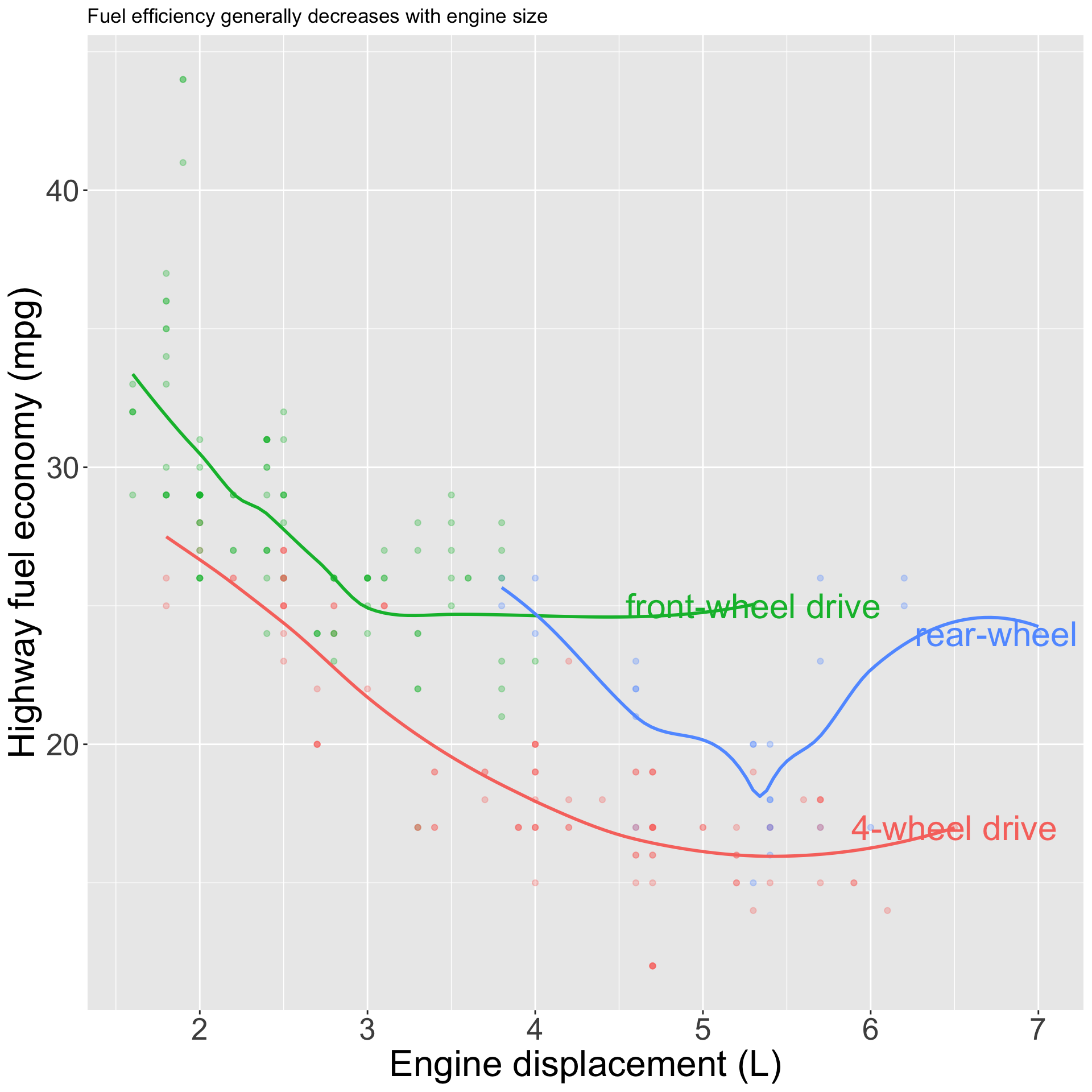
Annotations
pp <- mpg |>
  ggplot(aes(displ, hwy, color = drv)) +
  geom_point(alpha = 0.3) +
  geom_smooth(se = FALSE) +
  geom_text(
    data = label_info,
    aes(label = drive_type),
    nudge_y = 1.5, nudge_x = -0.8,
    size = 8
  ) +
  theme(legend.position = "none") +
  labs(x = "Engine displacement (L)", y = "Highway fuel economy (mpg)", color = "Drive train", title = "Fuel efficiency generally decreases with engine size")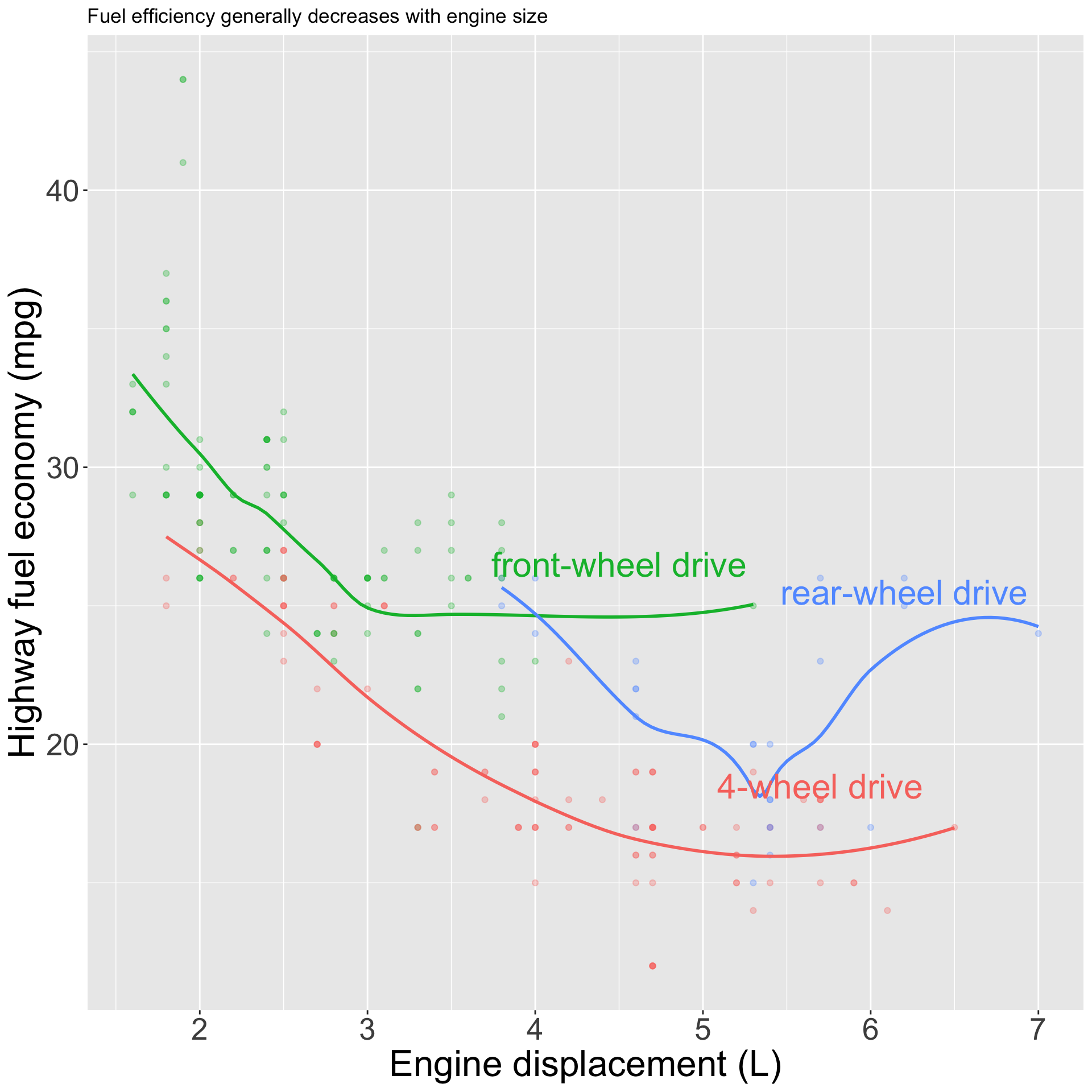
Annotations
pp <- mpg |>
  ggplot(aes(displ, hwy, color = drv)) +
  geom_point(alpha = 0.3) +
  geom_smooth(se = FALSE) +
  geom_text_repel(
    data = label_info,
    aes(label = drive_type),
    size = 8
  ) +
  theme(legend.position = "none") +
  labs(x = "Engine displacement (L)", y = "Highway fuel economy (mpg)", color = "Drive train", title = "Fuel efficiency generally decreases with engine size")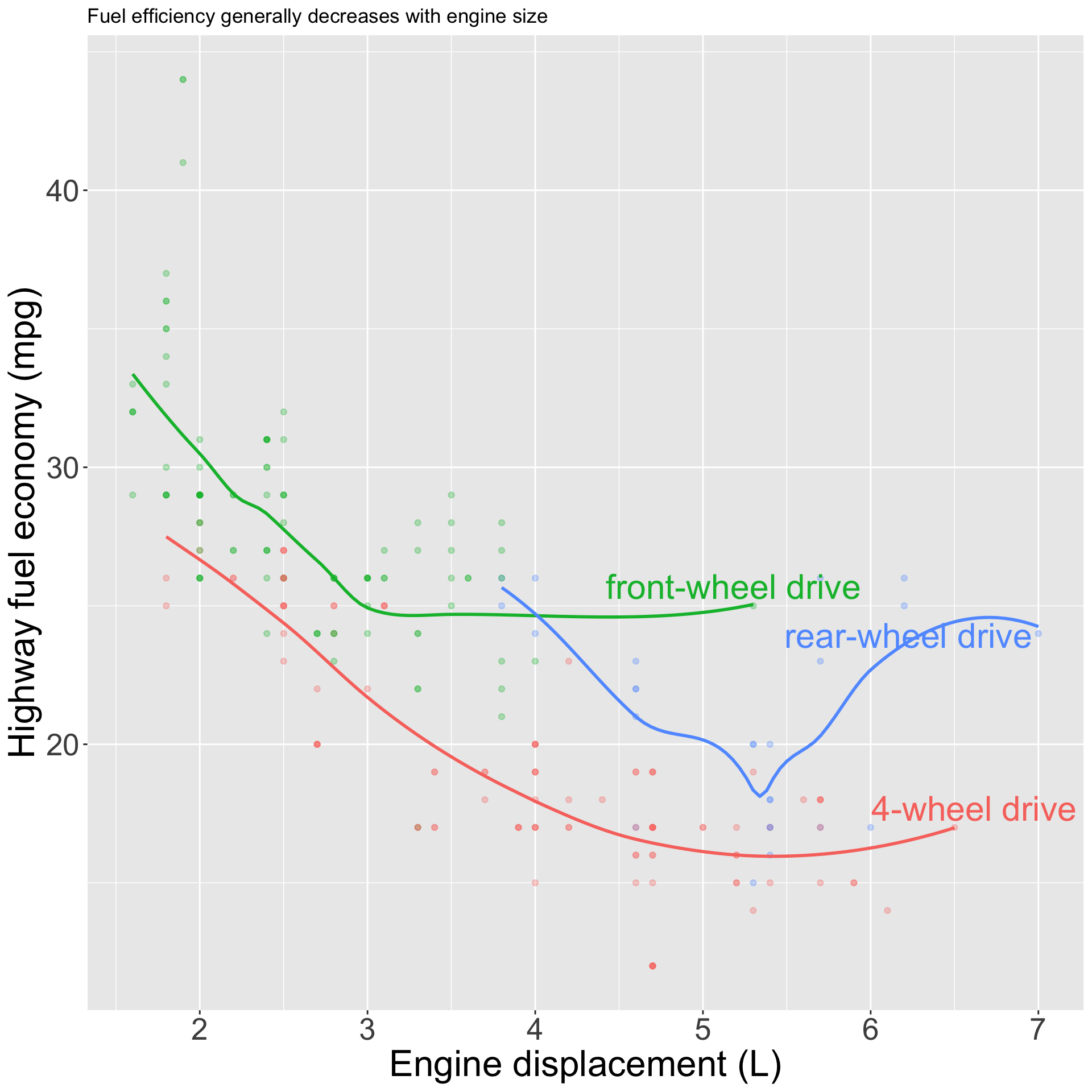
Annotations
Same idea can be used to highlight points on plot, e.g. outliers
potential_outliers <- mpg |> filter(hwy > 40 | (hwy > 20 & displ > 5))
ggplot(mpg, aes(displ, hwy)) +
  geom_point() +
  geom_text_repel(data = potential_outliers, aes(label = model)) +
  geom_point(data = potential_outliers, shape = "circle open", color = "red", size = 3) +
  labs(x = "Engine displacement (L)", y = "Highway fuel economy (mpg)", color = "Drive train", title = "Fuel efficiency generally decreases with engine size")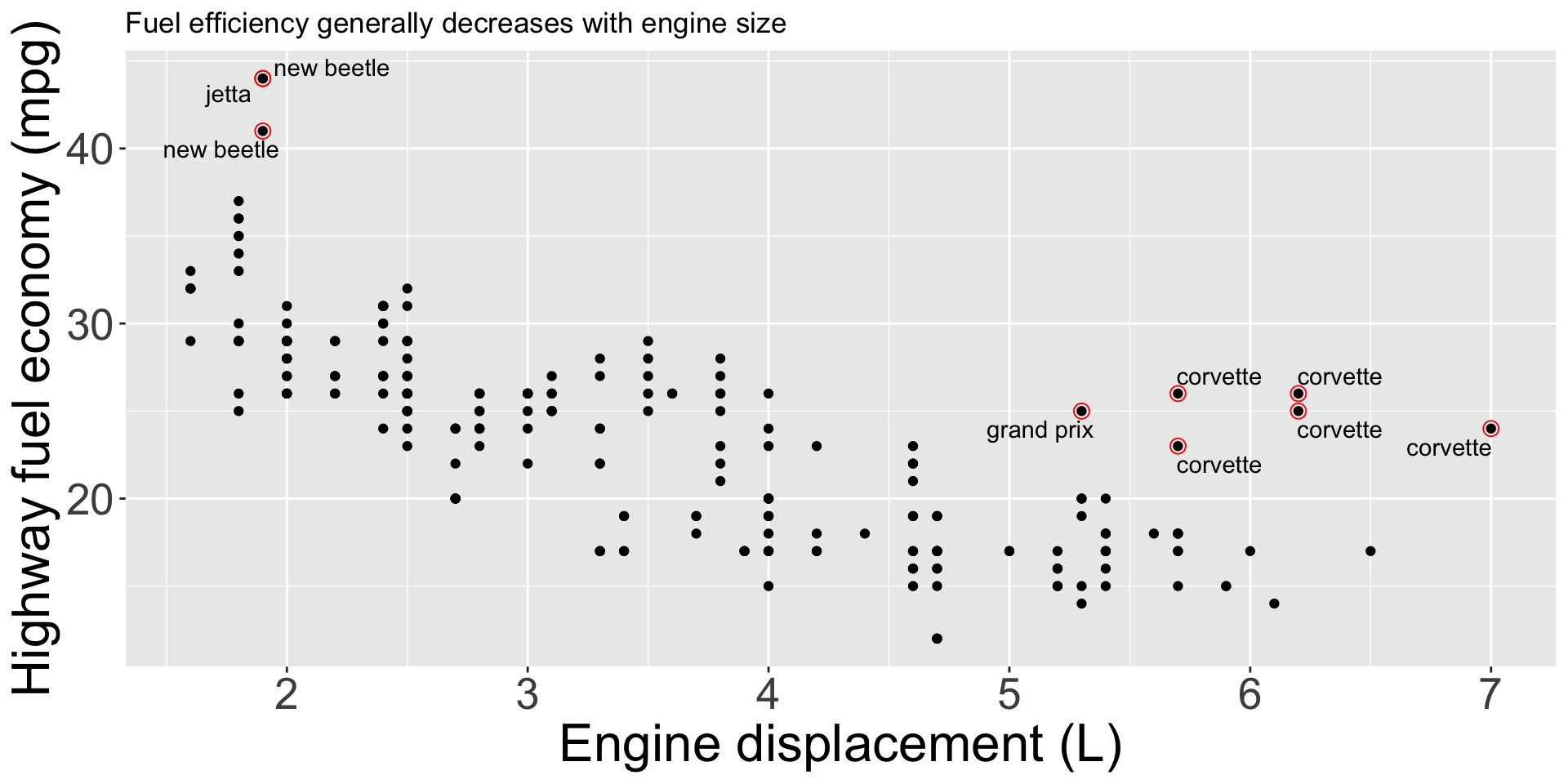
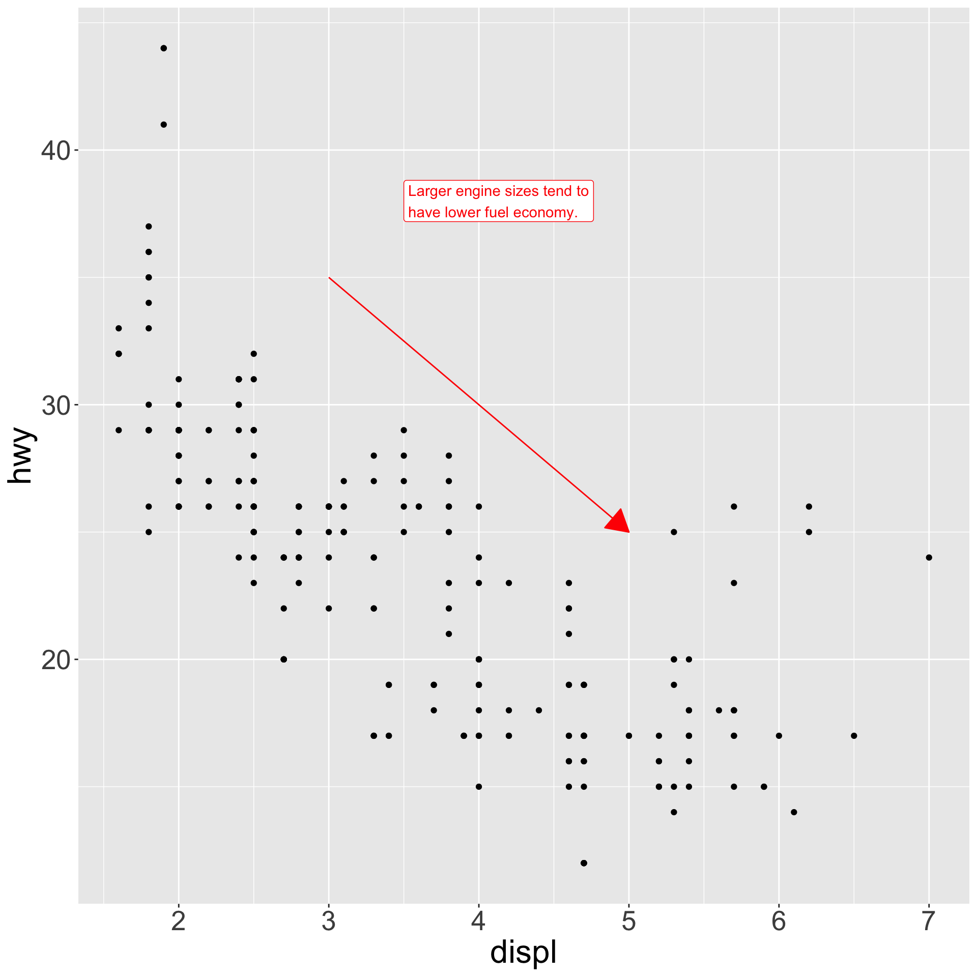
Annotations
- Let’s add a text label in red using
annotate(geom = 'label') - … and then add a line segment giving general trend
Axis ticks
Axes and legends are called guides in R.
- Axes used for x,y aesthetics, legends for everything else
- Ticks on axes and keys on legend affected by args
breaksandlabels.
Axis ticks
- Specifying
labelsandbreaksprovides a lot of flexibility on how to plot

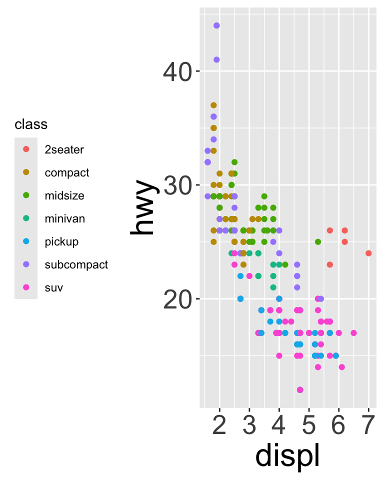
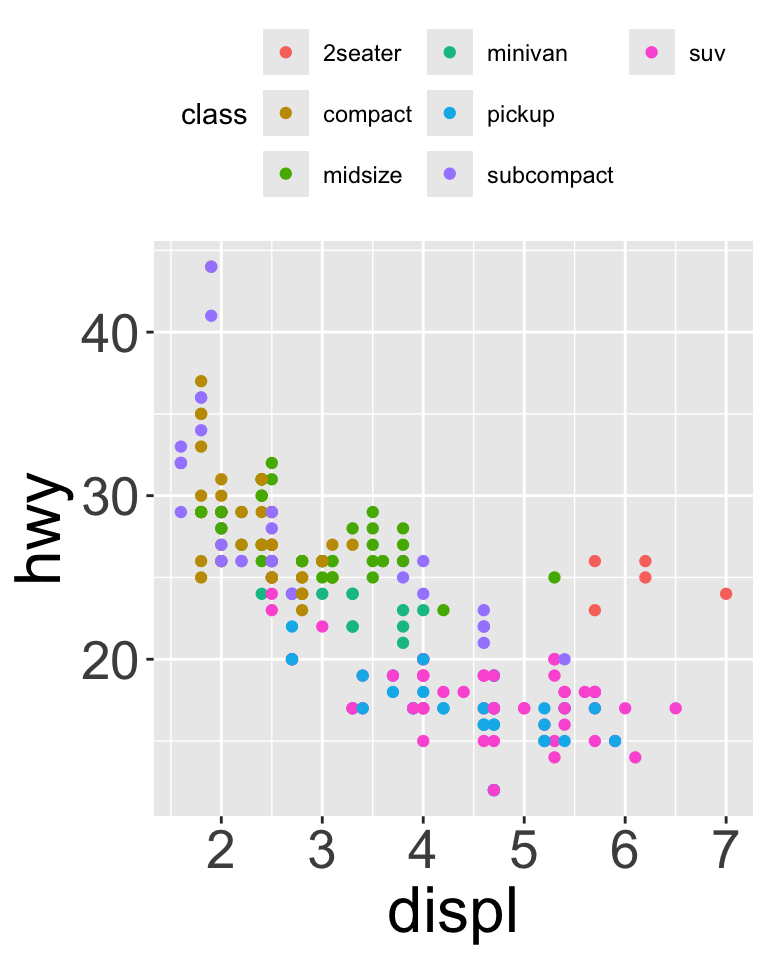
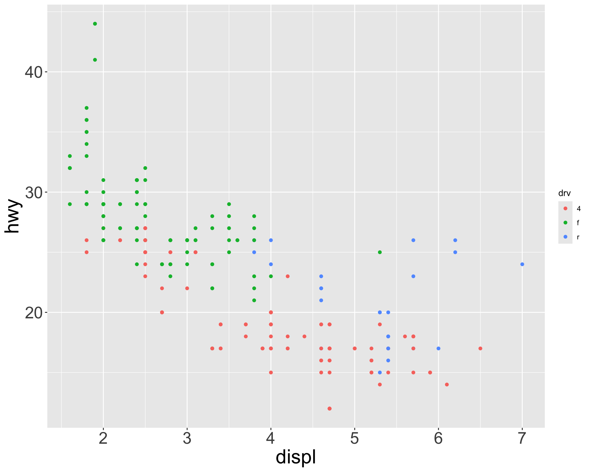
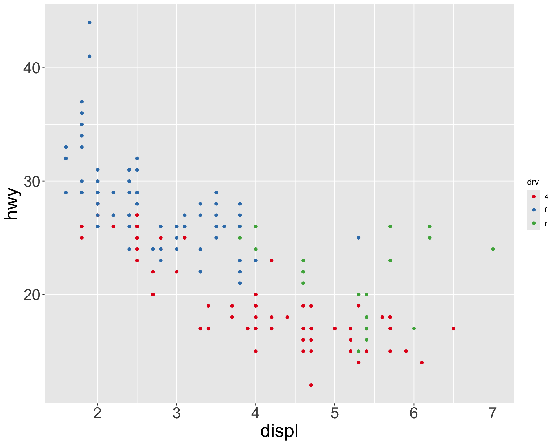
Legends
To control location of legend, use theme() (controls non data parts of a plot)
base <- ggplot(mpg, aes(x = displ, y = hwy)) + geom_point(aes(color = class))

base + theme(legend.position = "right")  # the default
base + theme(legend.position = "left")
base + theme(legend.position = "top") + guides(color = guide_legend(nrow = 3))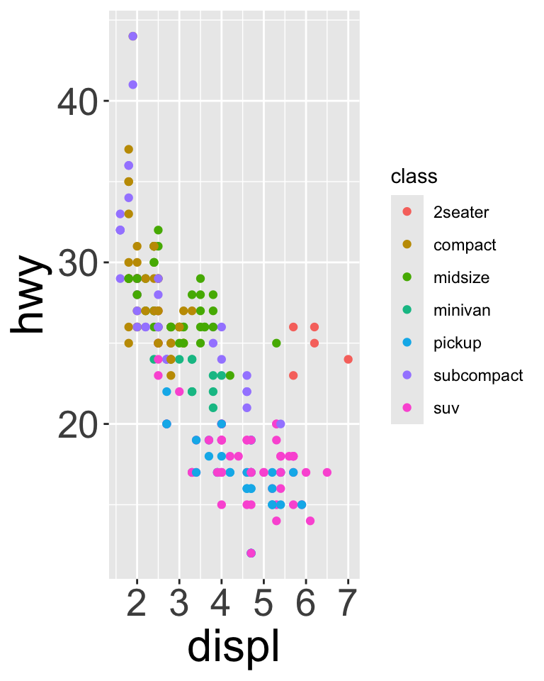
Replacing scales
Replacing scales
- Can use
scale_x_log10()andscale_y_log190)to plot regular values, but with ticks that are spread using a log scale
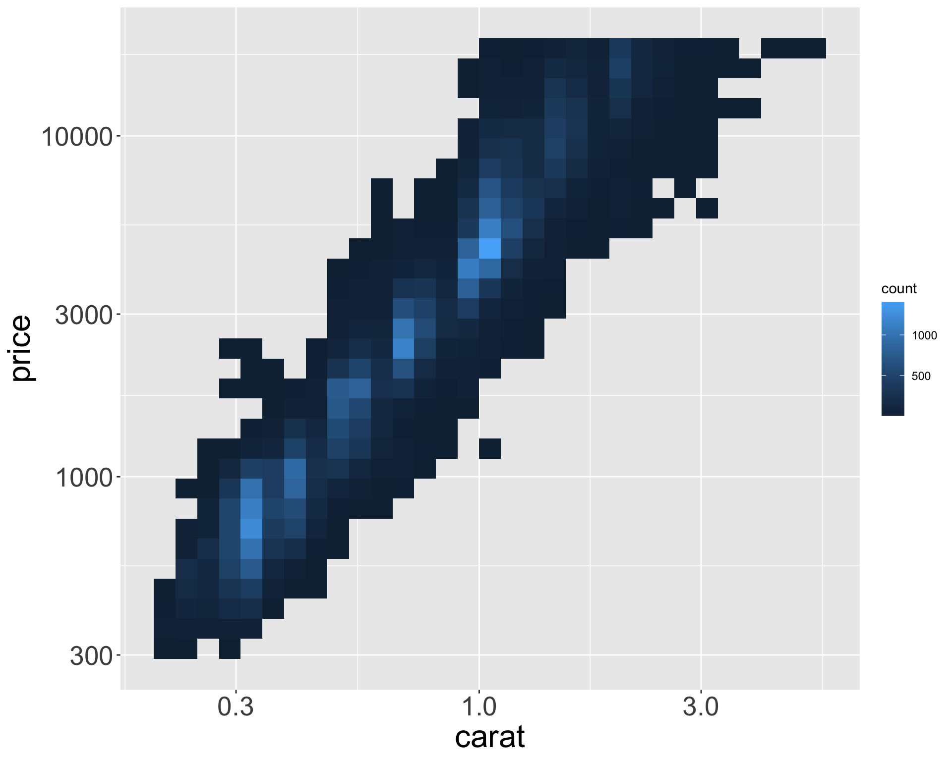
Replacing scales
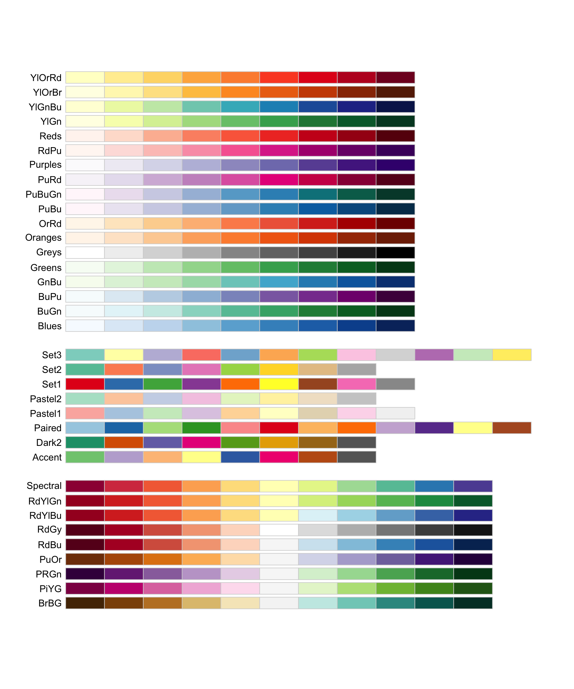
- Color scales are also often replaced; especially using
scale_color_brewer()
Replacing scales
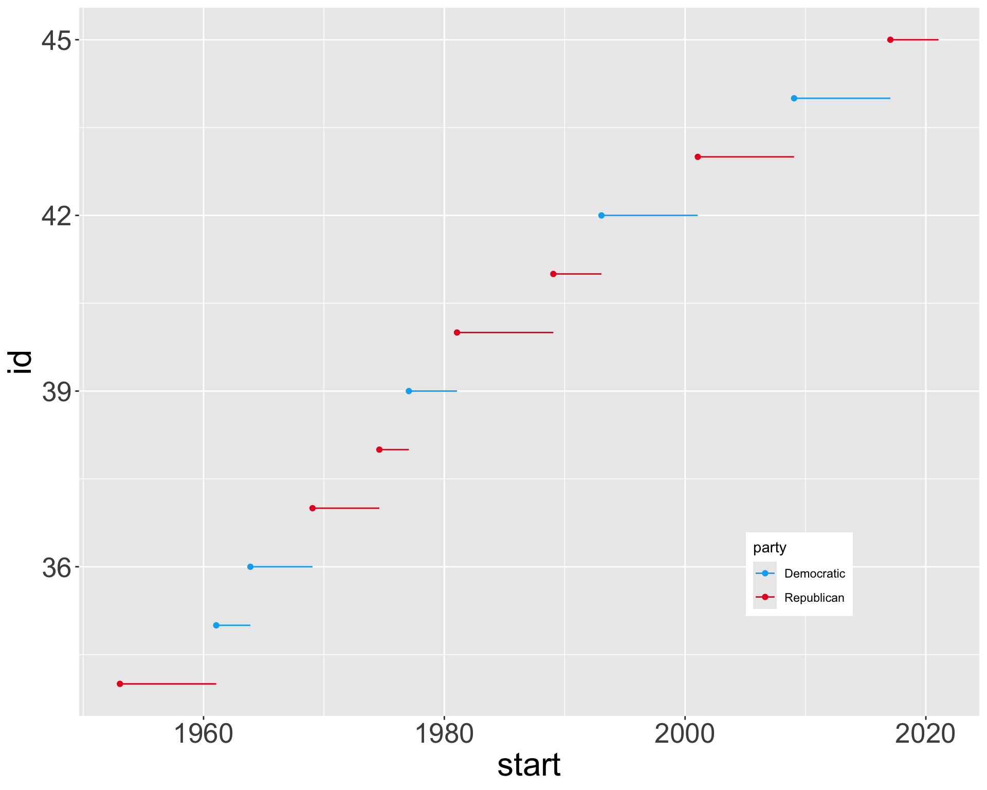
Manual color scaling
scale_color_manual() allows giving specific colors for groups in the tibble
# A tibble: 6 × 4
  name       start      end        party
  <chr>      <date>     <date>     <chr>
1 Eisenhower 1953-01-20 1961-01-20 Republican
2 Kennedy    1961-01-20 1963-11-22 Democratic
3 Johnson    1963-11-22 1969-01-20 Democratic
4 Nixon      1969-01-20 1974-08-09 Republican
5 Ford       1974-08-09 1977-01-20 Republican
6 Carter 1977-01-20 1981-01-20 Democratic- Takes argument
values: a named vector, with entries of the formgroup=color. colorcan be either English names (“blue”, “red”) or hexadecimal color codes