library(tidyverse)  # also loads ggplot2 package
library(ggthemes) # color palettes for ggplot3.2 exploratory data analysis
STA141A: Fundamentals of Statistical Data Science
Creating a ggplot
- Start with function
ggplot()
penguins |>
    ggplot()
Creating a ggplot
Creating a ggplot
- Start with function
ggplot() - Add global aesthetics (i.e., aesthetics applied to every layer in plot).
- Add layers.
- Display data using geom: geometrical object used to represent data
geom_bar(): bar chart;geom_line(): lines;geom_boxplot(): boxplot;geom_point(): scatterplot
Adding aesthetics and layers
We can have aesthetics change as a function of variables inside the tibble
- e.g. we can differentiate penguin species via colors
- When a categorical variable is mapped to an aesthetic, each unique level of the variable (here: species) gets assigned a unique aesthetic value (here: unique color)
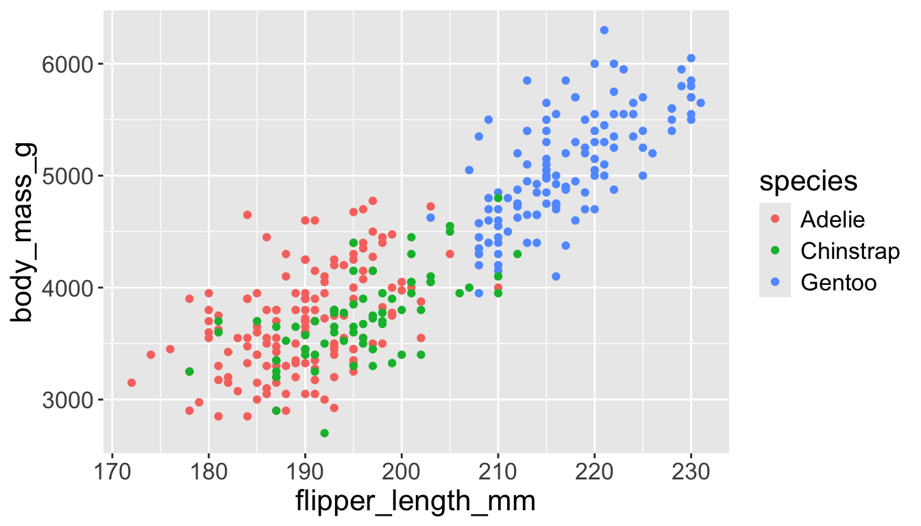
Adding aesthetics and layers
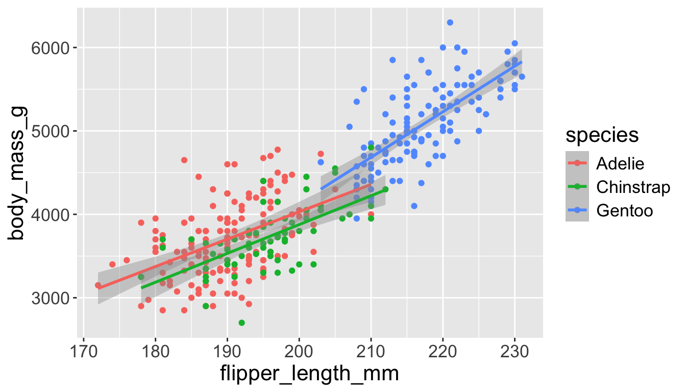
Let’s add a new layer, geom_smooth(method="lm"), which visualizes line of best fit based on a linear model
- When an aesthetic mapping is added inside
ggplot(), it is applied to all layers.- So
color=speciesinsideggplot()will group all penguins by species. - We now have a line for each species (not one global line).
- So
Adding aesthetics and layers
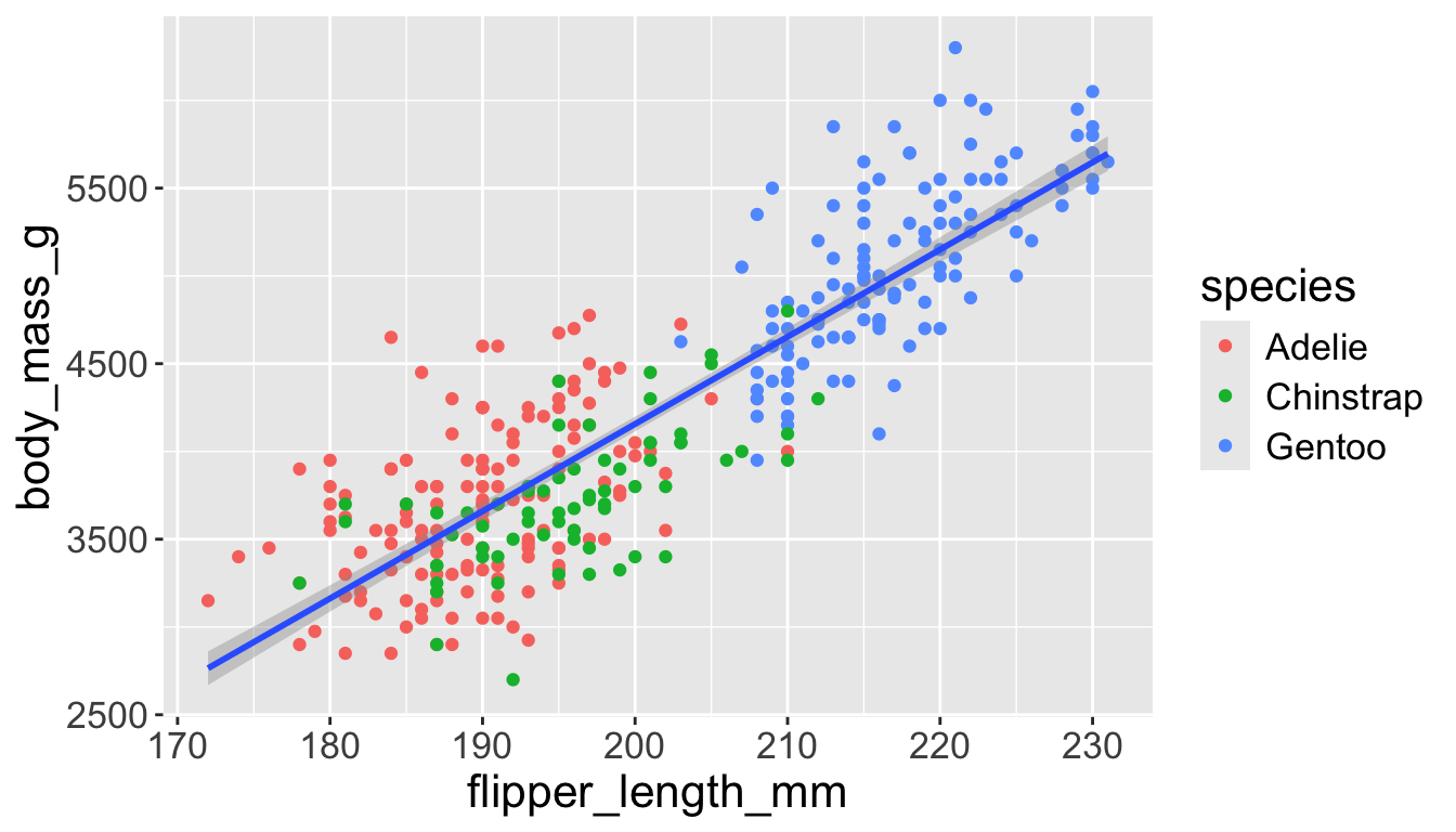
Let’s add a new layer, geom_smooth(method="lm"), which visualizes line of best fit based on a linear model
- When an aesthetic mapping is added inside a layer, it is applied to just that layer.
- So
color=speciesinsidegeom_point()will group all penguins by species only for that layer. - We now have one global line for all penguins.
- So
Adding aesthetics and layers
Adding aesthetics and layers
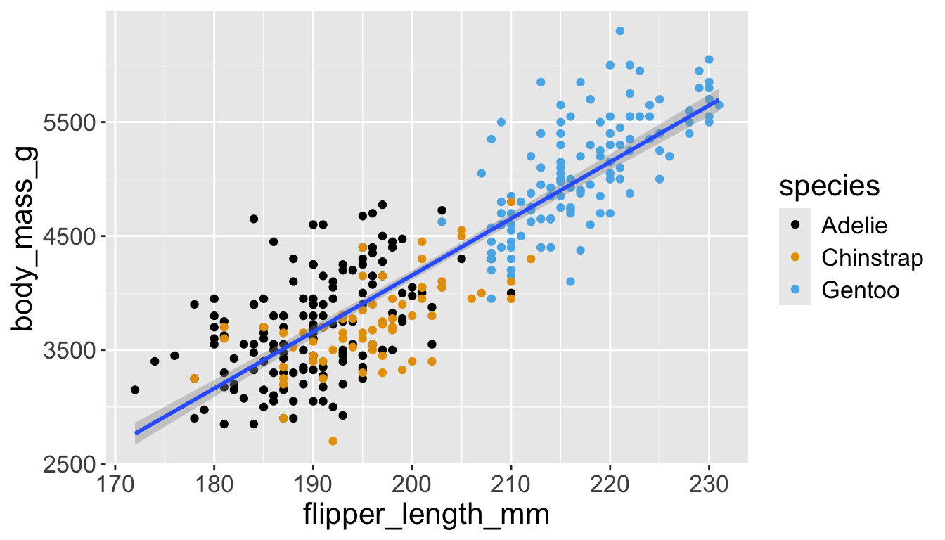
Let’s further differentiate different species via shapes.
- We can specify this in a local aesthetic mapping of points using
shape= - The legend will be updated to show this too!
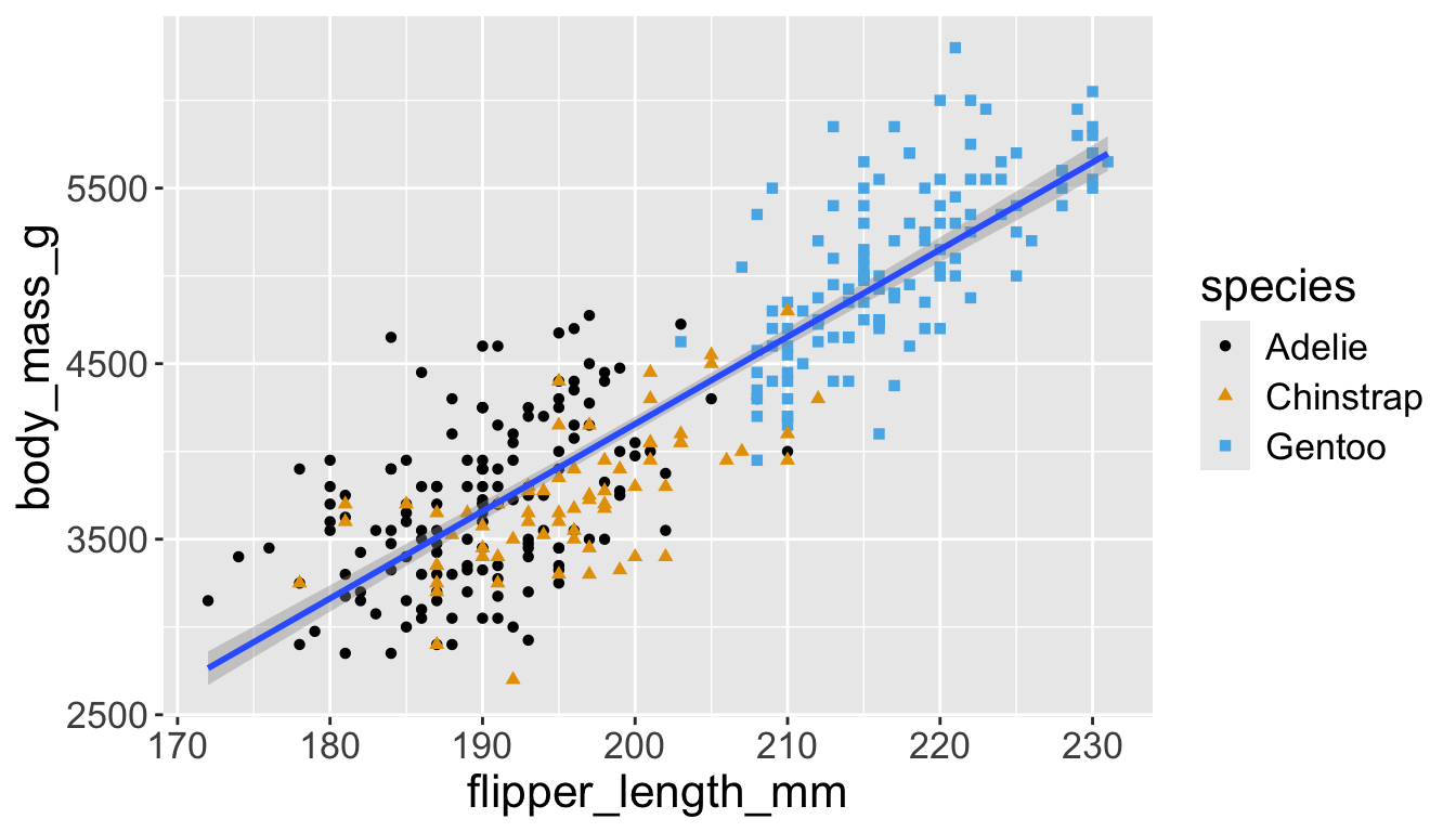
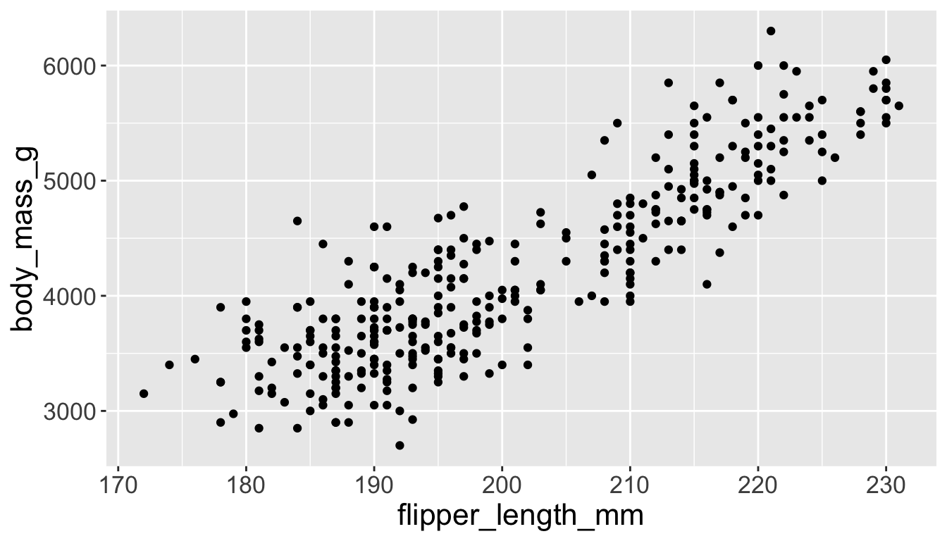
Now add title and axis labels
penguins |>
    ggplot(aes(x = flipper_length_mm,
y = body_mass_g)) +
geom_point(aes(color = species,
shape = species)) +
geom_smooth(method = "lm") +
labs(
title = "Body mass and flipper length",
subtitle = "Dimensions for Adelie, Chinstrap, and Gentoo Penguins",
x = "Flipper length (mm)", y = "Body mass (g)",
color = "Species", shape = "Species"
) +
scale_color_colorblind()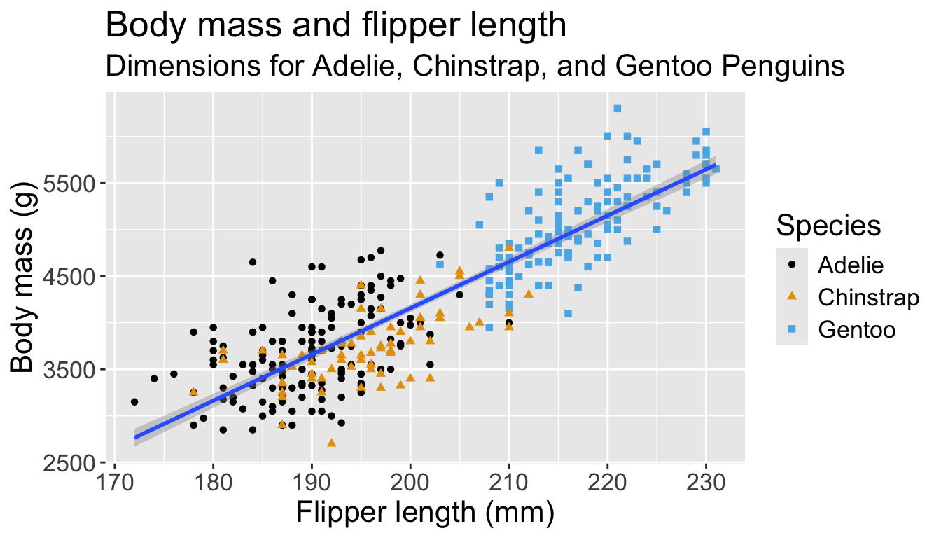
Visualizing distributions
Categorical variables take only one of a finite set of values
- Bar charts are useful for visualizing categorical variables
penguins |>
    ggplot(aes(x = species)) +
    geom_bar()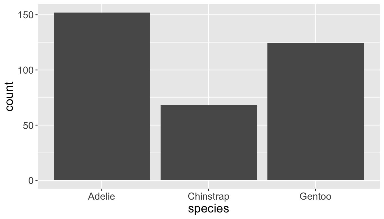
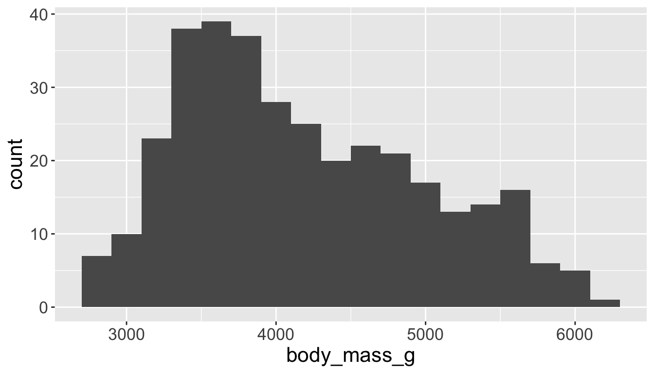
Numeric values we are familiar with
- Histograms are useful for these - use argument
binwidth =
penguins |>
    ggplot(aes(x = body_mass_g)) +
    geom_histogram(binwidth = 200)
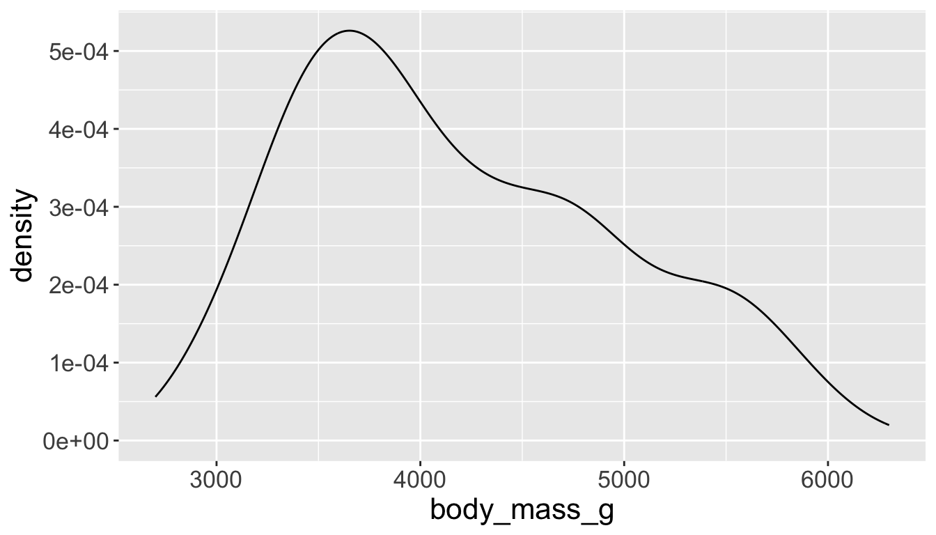
Visualizing distributions
- A smoothed out version of histogram — approximates a probability density function
Visualizing distributions
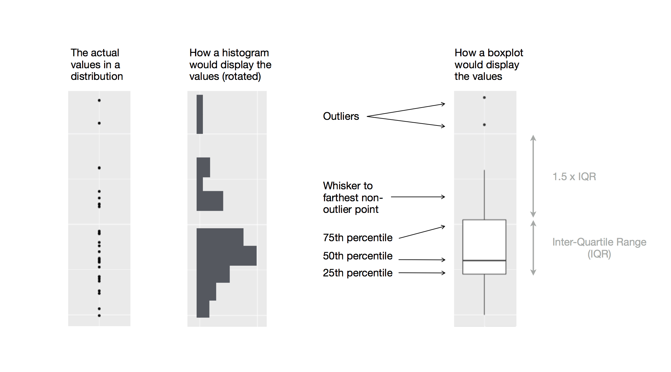
- Box plots allow for visualizing the spread of a distribution
- Makes it easy to see 25th percentile, median, 75th percentile, and outliers (>1.5*IQR from 25th or 75th percentile)
Visualizing distributions
Let’s see distribution of body mass by species…
…using geom_boxplot():
penguins |>
    ggplot(aes(x = species,
               y = body_mass_g)) +
    geom_boxplot()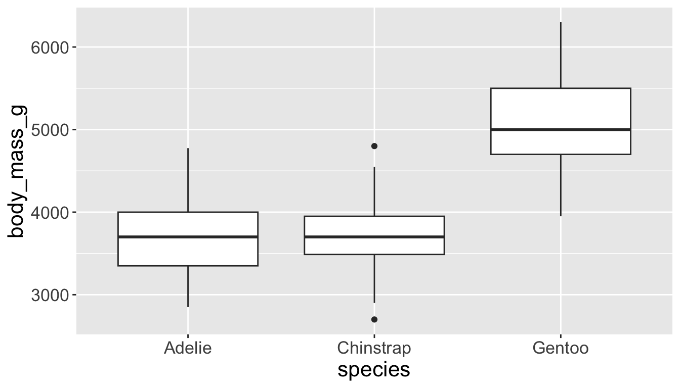
…using geom_density():
penguins |>
    ggplot(aes(x = body_mass_g,
               color = species)) +
    geom_density(linewidth = 0.75)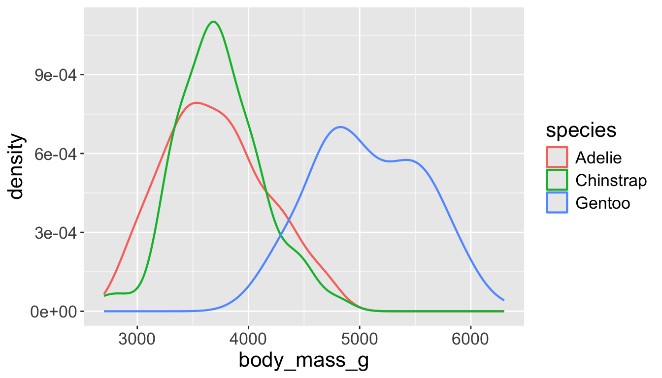
Playing with visual parameters
Use alpha to add transparency
alphais a number between 0 and 1; 0 = transparent, 1 = opaque
penguins |>
    ggplot(aes(x = body_mass_g,
               color = species,
               fill = species)) +
    geom_density(alpha = 0.3)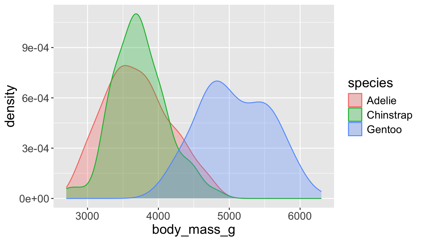
penguins |>
    ggplot(aes(x = body_mass_g,
               color = species,
               fill = species)) +
    geom_density(alpha = 0.7)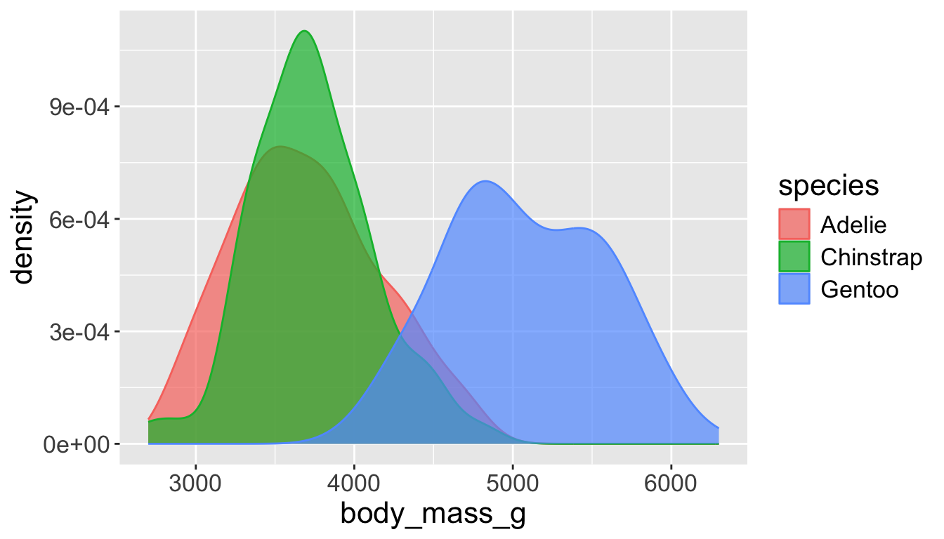
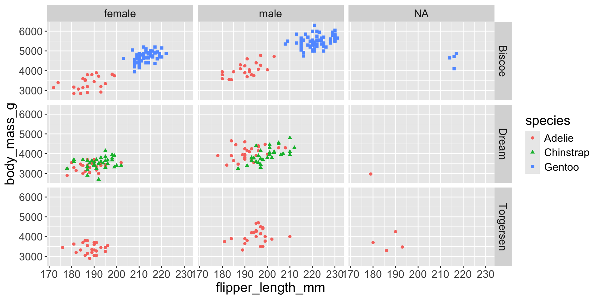
Multiple numerical variables
Already saw how to use scatter plots to visualize two numeric variables
We can use separate vals for color and shape
penguins |>
    ggplot(aes(x = flipper_length_mm, y = body_mass_g)) +
    geom_point(aes(color = species, shape = island))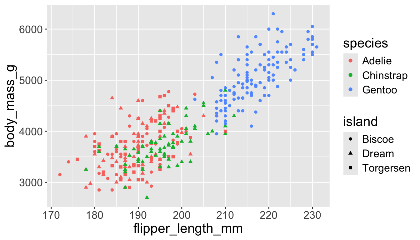
Too many things to remember…
Multiple numerical variables
Too many aesthetic changes (shape, color, fill, size, etc) can clutter plots
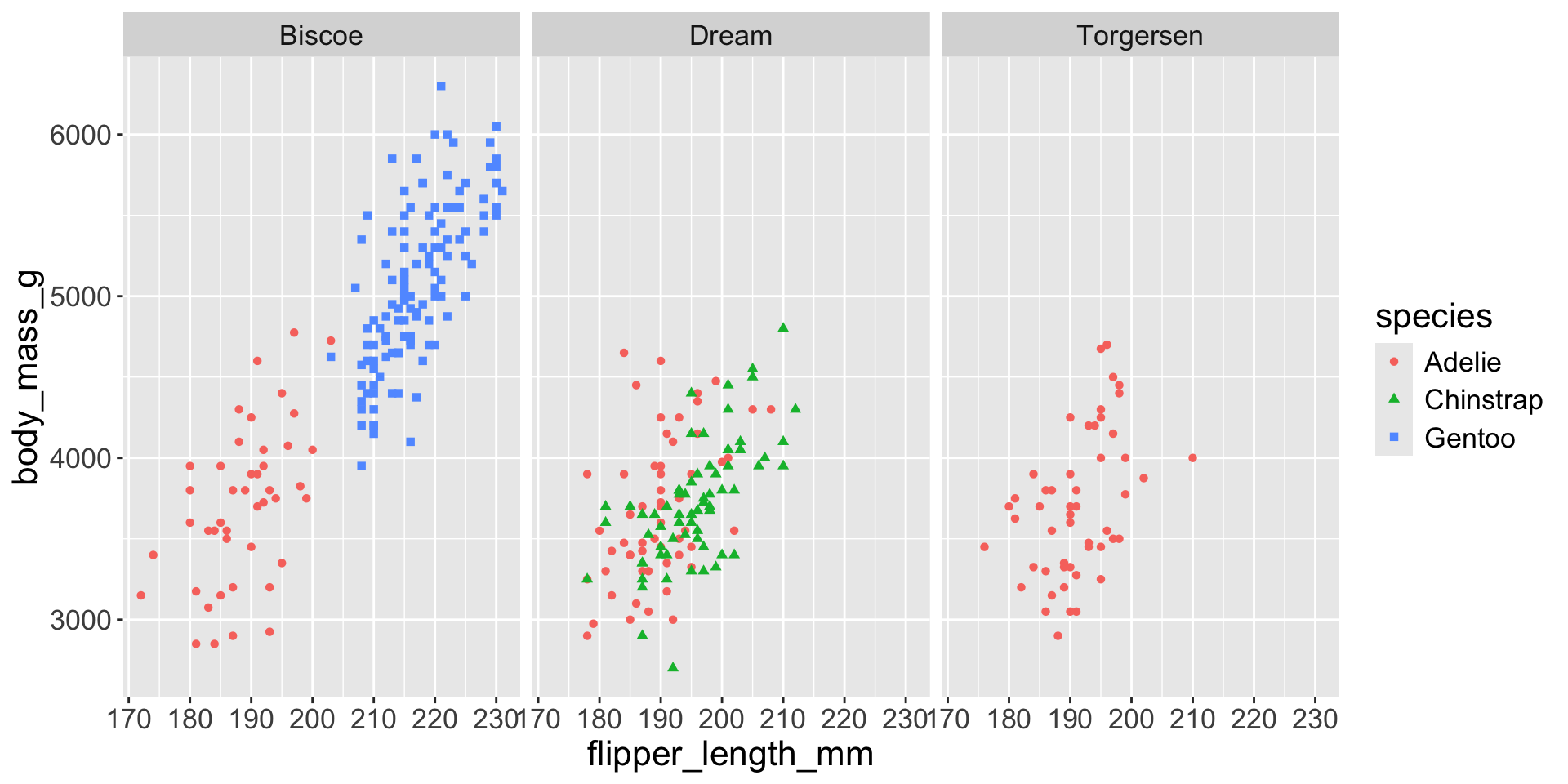
Multiple numerical variables
Too many aesthetic changes (shape, color, fill, size, etc) can clutter plots
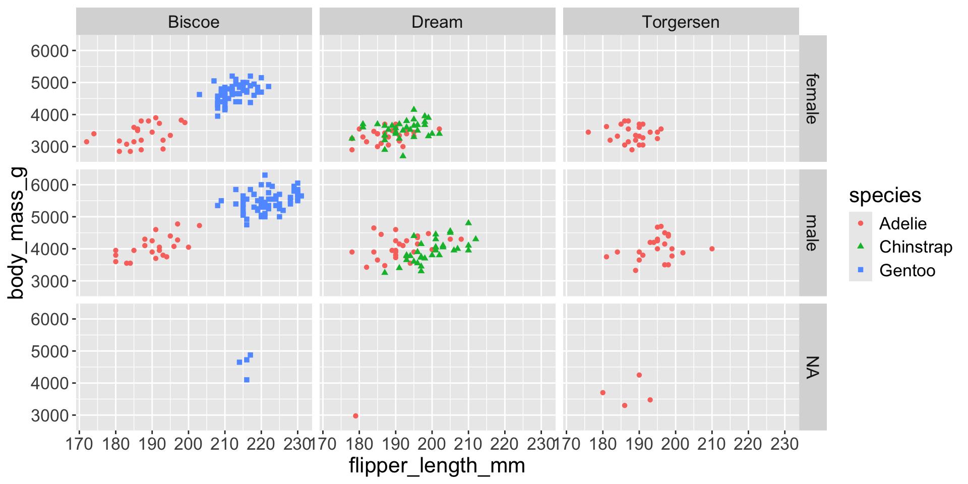
Multiple numerical variables
Too many aesthetic changes (shape, color, fill, size, etc) can clutter plots