# A tibble: 344 × 8
   species island    bill_length_mm bill_depth_mm flipper_length_mm body_mass_g
   <fct>   <fct>              <dbl>         <dbl>             <int>       <int>
 1 Adelie  Torgersen           39.1          18.7               181        3750
 2 Adelie  Torgersen           39.5          17.4               186        3800
 3 Adelie  Torgersen           40.3          18                 195        3250
 4 Adelie  Torgersen           NA            NA                  NA          NA
 5 Adelie  Torgersen           36.7          19.3               193        3450
 6 Adelie  Torgersen           39.3          20.6               190        3650
 7 Adelie  Torgersen           38.9          17.8               181        3625
 8 Adelie  Torgersen           39.2          19.6               195        4675
 9 Adelie  Torgersen           34.1          18.1               193        3475
10 Adelie  Torgersen           42            20.2               190        4250
# ℹ 334 more rows
# ℹ 2 more variables: sex <fct>, year <int>s3.5: data visualization
STA141A: Fundamentals of Statistical Data Science
Creating a ggplot

Creating a ggplot
Creating a ggplot
- Start with function
ggplot() - Add global aesthetics (i.e., aesthetics applied to every layer in plot).
- Add layers.
- Display data using geom: geometrical object used to represent data
geom_bar(): bar chart;geom_line(): lines;geom_boxplot(): boxplot;geom_point(): scatterplot
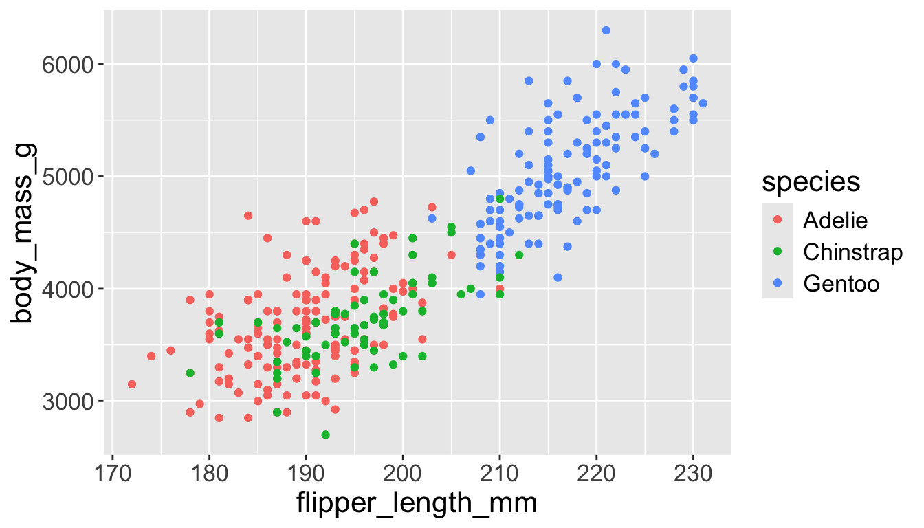
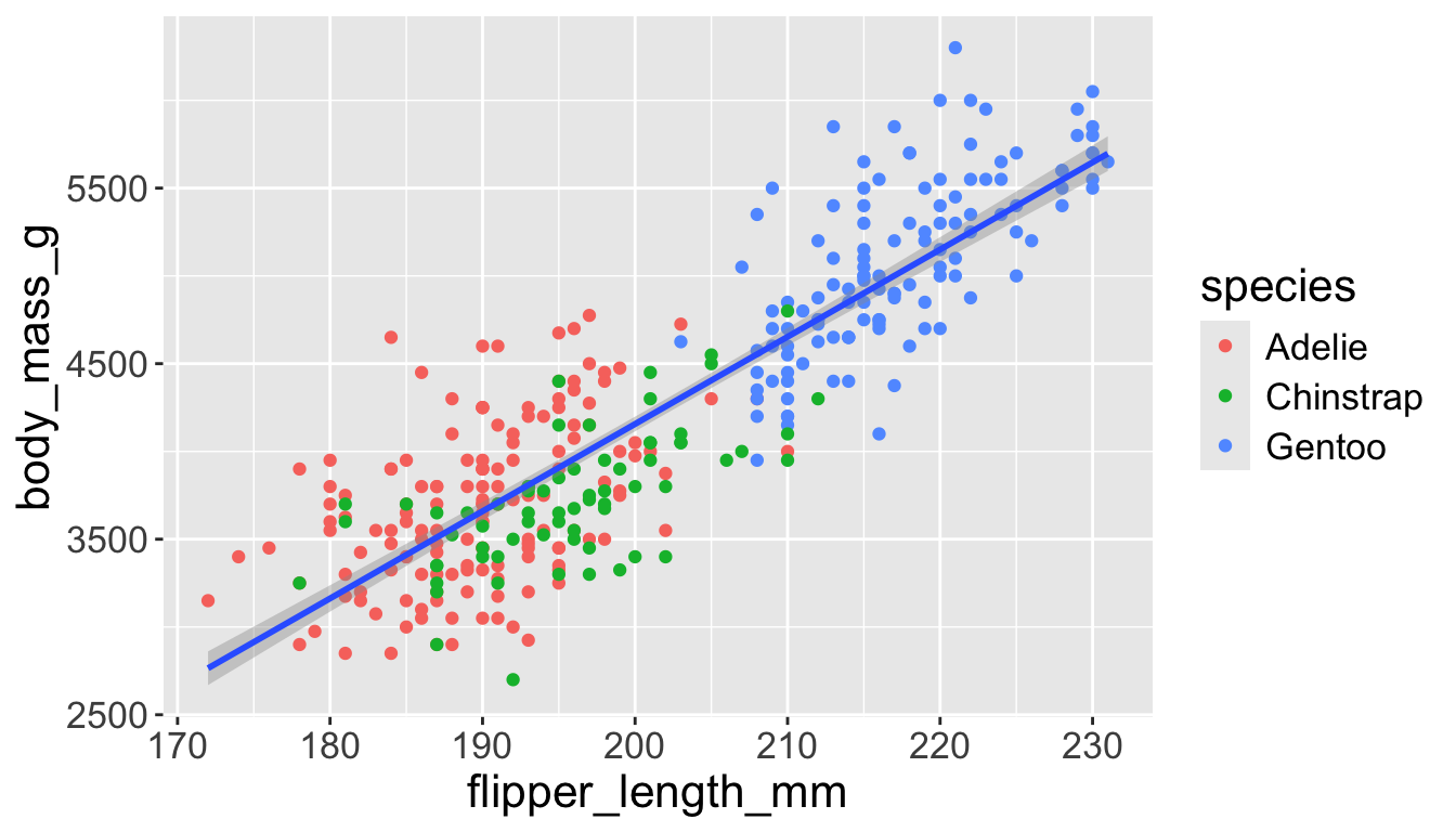
Adding aesthetics and layers
We can have aesthetics change as a function of variables inside the tibble
- e.g. we can differentiate penguin species via colors
- When a categorical variable is mapped to an aesthetic, each unique level of the variable (here: species) gets assigned a unique aesthetic value (here: unique color)
Adding aesthetics and layers
Let’s add a new layer, geom_smooth(method="lm"), which visualizes line of best fit based on a linear model
- When an aesthetic mapping is added inside
ggplot(), it is applied to all layers.- So
color=speciesinsideggplot()will group all penguins by species. - We now have a line for each species (not one global line).
- So

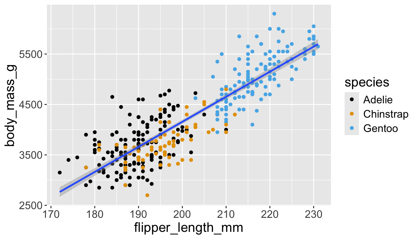
Adding aesthetics and layers
Let’s add a new layer, geom_smooth(method="lm"), which visualizes line of best fit based on a linear model
- When an aesthetic mapping is added inside a layer, it is applied to just that layer.
- So
color=speciesinsidegeom_point()will group all penguins by species only for that layer. - We now have one global line for all penguins.
- So
Adding aesthetics and layers
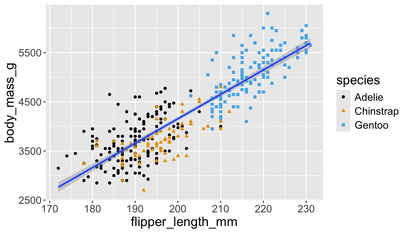
Adding aesthetics and layers
Let’s further differentiate different species via shapes.
- We can specify this in a local aesthetic mapping of points using
shape= - The legend will be updated to show this too!
Now just need to add title and axis labels
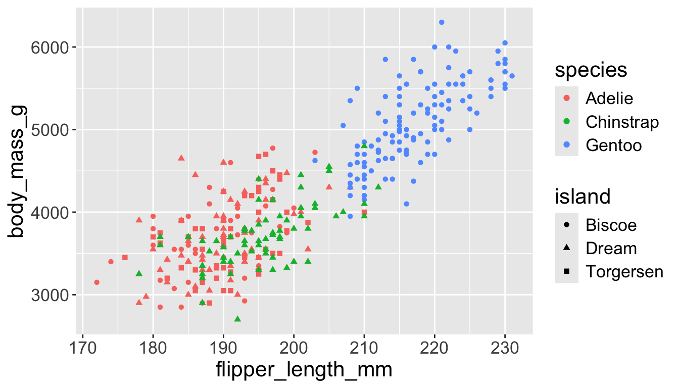
penguins |>
    ggplot(aes(x = flipper_length_mm,
y = body_mass_g)) +
geom_point(aes(color = species,
shape = species)) +
geom_smooth(method = "lm") +
labs(
title = "Body mass and flipper length",
subtitle = "Dimensions for Adelie, Chinstrap, and Gentoo Penguins",
x = "Flipper length (mm)", y = "Body mass (g)",
color = "Species", shape = "Species"
) +
scale_color_colorblind()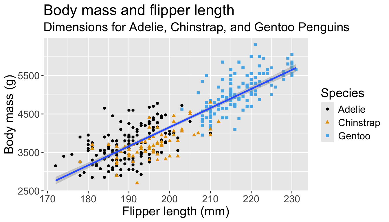
Visualizing distributions
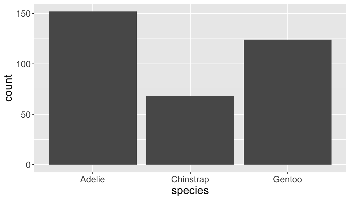
Categorical variables take only one of a finite set of values
- Bar charts are useful for visualizing categorical variables
Visualizing distributions
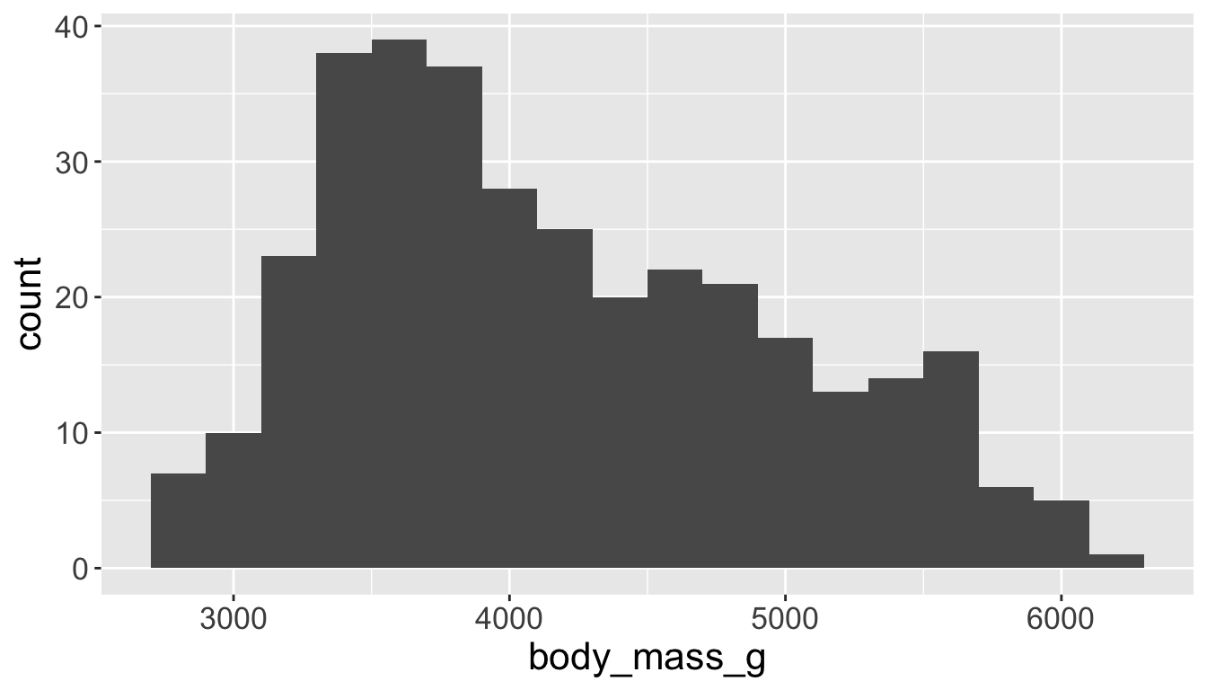
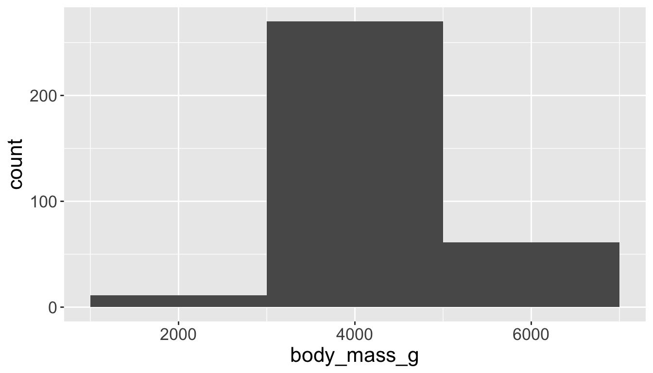
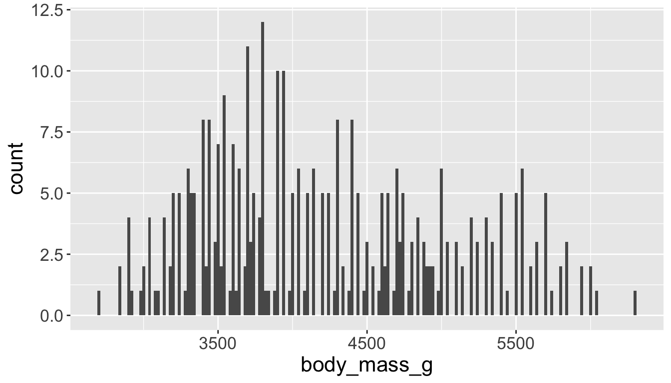
You will likely need to spend time tuning the binwidth parameter
Visualizing distributions
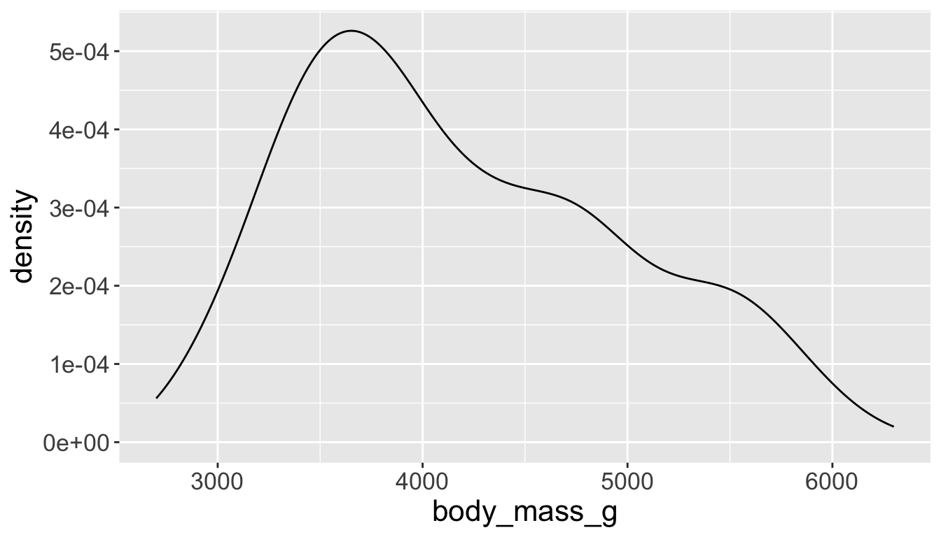
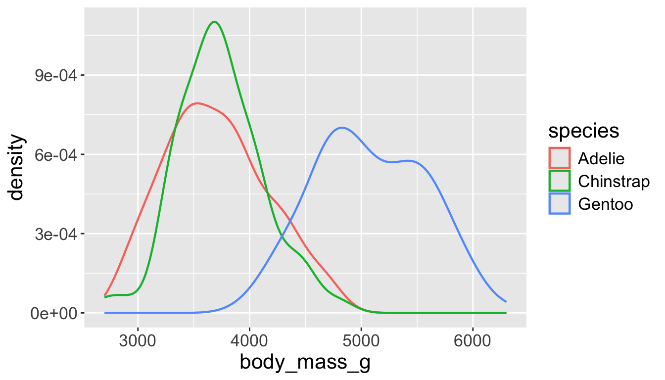
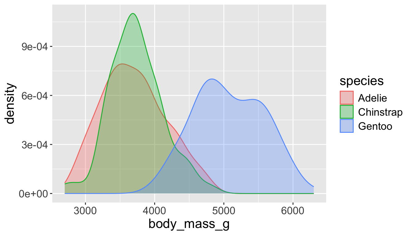
- A smoothed out version of histogram which is supposed to approximate a probability density function

Visualizing distributions
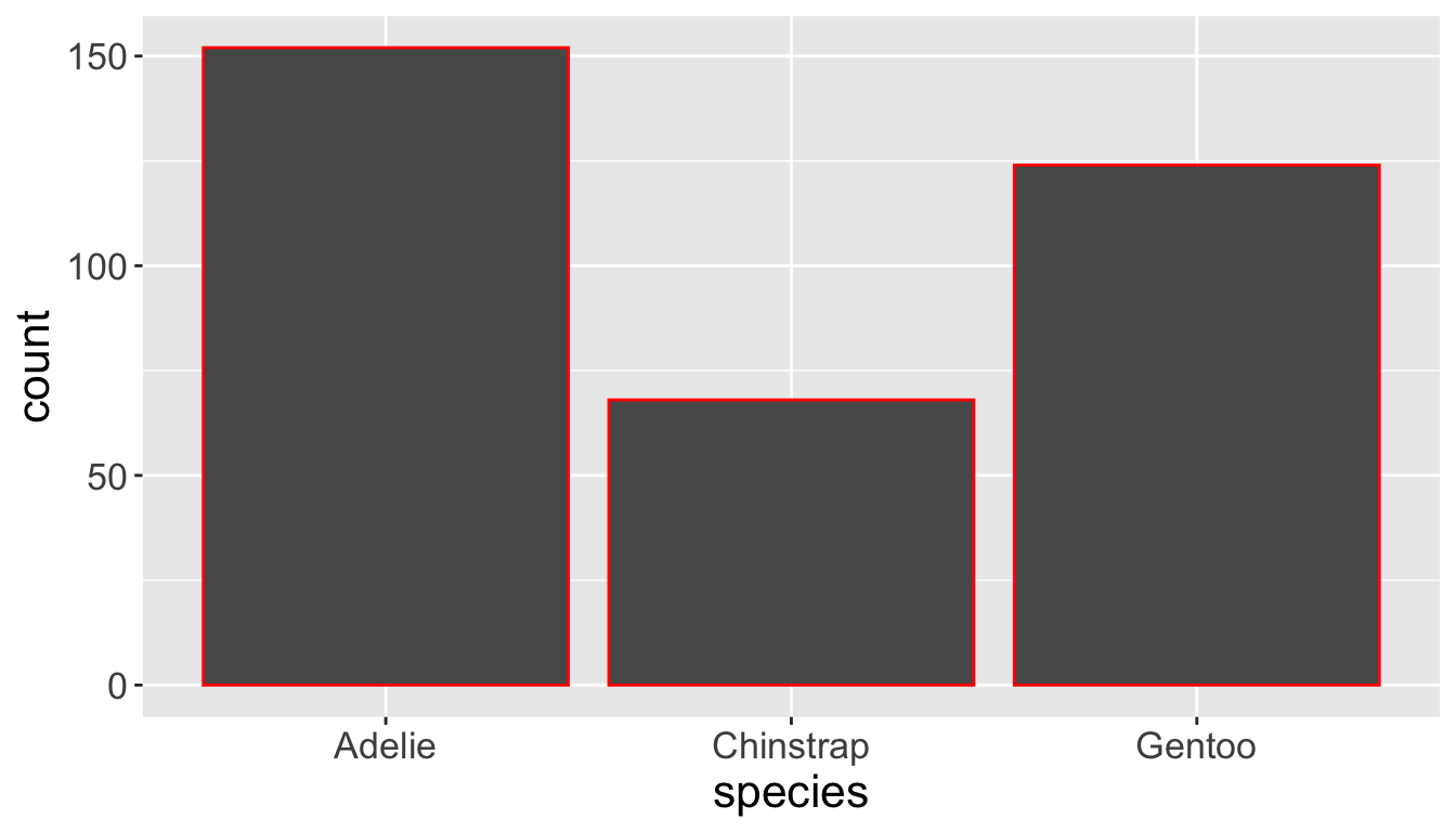
- Let’s check the difference between setting
color =vsfill =withgeom_bar:
Visualizing distributions
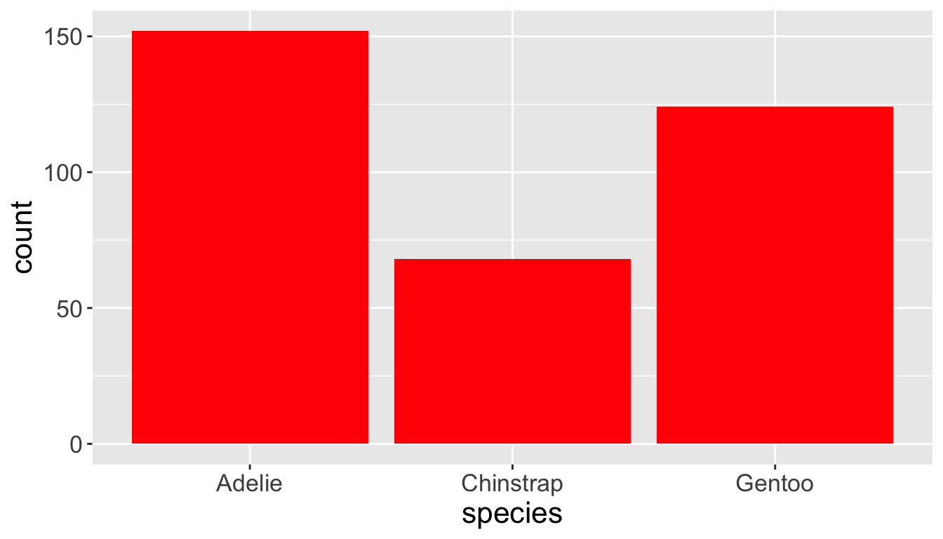
- Let’s check the difference between setting
color =vsfill =withgeom_bar:

Visualizing distributions
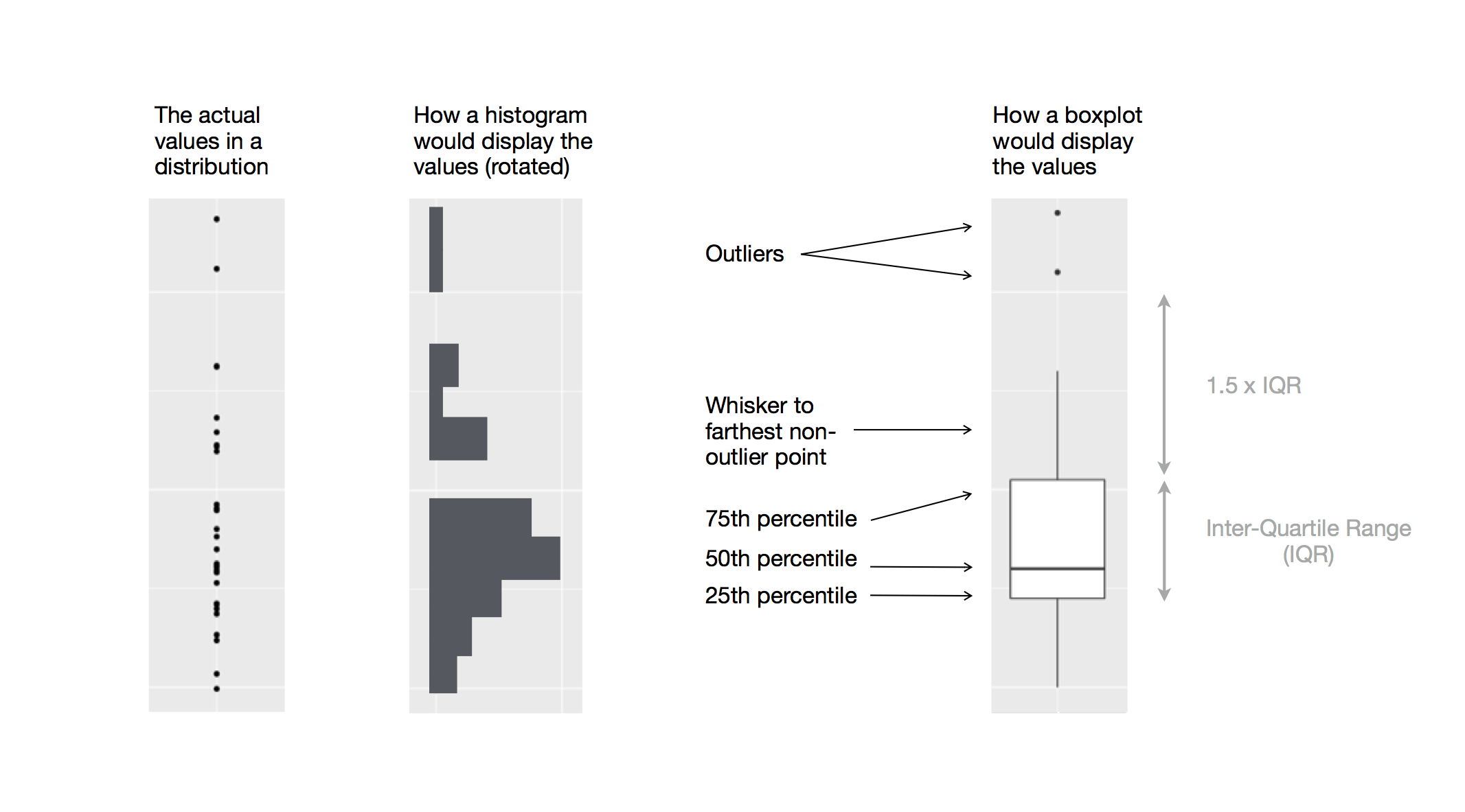
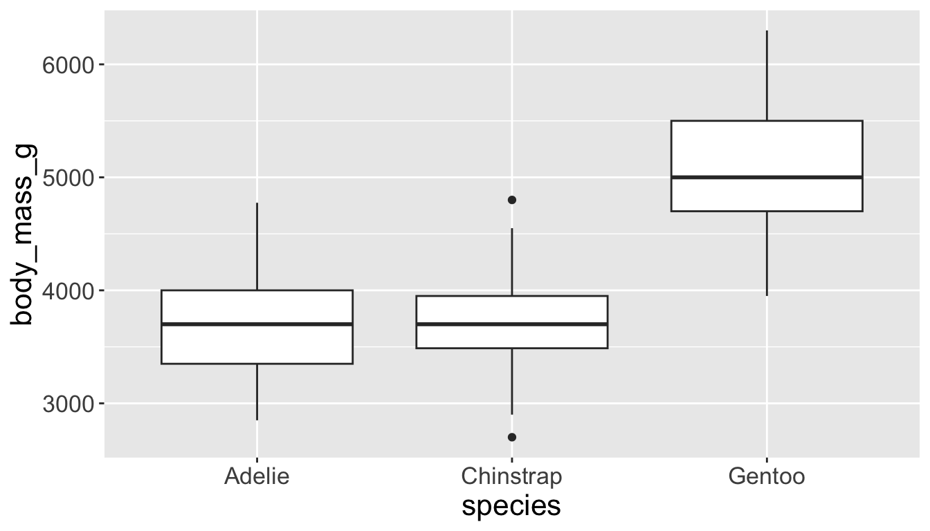
- Box plots allow for visualizing the spread of a distribution
- Makes it easy to see 25th percentile, median, 75th percentile, and outliers (>1.5*IQR from 25th or 75th percentile)
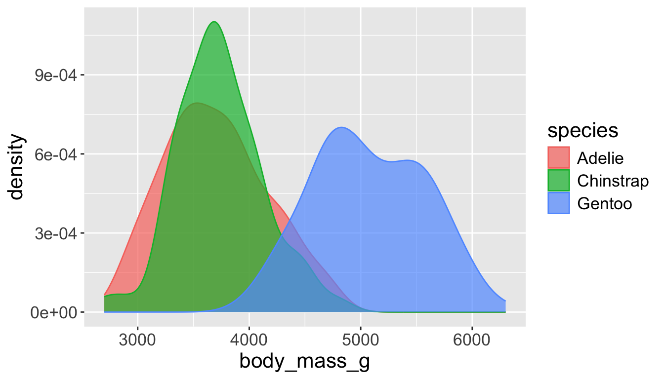
Visualizing distributions
Let’s see distribution of body mass by species…
Playing with visual parameters
Use alpha to add transparency
alphais a number between 0 and 1; 0 = transparent, 1 = opaque
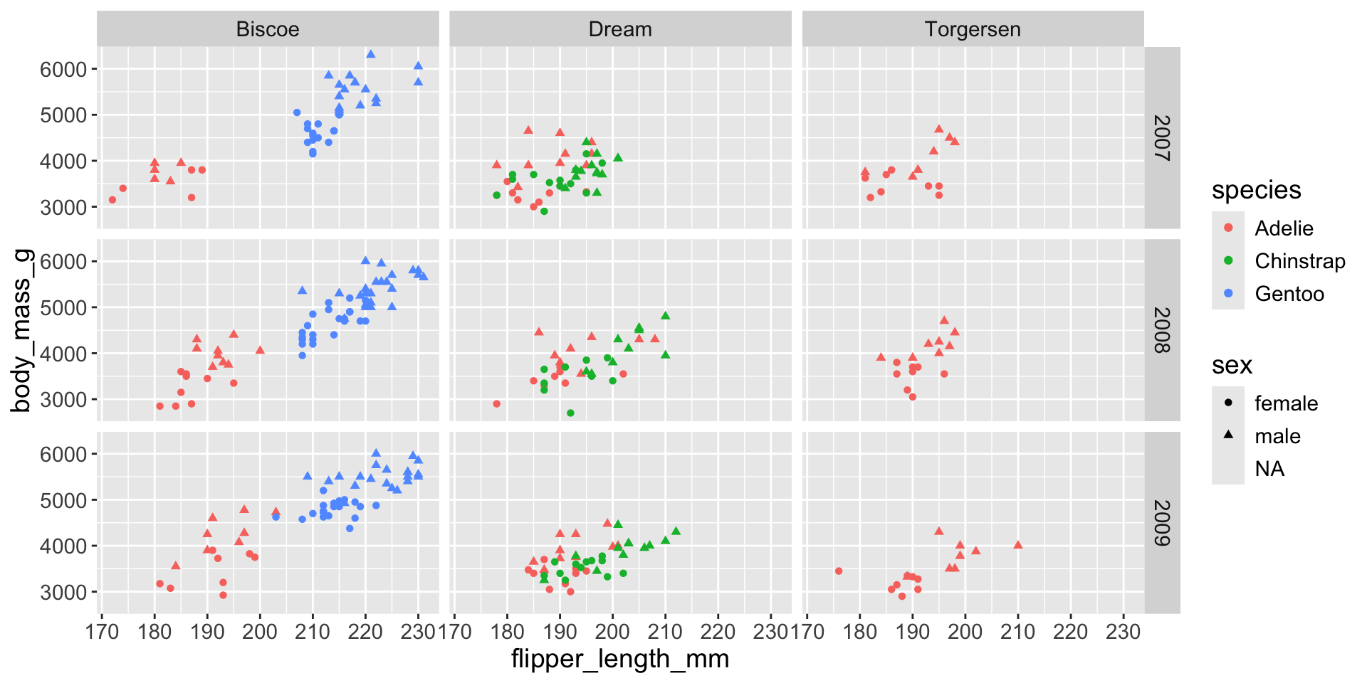
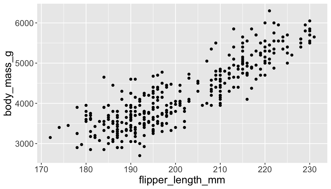
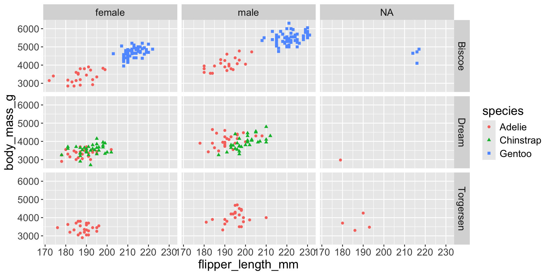
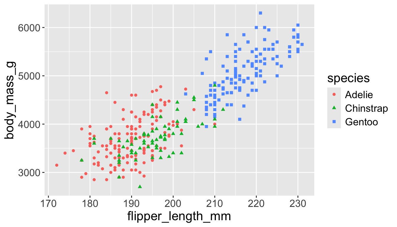
Multiple numerical variables
Already saw how to use scatter plots to visualize two numeric variables
Multiple numerical variables
Too many aesthetic changes (shape, color, fill, size, etc) can clutter plots
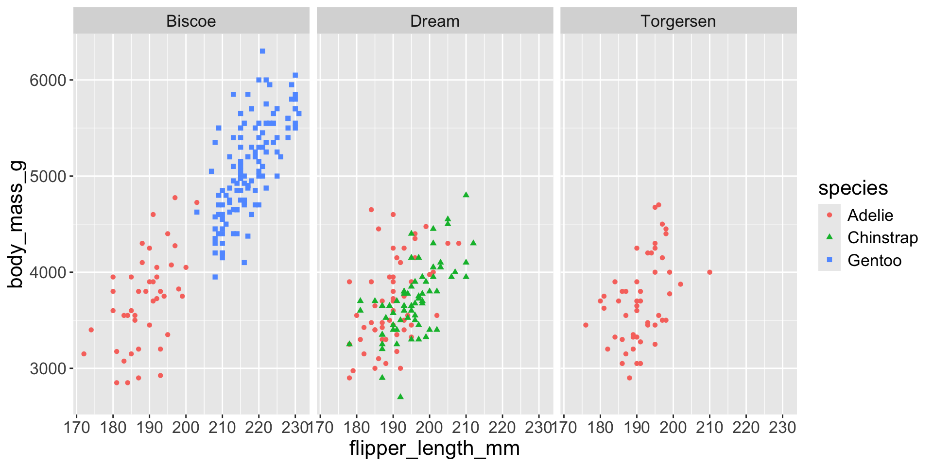
Multiple numerical variables
Too many aesthetic changes (shape, color, fill, size, etc) can clutter plots
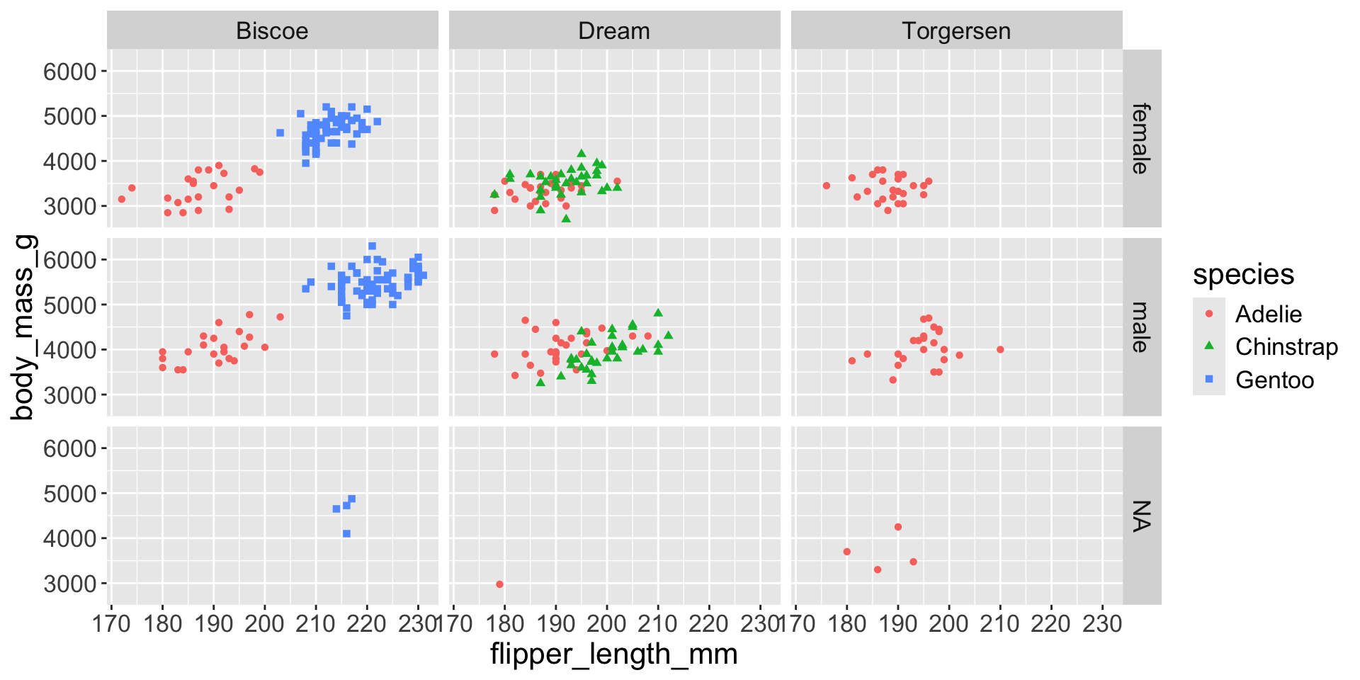
Multiple numerical variables
Too many aesthetic changes (shape, color, fill, size, etc) can clutter plots
Can change order of levels in factors

Shapes can be difficult to distinguish
Sometimes easier to read by replacing shape with first letter
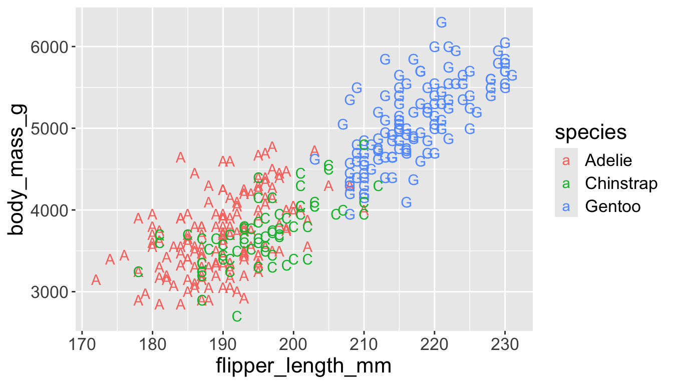
Might allow you to remove the legend

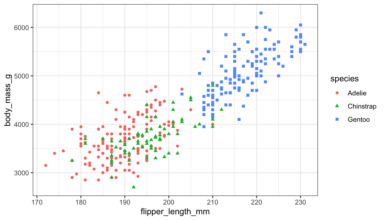
Change background
I don’t like the gray default background

Change background
I don’t like the gray default background
(gg)plotly